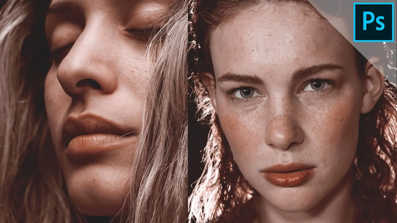
How To Create A Rose Gold Effect
A rose gold effect is a novel addition in image enhancement that replicates the lavish metallic tone, like of a genuine rose gold surface, into images. This approach prevails in various areas of image editing, from editing everyday photographs to embellishing product photographs as well as digital artworks. It adds a touch of modernism and luxury, resulting in an elegant minimalist aesthetic. Besides enhancing an image’s overall tone, a rose gold effect is also utilized to highlight texts and critical details and to emphasize the background or the main subject. The essential editing tools for adding a rose gold imprint to photographs include the gradient tool, brush tools, adjustment layers, texture overlays, blending mode settings, blur filters, hue/saturation adjustments, layer masking and some others. All these features are commonly accessible in advanced image manipulation software like Adobe Photoshop, Lightroom, GIMP, or Canva. In the following steps of this blog, we will discuss the detailed process of creating a rose gold effect using the earlier-mentioned tools and techniques.
Step 1: Initiating The Project
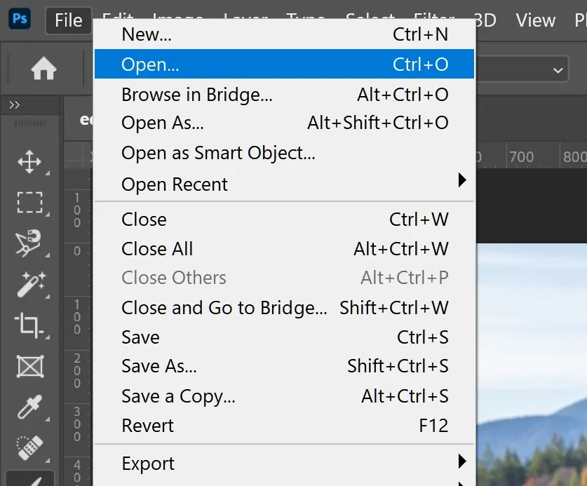
Initiate your preferred image editing program, such as Adobe Photoshop, GIMP, or Canva.
If you are working with an existing picture, head to the File menu and click Open to load your photograph.
If you are working on a graphic design or text-based representation, you can make a new document by clicking New File and specifying the canvas size per your essentials.
Make sure that the photograph or canvas dimensions correspond to your desired final yield, whether it’s for print or digital usage.
Consider importing any additional resources, textures, or background pictures that could help with making the rose gold effect.
Survey the photo, making sure that it is high-quality and all set for editing.
If vital, alter the resolution settings to confirm vivid detail within the final layout.
Step 2: Utilizing The Rose Gold Gradient
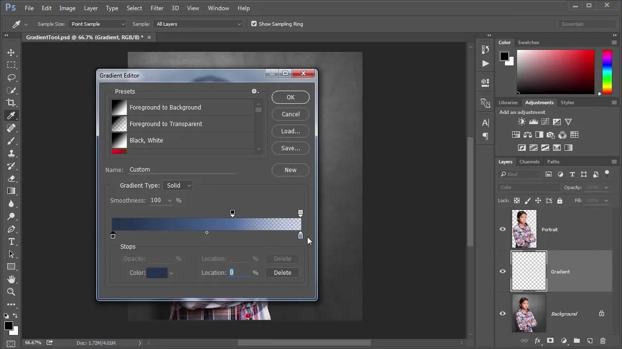
Start by making a new layer to work with the gradient application.
Get to the Gradient Tool in your software, which is often found within the toolbar or beneath fill choices.
Choose a rose gold palette which unites shades of pink, peach, and gold, and add it to the layer.
For detailed control, make a custom gradient by altering the colour stops. Put one stop to a light pink like RGB: 255, 182, 193, and the other to a golden shade like RGB: 255, 215, 148, and blend the two within the middle for a smooth shift.
Utilize the gradient over your canvas or chosen range in a linear or radial style.
If you like, alter the angle and scale of the gradient to harmonize the composition of your arrangement.
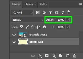
Play with opacity settings for a more discreet impact, as required. That will guarantee that the rose gold tones do not overwhelm the existing photograph.
At last, fine-tune the gradient for equilibrium and harmony with the general design.
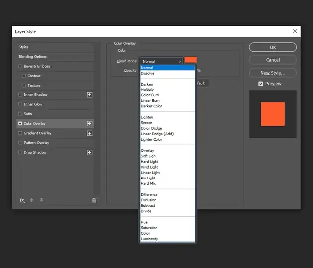
Step 3: Setting Suitable Blend Mode
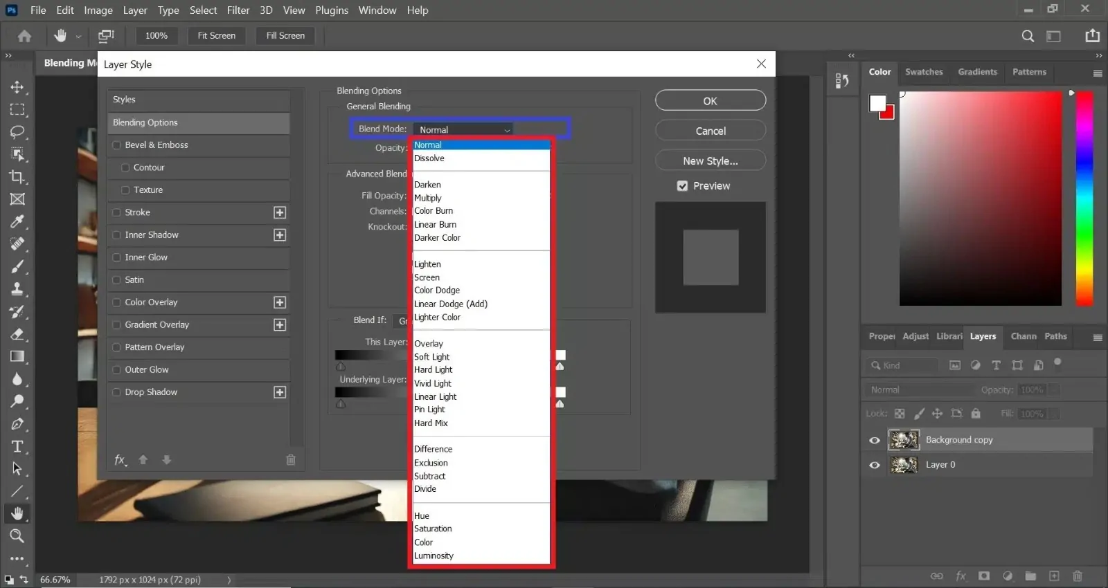
Once you have applied the rose gold gradient, move to the layer settings and find the Blending Mode dropdown menu.
Shift the blending mode of the gradient layer to Overlay or Soft Light, which can allow the gradient to blend naturally with the underlying layers while improving the image’s contrast.
Try diverse blending modes, including Screen for lighter tones or Multiply for deeper tones, depending on the impact you want.
Alter the opacity of the gradient layer to control its intensity. Decreased opacity will make the gradient more moderate, whereas higher opacity will deliver a more assertive impact.
Refine the blending mode and opacity until the rose gold tones consistently blend with the photo’s original colours, making sure that the impact appears smooth and outwardly engaging.
That step confirms that the rose gold tone does not show up too harshly and keeps up a proportional, harmonious aesthetic inside the overall layout.
Step 4: Adding Metallic Surfaces
To imitate the reflective properties of rose gold, include a texture layer that imitates a metallic surface.
Locate or make a metallic surface like a brushed metal or glittery foundation that has the reflective and sparkly qualities of rose gold.
After selection, import the texture and put it on a new layer over your gradient layer.
Put the texture layer’s Blending Mode to Overlay, Soft Light, or Screen, depending on the effect you need to attain. It allows the metallic surface to interact with the gradient underneath, making a realistic metallic look.
Alter the opacity of the texture layer to polish the effect and guarantee that the rose gold tones are still apparent. A more down opacity will permit for a more nuanced texture impact.
As required, utilize the Transform tool to scale or rotate the texture so it conforms perfectly with your plan.
At last, apply a slight blur to the surface layer to muffle any harsh lines and make the metallic formation look more natural.
Step 5: Painting Highlights And Shadows
Make a new layer and switch to a delicate, round brush to start painting highlights and shadows.
To paint highlights, select a light, warm colour like pale gold or delicate peach to delicately paint over zones that naturally catch the light, like the edges or regions of high contrast.
For shadows, choose a deeper shade of pink or rose gold and softly paint in regions where depth is required, like the corners or zones away from light sources.
Utilize a low-opacity setting on your brush to apply subtle layers, continuously building up the light and shadow until you accomplish the hoped depth.
Use Zoom in and focus on small, subtle elements, like edges or curves, to fine-tune the highlights and shadows.
Alternatively, utilize the Smudge Tool to blend regions for a more consistent shift between highlights, midtones, and shadows.
Alter the layer’s opacity if the impact appears too severe. Polishing these elements adds dimension and improves the authenticity of the rose gold effect.
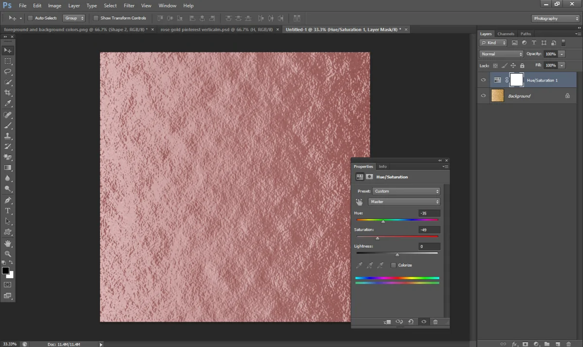
Step 6: Including Adjustment Layers
Include adjustment layers like Hue/Saturation, Brightness/Contrast, and Selective Color to fine-tune the general tone of your photograph.
Start with the Hue/Saturation layer to slightly change the pinks, golds, and overall colour balance. If you find the rose gold effect not dynamic enough, raise the saturation of the warmer tones.
Utilize the Brightness/Contrast layer to alter the overall image contrast, emphasizing the highlights of the rose gold while extending the shadows for more sensational depth.
Alter the Selective Color to target particular colour ranges such as reds, yellows, and magentas to further tune the rose gold tone and its richness.
For an included touch, utilize a Curves adjustment to control the tonal range and upgrade the bright, metallic quality of the design.
Be sure that each alteration is subtle, as applying intemperate changes can distort the general effect, so polish each layer for the most unified and adapted result.
Once you are satisfied, survey the image thoroughly and confirm that the rose gold tones blend equally into the composition.
Step 7: Finalizing The Composition
After done with the application of the rose gold effect to all components, you can survey your composition.
Make sure that all layers blend well and that the rose gold hue is harmonious throughout the image or design.
Polish any irregularities, like excessively bright highlights or muted shadows, to attain balance and harmony.
If you are working with text, icons, or logos, be sure that these components accommodate aesthetically with the rose gold theme for a cohesive appearance.
After fine-tuning the details, recheck the file’s resolution and quality, particularly if it is aimed at print or large-scale applications.
Save the ultimate form of your composition within a suitable file format like PNG, JPEG, or PSD and resolution for its intended objective.
With the rose gold impact, your plan will radiate modernity, grabbing attention through its lavish and pristine aesthetic. This step ensures that the image is prepared for sharing, publication, or utilization in any medium.
Conclusion
In summary, creating a rose gold effect in photographs and designs produces a soft, creamy, and extravagant appearance, simulating the gentle, light-coloured aesthetic of the genuine metal’s surface. You can either enhance the overall ambience of your images or focus on vital zones to bring the viewer’s attention to them. The blend of warm shades like pink, peach, and gold helps heighten the formation of both personal and aimed-to-share compositions. In the end, you will see the gracefully glossing images with a tinge of warmth represented within the visual narrative.
