How To Build a Reusable PBR Material Library for Furniture in Substance Designer
Substance Designer is popular in the creation of procedural and physically-realistic materials of 3D assets. In the case of furniture models, artists may be required to create several materials including wood, fabric, metal and leather without visual lack of uniformity across various products. Repeated manufacturing of those materials may slow down the production process and cause a discrepancy in PBR values.It is addressed using a reusable PBR material library in Substance Designer to standardize, parameterize and efficiently reuse a material across several different furniture models.
The workflow is concentrated on the development of the flexible and scalable PBR materials, which behave correctly when varying the lighting conditions. A systematic, process-based method enables the arrangement of materials into a reusable library that enhances productiveness and enables the creation of furniture visualization over the long term, e-commerce resources, and applications in real-time.
Step 1: Collect Reference Images and Analyze Furniture Materials
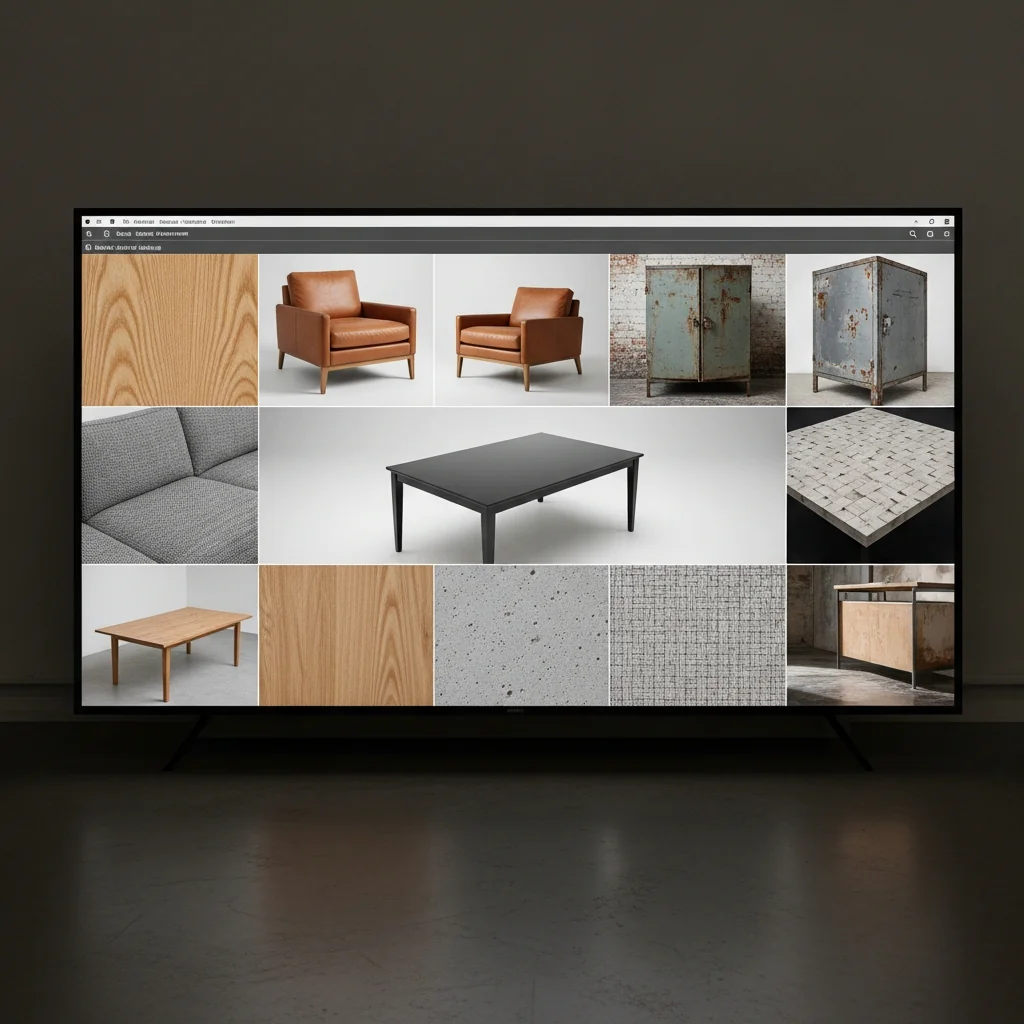
You must have good reference images before you embark on making furniture assets that actually appear and feel the way they should. This is the place upon which you base your organization. Failure to do this may result in your models appearing out of place like a person merely fashioned a guess of how wood or metal should look like.
At this point, you are not earning anything. You are only watching and scrutinizing. Here you find what will impact all the other things that are going to occur, the realism of your materials, the amount of details you have on your surfaces, and whether your PBR textures are even true to reality. If you get this step right you will be in a position to have a much more realistic final asset.
Sub-Steps
1. Gather High-Quality Reference Images
Get reference images in either manufacturer catalogs, studio product photos or on-site shots. Add close-ups, middle, and full shots of furniture. Literature references must be well-luminated and not heavily color graded as it can ruin the actual material properties.
2. Study Material Types and Finishes
Determine the furniture material, e.g. solid wood, veneer, laminate, fabric upholstery, leather, or synthetic surfaces. Notice finishes on surfaces such as matte, satin, glossy or coating, which have a direct influence on roughness and reflectivity.
3. Analyse Surface Details and Patterns
Check for the grain in wood, weave spacing & thread quality of fabric and that are there any pores, creases on leather and also get satisfied if there are any scuff marks. Distinguish between baseline surface textures and superficial anomalies such as scratches, dents or aging marks.
4. Observe Colour and Roughness Variation
Observe the subtle differences in color, brightness and surface roughness within material. Real-world furniture materials almost never have constant values; edges, high-frequency contact regions and exposed surfaces exhibit visually strong scattering.
5. Identify Wear and Usage Areas
Consider where natural wear would develop edges, corners, arms and seat cushions. These insights help inform the realistic distribution of wear during texturing and material editing.
6. Organise References Systematically
Type and finish references by material; (new, used, worn). An organized manner makes workflow more effective and less intuitive, when modelating and creating PBR materials.
Why This Step Matters
If you neglect proper reference your furniture will become generic and physically incorrect. Materializing in a real-world scale is fundamental for getting the correct surface reaction under light as well as believable roughness play and constant visual quality. This is the single step that roots the entire furniture development process in reality and reduces rework downstream.
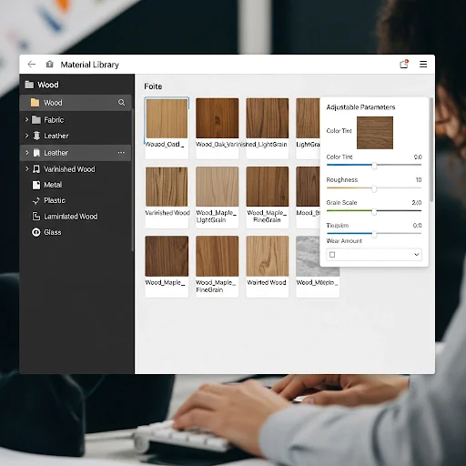
Step 2: Plan Material Categories and Library Structure
Once you’ve analyzed real world furniture materials, the next step is to consider how to arrange those materials in a reusable library. This step is to draft a good structure which can scale, maintain consistency and have high material reusability over different furnitures.
Sub-Steps
1. Define Primary Material Categories
Start by dividing furniture materials into large, easy-to-understand groups—like wood, fabric, leather, metal, plastic, and glass. These major categories help create a strong foundation for your material library, allowing you to organize different surfaces more easily.
2. Create Sub-Categories by Finish and Usage
Sub-Categories by Appearance and Function Go further within each main category, sorting by appearance and application. For example wood can be categorized as natural wood, varnished wood, painted wood and laminated wood. This method of organizing materials is easier to find and reuse later.
3. Standardise Naming Conventions
Define consistent rules for naming of materials, parameters and outputs. Names should indicate material, finish and grade. Uniform naming prevents confusion and provides for consistency between projects and teams.
4. Plan Parameter Exposure Strategy
Decide which material properties can be adjusted such as color tint, roughness and how much grain or wear. By limiting the exposed parameters to only the most crucial controls, materials remain flexible but easy to use.
5. Design Folder and File Structure
Sort things into predictable folder structure by category, sub-category and presence state. A well-organized library saves load times, helps in collaborating and is a good way for maintaining the project later on.
6. Consider Reusability and Scalability
Design materials so they can be reused between the various different furniture, and have to do a minimal amount of adjustments. Steer clear of asset-specific logic as much as you can and think in terms of modular, flexible material design.
Why This Step Matters
Without a well-designed material library hierarchy, a project can easily become chaotic and unproductive. Bad classification results in duplicate content, poor visual coherency and slow iteration. It helps to have a well organised material library in place, allowing efficient production, visual consistency and easy scalability as the asset library grows
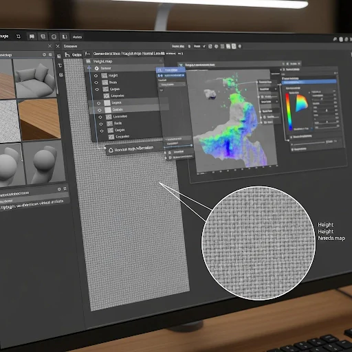
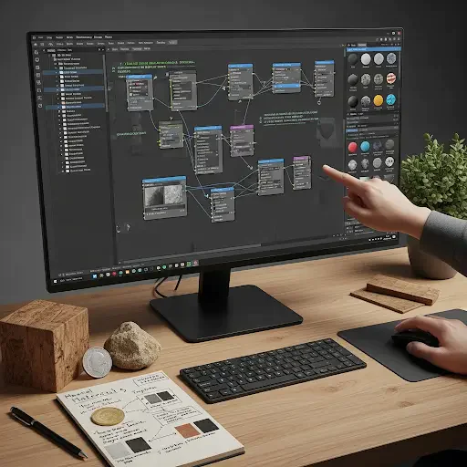
Step 3: Create a New PBR Graph in Substance Designer
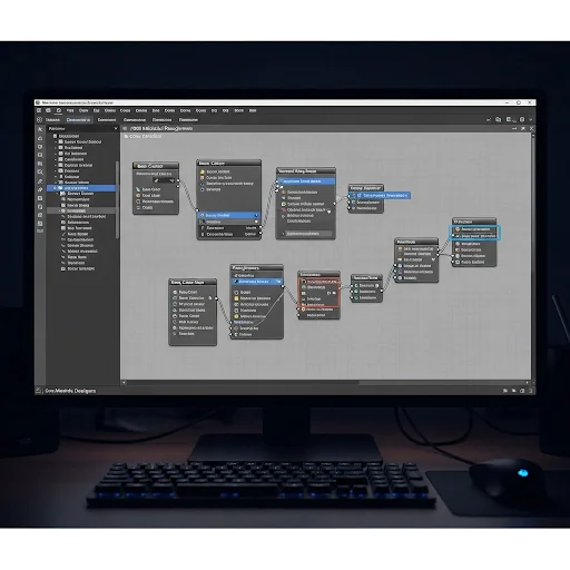
When material categories are designed and library structure is ready, let’s design new PBR graph. This stage also defines the technical base of the material: resolution, output flow and graph tree. The correct setup of a base graph guarantees coherence, scalability, and the accurate physical behavior during the material development.
At this point it’s more about the setup and structure, not visual components.
Sub-Steps
1. Create a New Substance Graph
Create a new graph based from a PBR Metallic/Roughness template. This will make it compatible with today’s most recent real-time engines and rendering pipelines. Specify the graph resolution based on the target platform with scalability in consideration.
2. Define Output Maps Early
Add and set up necessity output nodes, such as Base Color, Normal, Roughness, Metallic (Height if needed). It’s a best practice to create outputs at an early stage which will keep everyone on the same path while avoiding re-thinking (and unnecessary refactoring) towards the end in your workflow.
3. Set Graph Resolution and Scaling Strategy
Decide a default working resolution that suits your quality vs performance requirement. Design the graph so that it can be scaled up or down without loss of fidelity to details. Don’t bake resolution-specific details too early.
4. Organise the Graph Layout
Connect nodes in a logical sequence from input to output. Keep together all relevant nodes and reading direction from left to right. Having a clean graph layout makes for better reading, debugging and long term maintenance.
5. Establish Naming and Commenting Standards
Well name nodes by its function and add comments if required. A uniform naming and documentation policy facilitates collaboration and the resulting graph easier to return to or modify later.
6. Prepare for Parameterisation
Analyze potential regions of the graph that parameters may be exposed, for example color variation, roughness intensity and pattern scale. This allows to avoid useless rewiring at a later stage.
Why This Step Matters
An ill-designed PBR graph results in technical debt, lean iteration and low reusability. By establishing a well-organised, clean graph from the start you’ll get predictable, debuggable behaviour and feel good about expansion as material complexity grows. The technical electronics backbone of the complete material authoring process is established in this step.
Step 4: Build Base Color and Surface Detail Maps
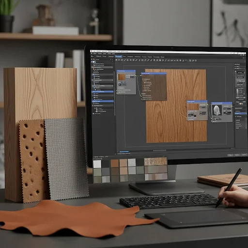
With the PBR graph in place, let’s build up the base color and primary surface detail maps for procedural PBR materials for furniture. At this stage I focused on defining the visual look and appearance of the material along with its surface details while being true to real world scale. This should help provide realistic color variation and basic surface detail without any great deal of wear or noise introduced into the textures
At this point, realism is more about restraint and observation than complexity.
Sub-Steps
1. Create the Base Colour Foundation
Begin by setting the base colour with neutral, physically correlated values from reference studies. Do not use pure colors or too high contrast. Add some variety in tone to avoid surfaces looking too flat and samey.
2. Add Controlled Colour Variation
Put/overlay soft colored noise or gradient layers into a layer mask for natural material inconsistency effect. Material variety, in the case of furniture materials, should be slow and subtle or repetitive to represent real color uptake from dyes shifting grain patterns on wood or fabric non-uniformity in its weave.
3. Generate Primary Surface Structure
Create the large surface detail patterns, such as wood grain, fabric WEave or leather pores. These details are the basic structure of what makes up the thing and should be able to be read at any scale.
4. Separate Structural Detail from Damage
Make sure surface structure details are authored without any sort of wear or damage effect. By separating these into individual elements we can retain greater control and the ability to reuse across varied states of assets.
5. Develop Height and Normal Information
Convert structural detail to height and normals with intensity controlled. The relief of the surface should be realistic and restrained, so that it does not produce significant exaggerations or distortions related to light interaction.
6. Maintain Consistent Scale and Direction
Check that the details of patterns, such as grain direction or fabric weave, match and scale evenly throughout the design. Poor scaling immediately ruins the realism and look of furniture assets.
Why This Step Matters
The startcolor and detail maps sort of decide how the material is looking, before lighting, ageing or wear has its influence. Bad basemaps give you flat, plasticky looking materials that you can’t hope to fix later with the roughness or lighting. A good base can keep the material looking real in any light and help future refinement.
Step 5: Generate Normal and Height Information
Once you’ve laid down base colors and primary surface features, the next thing to do is create normal and height data. This is where the material makes its connection with light, by adding surface depth and micro-relief in a manner consistent with plausibility. The objective is to achieve improved realism in visual shading, while remaining stable for shading and performance.
At this point, surface depth has to work in service of the material’s structure, not against it.
Sub-Steps
1. Refine Height Map from Structural Details
Leverage these surface patterns, that you just generated to create a clean height map. Height data must correspond to physical surface variations like grain depth, fabric thickness or leather pores. Don’t overlap noise artificially which doesn’t exist in real materials.
2. Control Height Intensity and Range
Keep them small and grounded in nature. There is little depth variation with the materials available for furniture. Insufficient height contrast resulted in shading artifacts and flat or unnatural silhouettes, particularly for grazing angles.
3. Convert Height to Normal Data
Derive Normal maps from your fine tuned height data via the proper conversion nodes. Make sure normal strength is stable and that it does not create identicious lighting responses or deformation.
4. Preserve Surface Directionality
Keep the sense of direction of such details right, e.g. wood grain or woven fabric. No matter what, normals with no clear direction are instantly unrealistic, and especially noticeable in dynamic lighting.
5. Blend Multiple Detail Layers Carefully
When integrating different sources of elevation, control the extent of blending in order to neither flatten nor exaggerate relief. The focus should mostly be on the structural and not too much on the secondary micro-details.
6. Validate Under Dynamic Lighting
See the normal- and height-output preview, under a variety of lighting angles. Verify highlights, shadows and reflections work naturally without evident seams, stepping or shading issues.
Why This Step Matters
Normal and height maps are the result from which a surface will respond to light. Weakly written depth has been shown to cause noisy and inaccurate shading, irrational reflection and unstable highlights. Building clean and tight normals and height allows your more intelligent assets to appear believable, performant, and consistent on virtually any rendering system.
Step 6: Define Roughness and Metallic Values
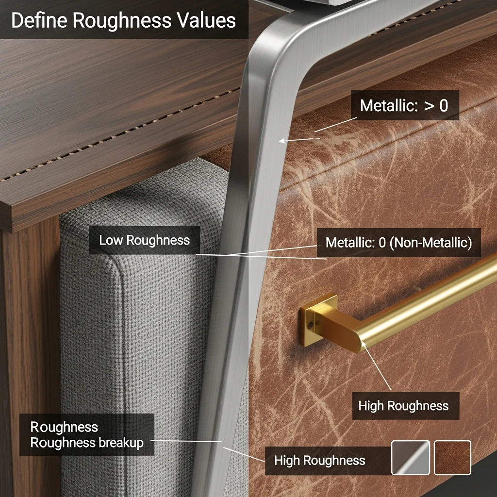
After creating our normals and height data as we did above, it is now time to describe how roughness and metal should be.This is the stage that will determine how material reacts to lighting, and hence its realism in various light conditions by maintaining physically accurate PBR values.The photoreal quality of the materials for furniture also requires accurate roughness and metallic behaviour, where low reflection variations have a large impact on dynamic lights quality.
Sub-Steps
Determine Material Conductivity
Determine if the material is metallic or non-metallic by real-life characteristics. The majority of standard furniture materials, including wood, fabric, leather and plastic are non-metallic elements and have a metallic parameter value of zero. The only parts that should have any metallic data are the metal parts themselves.
Establish Base Roughness Values
Establish an initial range of roughness depending on a surface finish, such as matte, satin, semi-gloss and glossy. These base values should also be physically plausible, and can not solely be based on visual preference.
Introduce Roughness Variation
Include fine roughness breakup for the appearance of natural surface variation. Test Variation should be minimal, occurring in a confined location and for sound reasons such as differences due to grain direction, weave density, coating thickness or surface compression.
Separate Structural Roughness from Wear
Make sure self-generated roughness is separated from wear-induced roughness. This decoupling enables the same data to be used for multiple condition states without regenerating the graph.
Avoid Over-Polishing the Surface
Hard Furniture materials are almost never 100% perfectly reflective. Excessively small roughness lead to plastic or mirror-like surfaces which do not occur in natural world. Keep a cool head and don’t lose your grip on what’s true.
Validate Under Multiple Lighting Conditions
Measure light intensity and angle dependences of the test roughness and metallic signals. Verify that reflections react in a natural, smooth way and don’t have tensity edges or flashing highlights.
Why This Step Matters
Roughness and metallic maps have a greater effect on how a material responds to light than any other PBR inputs. Wrong values result in unrealistic reflections or shading as well as noisy surfaces which cannot be treated later. Correct roughness and metallic values help make sure furniture materials are believable, stable and physically accurate in all your scenes lighting conditions.
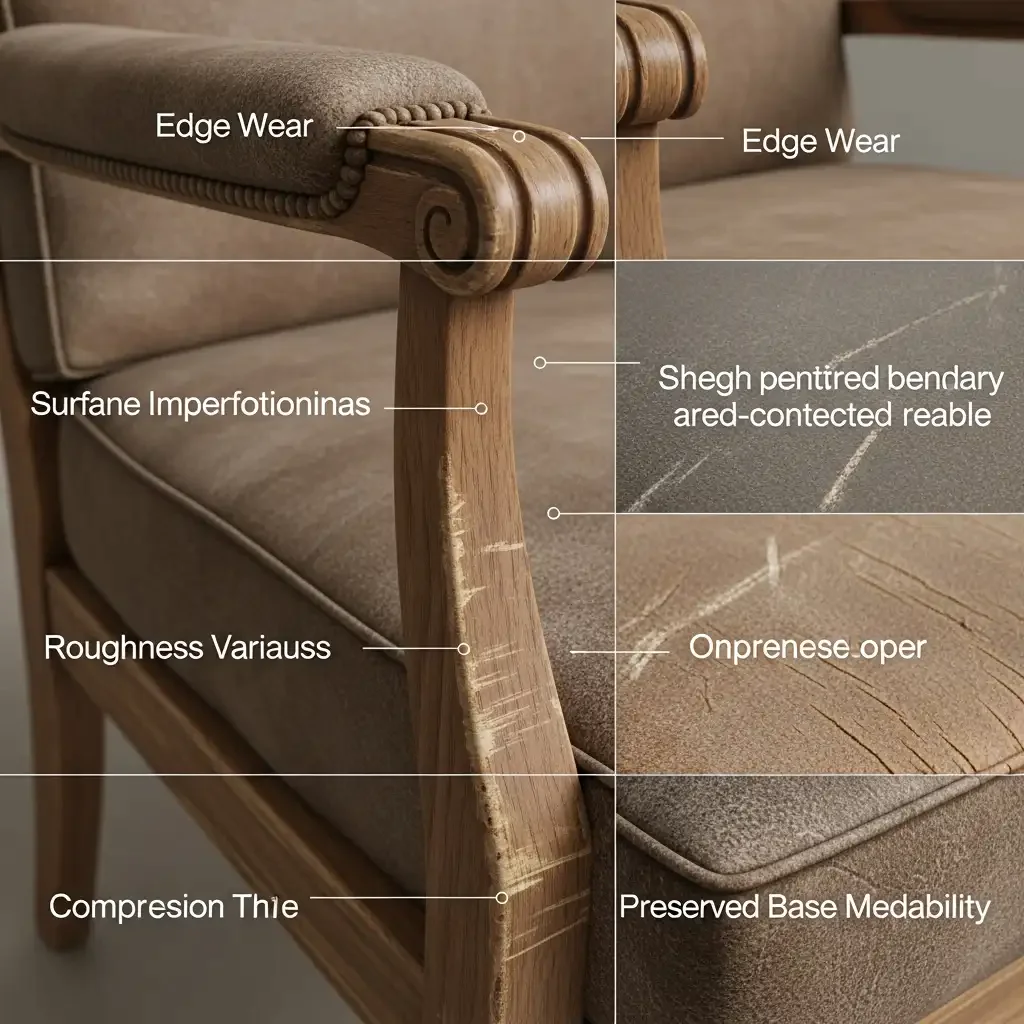
Step 7: Add Wear, Ageing, and Imperfections
Then, the core PBR properties described above can be used to turn that into wear, aging and surface imperfections. This step provides an added element of realism as it matches how furniture materials wear with use, contact, and environmental factors over time. The aim is to improve the credibility of simulation, without losing material integrity and reusability.
Sub-Steps
Identify Logical Wear Zones
Wear can be added to the main contact points including edges, corners armrests, seat surfaces and handles. Placement of the WEAR must conform to real-world placements, as determined through a referring process.
Add Edge Wear and Softening
Add some small edgewear to create an ageing effect of the material. It may have slight roughness, fading cutting and so on. Edge effects should tend to be kept to a minimum, unless it’s for battle damages.
Layer Surface Imperfections
Include in your artwork some minor flaws like scratches, scuffs, compression marks or fiber curving. These are points that should be subtle and worked into the material to help, not override.
Modify Roughness for Aging Effects
The color sometimes less affected than the surface roughness by aging. Raise the roughness a bit in heavy use region, just to simulate surface dulling, oil penetration or finish wear. Do not apply uniform roughness alterations across the material.
Preserve Base Material Readability
Just make sure that the wear layers are not hiding the texture of your finish beneath them. Warp, weave and primary normals must be visible after wear.
Control Wear Using Masks and Parameters
Drive wear with curvature, ambient occlusion or a custom generator. Introduce wear severity as one of the parameters to provide flexibility for various asset states.
Preserve Base Material Readability
Make sure wear layers won’t hide the surface structure. Grain direction, weave patterns and primary normals shall be visible and readable after erasure.
Why This Step Matters
Wear and imperfections are what turn a technically accurate material into one that is believable. So whenever they are missing, furniture resources look like synthetic and sterilized. Yet too much, or ill-conceived wear breaks realism just as suddenly. Carefully-controlled aging improves visual authenticity, yet allows the material to remain flexible, reusable and production friendly.
Step 8: Optimize and Validate the Material
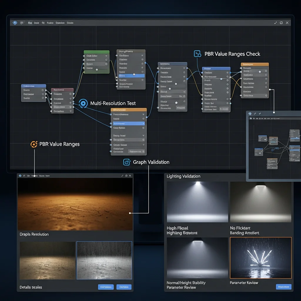
Post Wearing and Ageing the material needs to be fine-tuned and tested to make sure it works properly in different light settings, resolutions and scenarios. This phase focuses on technical solidity, efficient performance, and ensuring the material outputs are production-ready PBR materials across different use cases.
1. Check PBR Value Ranges
Ensure that base colour, roughness, and metallic are within sensible range values. It is best to avoid stark values or extremes that render realism in bright or low light.
2. Test at Multiple Resolutions
In other words, you can take a look on the content with different texture resolution to check if all details scales properly. Readability of patterns and noise should stay readable without going to mush or being too sharp.
3. Validate Under Different Lighting Setups
Experiment with different light angles and intensities on the material. Ensure that highlights, reflections and shadows respond exactly the same way, no flickering, banding or shading artifacts.
4. Optimise Graph Complexity
Prune away non-essential nodes, redundant blends or overpriced operations. A verbose and ineffective graph hinders performance and makes the material harder to maintain.
5. Confirm Normal and Height Stability
Also check the surface at grazing angles to avoid normals/height database errors producing: shading artifacts, crawling on the screen, an exaggerated depth.
6. Review Parameter Behaviour
Unit-test public inputs to make sure they generate an expected predictable result. Parameters should be flexible with-out destroying the physical logic of the material.
Why This Step Matters
Unoptimized materials could prove to look fine alone, but not in scenes or real-time. Validation guarantees that output is stable, performant, and visually consistent across all use cases. This is to avoid last minute fiddling around with your project that impacts overall production quality.
Step 9: Package the Material for Library Application
After material is tuned and validated it has to be prepared for packaging into the library. The next phase is about standardization, documentation and long term reusability. Good material can be used time after time with a little tweaking.
This is the step that takes one material and turns it into an asset that can scale.
Sub-Steps
1. Finalise Naming and Metadata
Use uniform names throughout for the graph, outputs and parameters. Add in descriptive stickers listing material type, finish, and how much variation or flex there is.
2. Organise Outputs and Parameters
Organise exposed parameters with logic and dont show controls you don’t need. An organized set of parameters makes it easier to use for both artists and technical users.
3. Create Preset Variations
Create presets for typical varieties – such as newly minted, sandy, or worn coins. Presets make your look entertaining fast yet never forget to be consistent with visual tone all over dem precious stuff.
4 . Add Documentation and Notes
Share in-graph comments about major logic regions and parameter usage. Short notes help other users to understand how and correct the code.
5. Store within the Defined Library Layout
Put the finished stuff in the predetermined folder structure, by category, and finish. Continuous storage encourages ease of expansion and team working.
6. Test Reuse on Multiple Assets
Test the text for variety of furniture layouts for adaptability. A library-ready thing ought to need little in the way of tweaking from asset to asset.
Why This Step Matters
Without packaging, even good materials are hard to reuse and keep up. Library-ready assets speed production, ensure maya consistency and further reduce wasted effort. This step effectively finishes the workflow by turning a final material into an assuredly production-ready asset.
Why a Structured PBR Workflow Matters for Photorealistic Furniture Materials
Visual complexity does not make photorealistic furniture rendering, but rather realistic material shades under different kinds of light. A well-defined PBR workflow gives deterministic control over the response of a surface, making materials that stay consistent, predictable, and reusable in production pipelines.
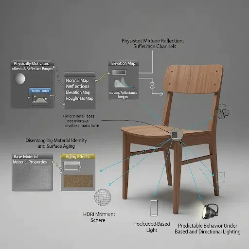
1. Physically motivated albedo and reflectance ranges
Furniture materials: wood, fabric and leather usually have limited real-world reflectance. Upgrading to a PBR production workflow will impose energy conservation and clamps on albedo luminance.
Lack of this limitation (this is practically impossible to achieve) leads to good looking materials under neutral light, but fail rampantly if you use high contrast HDRI, get over-bright and washed out diffuse response or bad fresnel falloff at high angles.
2. Consistent Micro-surface Reflections Across Multiple Surface Channels
Micro-Surface Detail Micro-surface is all furniture surfaces are depended upon for realism. If the grain orientation, surface frequency and roughness variance are defined at base it guarantees that:
Normal, elevation and roughness maps are defined at compatible scales
Surface breakup remains physically plausible
Micro detail does not overtake macro form.
The coherence is essential for materials like wood veneer and upholstery, where directionality drives realism.
3. Disentangling Material Identity and Surface Aging
A controlled process divides identity from the surface. The bulk material properties describe how the surface interacts with incident light, and independent modulation layers are used to introduce wear, dirt and aging.
This protects the base BRDF response from aging effects, and permits multiple different visual appearances to be derived from a single physically based material definition.
4. Predictable Behaviour Under Image-Based and Directional Lighting
When PBR inputs are authored correctly, furniture materials look the same from HDRI environment to area lights to headlamps in a studio, making all of our customer’s work look cool. This reliability becomes critical when assets are transferred among:
Product visualization
Interior scenes
Real-time preview environments
Material performance does not vary with light intensity or color temperature.
5. Reduced Look-Development Iteration
In a production pipeline, you are not as concerned to have to do everyday corrective workflows (rebalancing roughness, bring down tone of normal intensity, fixing gamma etc) When the physical truth is resolved early, iteration then becomes as much or more about art direction and less about technical fixing.
6. Scalable Material Systems for Furniture Libraries
Furniture manufacturing Meeting the needs for whenever plenty of different materials and a variety of characteristics are present. A pbr pipeline can support quasi-parametric/nominal-resolution-specific materials that can scale across assets without reauthoring.
This kind of practice ensures the pipeline is stable, maintainable and consistent over time.
Conclusion
A reusable PBR material’s library for furniture is born with a methodical and consistent workflow instead of an orphaned material. By referencing real-world reference data, scoring texturing against physically accurate PBR values and removing core material functions from its variations, this approach results in a scalable PBR material system that ensures materials are uniform, consistent, scalable and can be re-used time and time again on a variety of furniture assets.
This procedural methodology employed in Substance Designer minimizes duplication, while maintaining a consistent look between art sets, and guarantees a dependable material no matter what lighting or rendering engine is being used. The outcome is a production-ready material library for long-term furniture visualization, e-commerce and real-time use, with little to no rework.
This early planning prevents repetition, contains visual cohesion and facilitates management of further material.
