How to Achieve Smooth Color Transitions with the Gradient Tool
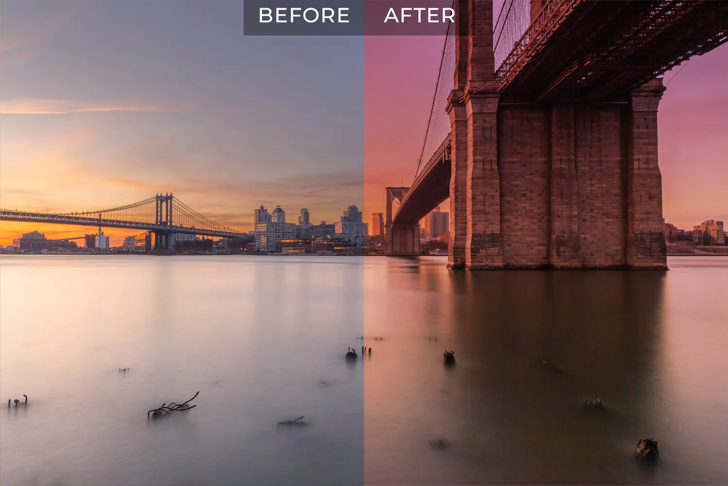
Colour transitions must be smooth to create aesthetically pleasing visuals. Whether editing photos or creating digital artwork, having streamlined colour gradients can greatly impact the end product. The Gradient Tool is a resilient tool that can assist you in accomplishing this. This blog post will review the utilization of the Gradient Tool to make intuitive colour transitions in image editing. By grasping these techniques, you can boost your photographs with engaging and smooth colour blends.
The Basics of the Gradient Tool:
The Gradient Tool is a powerful feature in image editing software to create smooth colour transitions within your images. Understanding the basics of the Gradient Tool is essential to harness its capabilities and enhance your images effectively.
The Gradient Tool works by gradually blending multiple colours. It offers various gradient types, such as linear, radial, and angular gradients, allowing you to customize the direction and pattern of the colour transitions. With the Gradient Tool, you can achieve seamless gradients that add depth, dimension, and visual interest to your images.
Select the Gradient Tool from your image editing software’s toolbar and choose the desired gradient type. Click and drag on your image to define the gradient’s beginning and finishing points. You can also adjust the gradient’s length, angle, and position to suit your composition.
Furthermore, the Gradient Tool provides options to customize the gradient’s colours, opacity, and blending modes. That creates unique effects and refines the colour transitions according to your creative vision. Experimenting with different colour combinations, opacity levels, and blending modes can help you achieve the desired aesthetic and evoke the intended emotions in your images.
Take the time to explore the different gradient types, experiment with various settings, and observe the impact on your images. With practice and creativity, you can utilize the Gradient Tool to transform your images into visually stunning works of art.
Selecting the Right Color Scheme:
Selecting the right colour scheme is vital in image editing as it greatly impacts the overall visual impact and emotional response evoked by your images. The right colour scheme can enhance the mood, convey a specific message, and create a harmonious composition. Following are tips to select the right colour scheme for your images:
Consider the Purpose and Mood: Think about the purpose of your image and the emotions you want to convey. Different colours have different psychological associations and evoke distinct moods. Warm colours such as yellow, red and orange create a sense of energy and warmth, while cool colours like blue and green evoke calmness and serenity. Select colours that align with the intended mood and purpose of your image.
Utilize Color Theory Principles: Familiarize yourself with colour theory principles to guide your colour scheme selection. Concepts such as complementary colours (opposite colours on the colour wheel), analogous colours (adjacent colours on the colour wheel), or monochromatic schemes (variations of a single colour) can help you create visually pleasing and harmonious colour combinations.
Consider Contrast and Balance: A well-balanced colour scheme often incorporates various colours with varying contrast levels. That includes considering the balance between light and dark shades, warm and cool tones, and complementary or analogous hues. Aim for a harmonious balance that creates visual interest without overwhelming the viewer.
Consider the Subject and Context: The subject matter of your image and the context in which it will be presented should also inform your colour scheme. For example, natural landscapes call for earthy tones and greens, while a high-energy sports image might benefit from bold and vibrant colours.
Utilize Online Resources and Inspiration: Take advantage of online resources and sources of inspiration to assist you in selecting colour schemes. Websites like Adobe Color, Color Hunt, and Pinterest offer pre-made colour palettes and allow you to explore and generate different colour combinations. Additionally, observing artwork, photography, and design in various media can spark ideas and inspire unique colour schemes.
Creating Linear Gradients:
Creating linear gradients in image editing allows you to achieve smooth colour transitions that add depth and visual interest to your images. Here are some steps to create linear gradients effectively:
Select the Gradient Tool: In your image editing software, choose the Gradient Tool from the toolbar. It is usually represented by a rectangle divided into two or more colour segments.
Choose the Linear Gradient Type: Select the linear gradient type in the options bar or gradient panel. That ensures that the colours blend in a straight line.
Define the Starting and Ending Points: Click and drag on your image to define the starting and ending points of the gradient. The drag’s direction and length determine the gradient’s angle and extent.
Customize the Color Stops: A linear gradient transitions from one colour to another by default. However, you can add additional colour stops to create more complex transitions. Click on the gradient line and adjust the colours, opacity, and position of each colour stop to fine-tune the gradient.
Refine and Experiment: Play with different starting and ending points, angles, and colour stop positions to achieve the desired effect. Smooth colour transitions are best achieved by making the shifts between colours subtle and gradual.
Linear gradients are versatile and can be used in various ways. They can create background elements, gradients on shapes, simulate lighting effects, or add depth to your images. By experimenting with different colour combinations and settings, you can achieve visually pleasing and seamless linear gradients using the Gradient Tool in image editing.
Exploring Radial and Angular Gradients:
Exploring radial and angular gradients can open up new possibilities for creating captivating colour transitions and adding visual interest to your designs. These gradient types offer unique patterns and directions for blending colours seamlessly.
Radial Gradients: Radial gradients emanate from a central point and expand outward in a circular or elliptical pattern. Use the Gradient Tool and the Radial Gradient Type to create a radial gradient. Click and drag on your image, starting from the centre point and extending outward. Experiment with the gradient’s size, shape, and position to achieve the desired effect. Radial gradients are useful for creating focal points, adding depth, or simulating lighting effects like sunbursts or glowing elements. You can achieve smooth and captivating colour transitions by adjusting the colours, opacity, and position of colour stops along the gradient line.
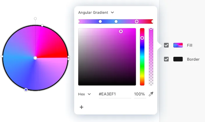
Angular Gradients: Angular gradients create colour transitions around a centre point in a circular or elliptical pattern. Select the Gradient Tool and choose the angular gradient type. Click and drag on your image to define the gradient’s beginning and finishing points. The angle and size of the gradient determine the direction and extent of the colour transitions. Angular gradients can be used to create radial backgrounds and decorative elements or to highlight specific areas of your image. Experiment with different angles and colour combinations to achieve eye-catching and dynamic colour transitions.
Combining Gradient Types: Don’t limit yourself to a single gradient type. You can combine radial and angular gradients or layer gradients to create complex and visually striking effects. For example, a radial gradient can be used as a base and apply an angular gradient on top to add dimension and depth. By experimenting with different gradient types, you can unleash your creativity and achieve unique and captivating colour transitions in your images.
Remember your image’s composition and subject matter when working with radial and angular gradients. Consider how the gradients can enhance the visual impact and guide the viewer’s attention. Adjust the colours, opacity, and blending modes to achieve the desired mood and atmosphere.
Applying Opacity and Blending Modes:
Applying opacity and blending modes to your image gradients can take your designs to the next level by enhancing the smoothness of colour transitions and adding depth and visual interest. Here’s how you can effectively utilize opacity and blending modes:
Opacity: Adjusting the opacity of your gradient allows for subtle blending between colours, resulting in seamless transitions. Lower opacity values create more transparent gradients, while higher values make the colours more opaque. You can create a soft and subtle transition between colours by reducing the gradient’s opacity. On the other hand, increasing the opacity can make the gradient more vibrant and pronounced. Experiment with different opacity levels to find the balance that achieves the desired effect for your image.
Blending Modes: Blending modes determine how colours interact with each other when multiple layers or gradients are combined. They offer various ways to blend and overlay colours, creating interesting effects and refining the transitions in your image. Popular blending modes include Soft Light, Overlay, Multiply, and Screen. For example, the Soft Light blending mode can create a gentle effect, while the Overlay blending mode intensifies the colours and contrast. Experiment with different blending modes to achieve your image’s desired look and mood.
Layering and Masking: To further enhance your gradients, consider utilizing multiple gradient layers and masking techniques. You can create complex and dynamic colour transitions by overlaying gradients with varying opacity and blending modes. You can also use masks to control where the gradients are applied, allowing for precise and targeted adjustments. Masking enables you to apply gradients selectively to specific areas of your image, providing more control over the colour transitions and composition.
Conclusion:
In conclusion, applying opacity and blending modes to your image gradients can elevate your designs by enhancing color transitions and adding depth. By adjusting opacity, you can create subtle and seamless blends, while blending modes offer various effects. Experiment with these techniques to achieve the desired aesthetic and make your designs visually captivating and professional.
