How To Edit Photos In Sepia Tone
Sepia tone provides a traditional touch to photographs by manipulating saturation, contrast, and color balance settings to impart a brownish color. Sepia editing can prove very successful for portraits, landscapes, and still-life images, adding a traditional and artistic flavor. Sepia’s warm, brownish tones take viewers back in time, recalling old family albums or historical photos. By mimicking the fashion of retro prints, it makes images feel like a piece of history that radiates a longing for the past. It provides a sense of familiarity and soft ambiance, resulting in an emotional bond between the observer and the image. You can also use a sepia tone to turn an up-to-date picture into one that looks to have been taken decades ago, soaking it in authenticity and historical relevance. This blog overviews the practical approaches to adopt when you want to edit your photos in sepia tone. By learning the techniques behind the sepia toning effect, you can make your images look like reflecting the days of old prints and treasured family albums.
Open the photo:
Step 1: Launch the photo editing software on your computer.
Step 2: Select the “Open” or “Import” option in the software’s interface.
Step 3: Browse through your computer’s files and folders to find the photo you want to edit.
Step 4: Click on the photo file to select it.
Step 5: Depending on the software, you may need to choose the file format (JPEG, PNG, etc.) or click “Open” to proceed.
Step 6: The photo will now appear in the editing software’s workspace, ready for adjustments.
Step 7: Ensure you have a duplicate layer of the original image to work on, preserving the original file.
Duplicate the layer:
Step 1: With your photo open in the editing software, look for the “Layers” panel. It is usually located in a sidebar or under the main menu.
Step 2: In the Layers panel, you will see the original layer representing your photo. Right-click on this layer or look for an option to duplicate it. Alternatively, you can usually find a “Duplicate Layer” option in the software’s main menu.
Step 3: Click on the “Duplicate Layer” option. A new layer will be created, identical to the original one, and placed on top of it in the Layers panel.
Step 4: Give the duplicated layer a meaningful name to help you differentiate it from the original layer. This step is optional but helpful, especially when working with multiple layers.
Step 5: By duplicating the layer, you ensure that any adjustments or effects you apply will only affect the duplicated layer, leaving the original layer untouched.
Step 6: You can edit the duplicated layer to create the sepia tone effect. Use the editing tools and techniques described earlier to achieve the desired result.
Step 7: Watch the layers panel to see the changes applied to the duplicated layer as you adjust.
Adjust color balance:
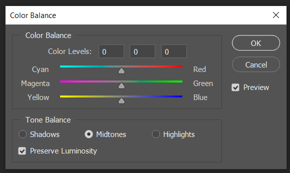
Step 1: Select the duplicated layer in the Layers panel by clicking on it.
Step 2: Look for your editing software’s “Adjustments” panel or menu. It may be labeled as “Color Balance” or “Hue/Saturation” or represented by an icon that resembles a color wheel or sliders.
Step 3: Click on the “Color Balance” or related option to open the color adjustment controls.
Step 4: You will typically see sliders or numerical values representing different color channels, such as red, green, and blue.
Step 5: To create a sepia-tone effect, you want to shift the colors towards warm tones. Increase the values for the red and yellow channels while reducing the values for the blue channel.
Step 6: Adjust the red channel slider or value slightly to the right (towards the positive side). That will introduce more warmth into the image.
Step 7: Next, adjust the yellow channel slider or value similarly, enhancing the warm tones.
Step 8: Finally, decrease the blue channel slider or value by moving it to the left (towards the negative side). That reduces the presence of cool tones.
Fine-tune saturation:
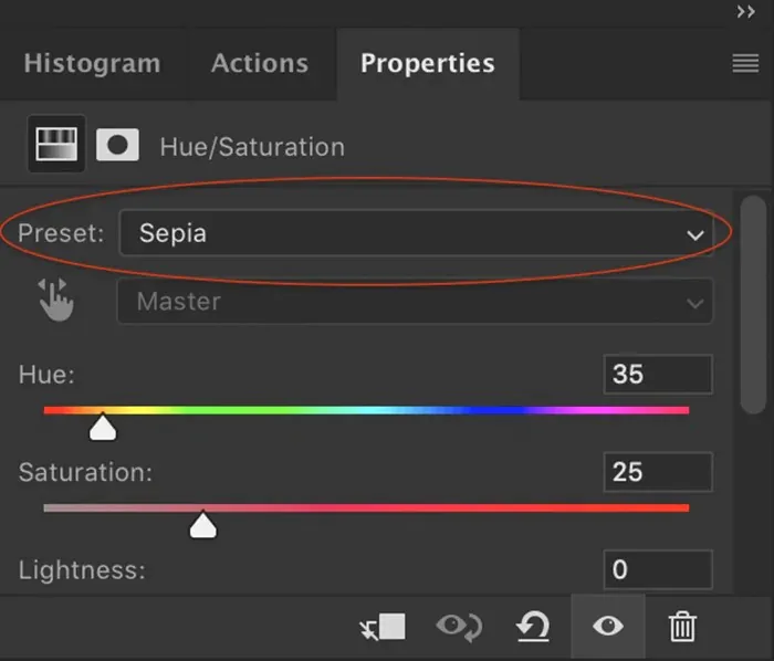
Step 1: Make sure the duplicated layer is still selected in the Layers panel.
Step 2: Locate the “Saturation” or “Vibrance” adjustment controls in your editing software. That can usually be found in the “Adjustments” panel or menu.
Step 3: Access the saturation adjustment settings on the “Saturation” or related option.
Step 4: Typically, a slider or numerical value represents the saturation level.
Step 5: Decrease the saturation slightly to achieve a more subdued, vintage look. Move the slider or adjust the value to the left (towards the negative side).
Step 6: Observe the changes in the image as you fine-tune the saturation. Be careful not to overdo it, as too much desaturation can result in a flat or muted appearance.
Step 7: Adjust the saturation level until you balance, retaining some color vibrancy while maintaining a subdued, nostalgic feel.
Step 8: Remember that the ideal saturation level may vary depending on the specific image and your artistic vision. So you can experiment and adjust accordingly.
Add vignette:
Step 1: Ensure the duplicated layer is still selected in the Layers panel.
Step 2: Look for your editing software’s “Effects” or “Filters” menu. It may also be located within the “Adjustments” panel.
Step 3: Search for the vignette effect among the available options. It is typically labeled as a “Vignette,” “Lens Vignette,” or something similar.
Step 4: Click on the vignette effect to apply it to the image.
Step 5: Adjust the settings of the vignette effect to achieve the desired look. Standard parameters include the amount, radius, and feathering of the vignette.
Step 6: Increase the amount to darken the edges of the image, creating a more pronounced vignette effect. Decrease it for a subtler effect.
Step 7: Adjust the radius to control how far the darkening extends from the edges toward the center of the image. Experiment with different values to find the right balance.
Step 8: Use the feathering parameter to determine the smoothness of the transition between the darkened edges and the rest of the image. Higher feathering values result in a softer change.
Step 9: Preview the vignette effect in real time and make further adjustments until you achieve the desired outcome.
Adjust contrast and brightness:
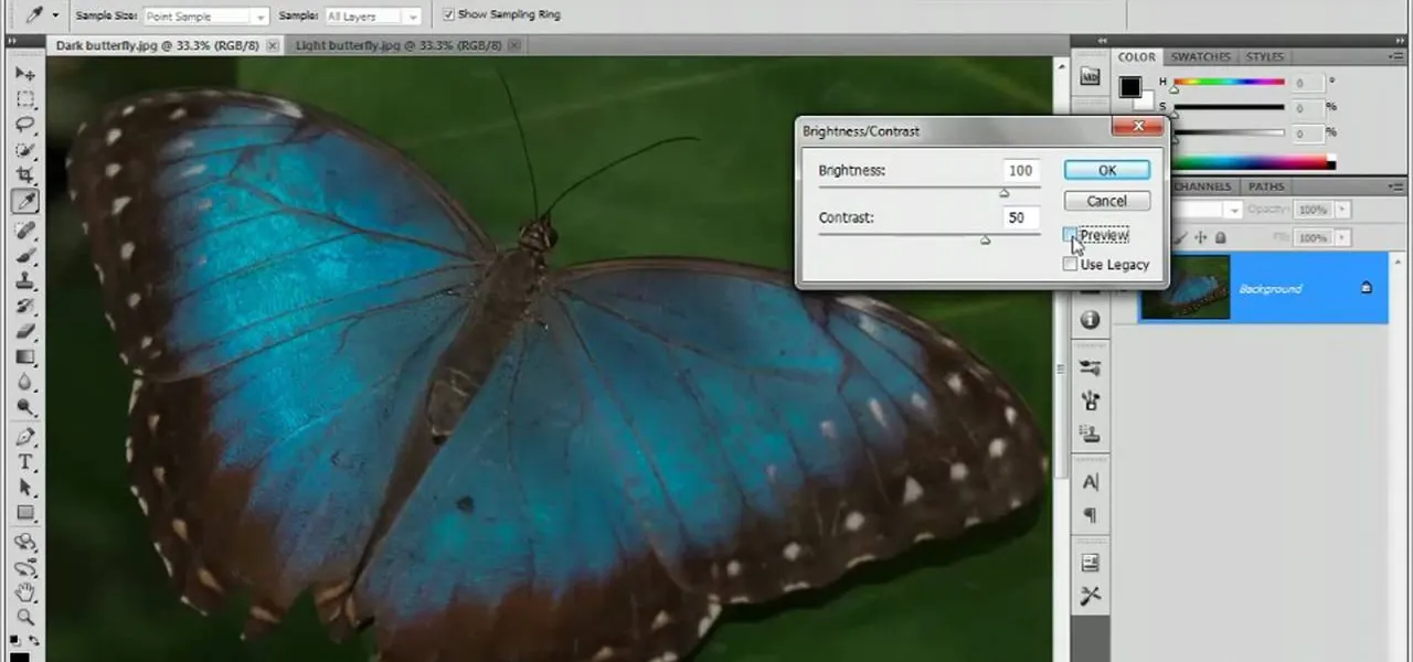
Step 1: Make sure the duplicated layer is still selected in the Layers panel.
Step 2: Look for the “Adjustments” or “Image” menu in your editing software to find options to modify contrast and brightness.
Step 3: Locate the “Contrast” adjustment control and click on it to access the settings.
Step 4: Adjust the contrast slider or numerical value to increase or decrease the overall contrast in the image. Moving the slider to the right will increase contrast while moving it to the left will reduce contrast.
Step 5: Observe the changes in the image and adjust the contrast until you achieve the desired level of differentiation between light and dark areas. Maintain details and avoid excessive contrast that may lead to loss of information.
Step 6: Find the “Brightness” adjustment control and click on it to access the settings.
Step 7: Use the brightness slider or numerical value to increase or decrease the image’s overall brightness. Moving the slider to the right (towards the positive side) will increase brightness while moving it to the left (towards the negative side) will decrease brightness.
Step 8: Evaluate the changes in the image and adjust the brightness to achieve the desired overall lightness or darkness.
Save the edited image:
Step 1: Ensure that you are satisfied with all the edits and adjustments you have made to the duplicated layer.
Step 2: Navigate to the “File” menu in your editing software, usually located at the top-left corner of the program’s interface.
Step 3: Click on the “File” menu and select the “Save” or “Save As” option. That will open a dialog box or prompt where you can specify the file name, format, and destination.
Step 4: Choose a file name that is descriptive and meaningful, making it easy to identify the edited image.
Step 5: Select the desired file format for the saved image. JPEG, PNG, or TIFF. JPEG is suitable for online sharing and general use, while PNG or TIFF is better for preserving image quality and transparency.
Step 6: Specify the destination folder where you want to save the edited image.
Step 7: Double-check all the details in the save dialog box to ensure everything is correct.
Step 8: Click the “Save” or “OK” button to save the edited image.
Depending on the file size and processing time, the software may take a moment to save the image. Be patient and avoid interrupting the process.
Conclusion:
Sepia tone goes beyond simple color adjustment. Images with sepia tones have a unique appeal reminiscent of old pictures and retro elegance. You can create unique and compelling outcomes by playing with different settings, such as changing color balance, saturation, vignette, contrast, and brightness. Sepia-toned photography is an enthralling and inventive technique that turns photographs into nostalgic works of art. This approach works incredibly well for vintage-inspired themes such as portraits, landscapes, and still-life compositions, bringing an aura of antiquity and intensity. Eventually, Sepia-toned shots can whisk viewers to another historical period by illustrating the beauty of a warm brown tone.
