How To Make Pop Art Images
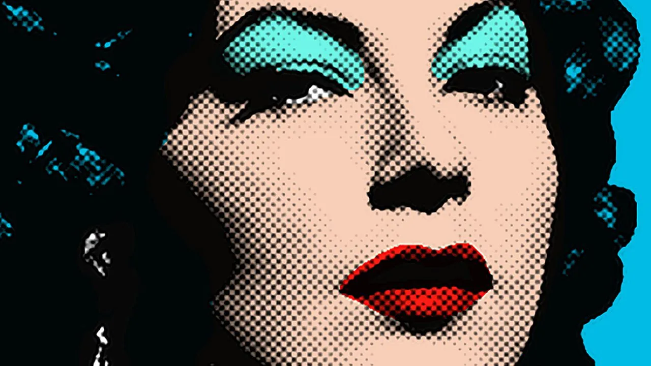
Pop art creates visuals that introduce vivid, bold colors to images with elements related to ordinary life, including comics, advertisements, and cultural symbolism. Both aspects—vibrant, bright colors and perceptible everyday imagery—are the emblem of pop art photographs. The primitivism approach to pop art emerged during the mid-20th century, directed towards taking a break from conventional color decency and subject adjustments. Even now, this approach significantly influences developing features like the high saturation and the sharp contrast in our digital compositions, simplifying them with a distinctive outline around image subjects that resembles a bold black lining. Applying pop art effects to your portraits or even mundane items in the images transforms them into dazzling rainbow collages, comic book themes or sometimes a combination. This blog article demonstrates the techniques and abilities required to produce astounding pop art images. It offers a practical guide to help you reveal your creativity and upgrade your art.
Step 1: Image Selection
The first step to creating pop art images is to select a photograph that perfectly coordinates with the pop art settings.
Select the image with subjects having substantial visual attention, like a portrait or landscape, with some protruding objects you can focus on for outlining.
You can also assay for images with a strong distinction between darker and lighter areas.
Images with well-defined contours make it easier for you to outline pop art.
You can make mental images supposing how your chosen visual looks in bold colors and graphic patterns.
Step 2: Image Duplication
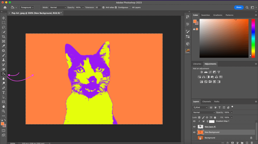
After choosing a pop art adjustable image, the next thing you have to do is duplicate the image. You can utilize any of the common editing software, like Photoshop.
Using Photoshop, you should load your image using the “open” or “import” option.
Next, click on the image layer in the layer panel to produce an identical copy of the image layer. You can also directly click on the option “duplicate layer.”
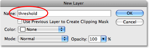
Name the duplicate layer to avoid letting it mix with the original one. Do editing, like color and pattern modifications, on your duplicate layer.
At last, save your work and proceed to the next steps.
Step 3: Creating a Bold Base
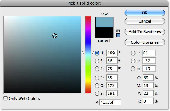
Choose a color scheme that is strong and noticeable and fits your pop art expectations. Some common shades include kinetic reds, blues, yellows, and greens. These colors will be the base for your pop art transition.
The techniques for color selection vary in different image editing software; however, the most commonly found in the majority of those applications include:
Paint Bucket Tool: This tool will fill specific regions with the color of your choice.
Brush Tool: Apply color judiciously using a gentle brush. For more precise color application, adjust the brush opacity.
Layer Blending Modes: Experiment with various layer blending modes to obtain the desired color effects.
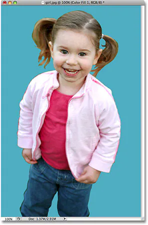
Begin by applying the signature bold pop art shades to various portions of your cloned picture. Fill the backdrop region with a bright color; you can fill a background region with a bright color or use color to highlight certain elements in the image.
Refine contrasts by using complementary colors next to each other. That maximizes the visual aura of your art.
Step 4: Adding Outlines and Patterns
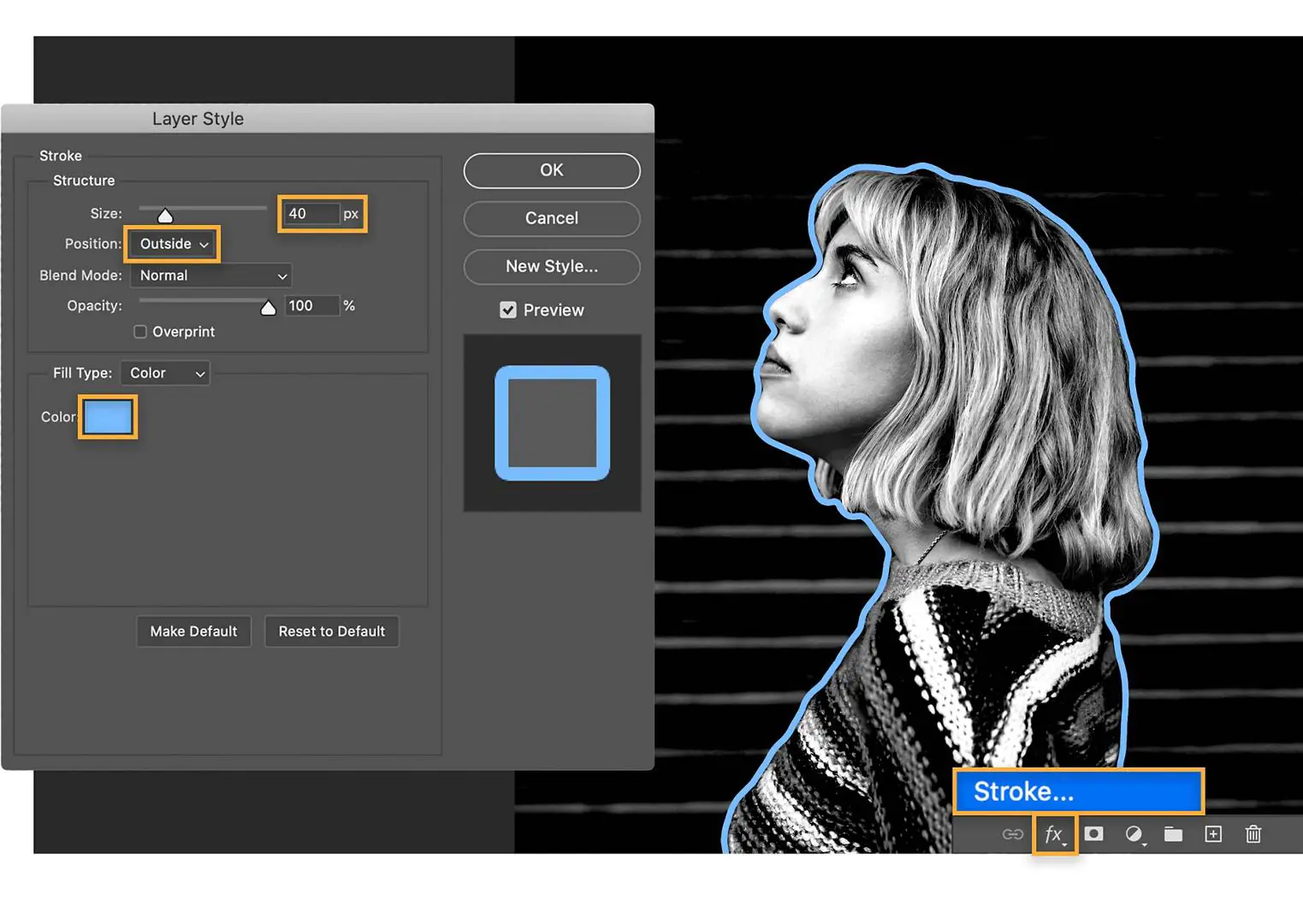
Make a mental note about the edges of objects or the main subject you want to outline.
Choose the suitable brush setting for creating outlines. You can go for a larger brush size that can create bolder outlines while adjusting opacity accordingly for a subtler or more pronounced boundary.
Other than black, you can also experiment with other dark shades for outlining edges. Next, outline the edges using tools or automatic outlining adjustments.
After outlining your pop art image, you can introduce patterns like dots, stripes, or zigzag lines in different elements like clothing or backgrounds.
Make a new layer solely for your outlines and patterns to simplify modifications.
Variate the thickness of your outlines as well for a dynamic look. Thinner lines offer subtlety, while thicker lines attract attention to crucial parts. For your outline layer, experiment with blending modes.
Modes like “Multiply”, and “Overlay” can interact with the underlying colors to produce intriguing results.
Check the general balance of your outlines and patterns to see if they complement your base colors regularly.
Step 5: Include Graphic Elements
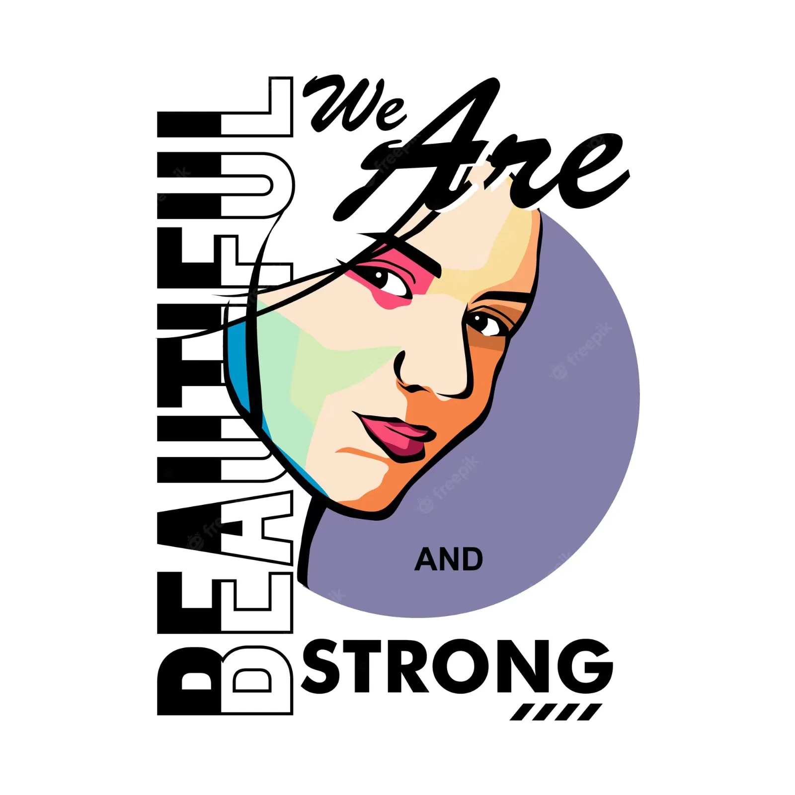
Adding graphic elements like text, symbols, and geometrics further amplifies the visual language of your image.
Choose the graphic components that correspond to your pop art concept. Demonstrate the premise of your image with words, symbols, or forms.
Text can be inserted using strong typefaces that complement the pop art aesthetic. Try using slogans and phrases that are pertinent to your notion.
Select symbols that fit inside the context of your image. Icons such as hearts, stars, and even comic book-style speech bubbles can help to boost the narrative action.
Additionally, use geometric shapes to entice interest in certain image regions. Geometrical forms can aid in directing the focus of the audience.
Create separate layers for each graphic element for flexibility and fine-tuning.
Coordinate colors with the pop art image palette for harmony.
Position elements strategically, varying size to emphasize significance.
Finally, try blending modes like “Overlay” or “Soft Light” to integrate graphic elements with the image perfectly.
Step 6: The Final Review
Take a panoramic glance at your pop art image and observe each element, such as colors, outlines, patterns, and graphic forms.
Start by checking color harmony to identify if it’s still clashy or disrupting. Adjust the shade settings if needed.
Ensure the strength of contrast among colors, patterns, and outlinings.
Determine the positioning of elements within your image, ensuring balanced placement and no overcrowding.
Be considerate of visual flow, ensuring natural progression from element to element. Strive for unity and consistency across all elements.
At last, identify the focal points of the image to draw viewers’ attention.
All these final assessments will bestow your pop art image with polished and flawless pop art effects embodied with a catchy, vibrant, and dynamic essence.
Conclusion
In essence, pop art fuses vibrant colors with ordinary elements and designs visuals that inspire recognition and innovation. This mid-20th-century approach that championed audacious color palettes and boldness still influences contemporary digital compositions, using high saturation and sharp contrast to infuse your images with antiquity. Making pop art images consists of meticulously curated steps, from selecting images to adding graphic elements to creating a tactile composition that diverges from the ordinary. The alliance of high saturation and sharp contrast elegantly inoculates contemporary pop art with an intriguing yet simple impression, giving the final work a pictorial language that speaks to the spirit of our times.
