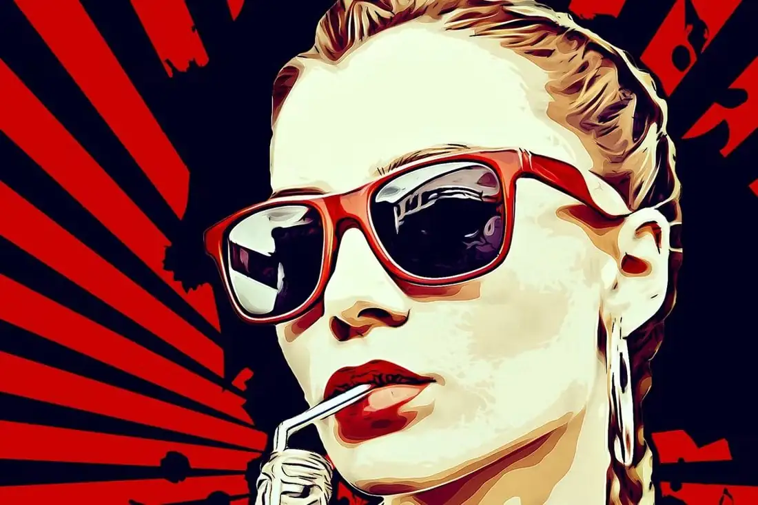
How To Create Roy Lichtenstein Pop Art In Illustrator
Roy Lichtenstein Pop Art is a visual acclaim to the works of the eminent figure of the late-19th Pop Art movement. Lichenstein’s works at that time were representative of comic imageries, vibrant colors, and dotty patterns, describing daily American life. His dramatic depiction of the subject of an image is still appreciated and frequently employed by modern comic artists, both in physical and digital paintings. The mechanical art of sharp boundaries around objects and dots with identical spaces gives the art a mechanical and modern look that is less tangled yet vivid and simple. With the rise of consumerism and mass media traditions, Lichtenstein’s art has achieved a new dimension in accuracy and innovation, giving the impression of having less historical impact and more contemporary receptivity. Modern artists often use digital software like Illustrator to create this thriving artwork, which contains all essential drawing, sketching, and shading tools with many other valuable features. This blog tutorial will present a step-by-step process for creating lively, attention-catching Roy Lichtenstein-style Pop Artwork.
Step 1: Initiate your Illustrator
Find your Adobe Illustrator on your PC desktop and click it to launch and start your artwork.
You can select between pre-created documents or a new canvas on the Illustrator interface.
Choosing a new project to start your art adventure would be best for a fresh and non-messy workflow.
To open a new canvas, click on the option “Create New,” and your fresh canvas will appear for Lichtenstein Pop Art composition.
Step 2: Adjust your canvas
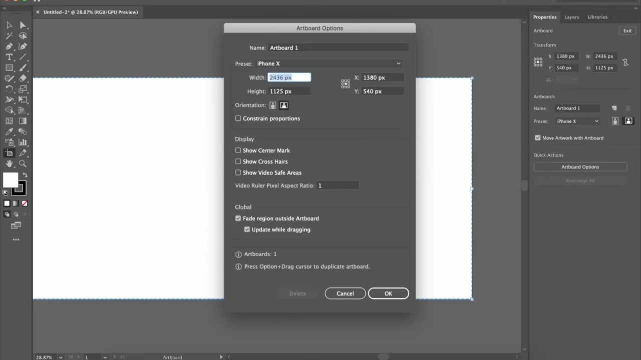
Decide on the standard size and orientation of your canvas. For Lichtenstein art, usually, a square or rectangular-shaded canvas works best.
Adjust the canvas size, like in inches or pixels, by navigating to the option “File” and then click “New.”
Finalize an appropriate resolution for canvas; usually, 300 DPI is perfect for dot printing purposes, and 72 DPI is ideal for digital composition. Resolution adjustment ensures the quality and fineness of your art.
Regulate the color setting. Lichtenstein Pop Art is all about bold and vibrant colors, so color adjustment undoubtedly matters. Here again, consider your purpose, like for a digital exhibition set in RGB color mode; on the other hand, CMYK is ideal for a physical display.
Step 3: Select an image
Choosing an image as your background to work on brings a more vivid result in sharp-lined artwork, as you don’t have to work on abstract or random sketching concepts.
Choose an image of definite lines, shapes, or bold graphic subject images to make your composition stand out.
Go for images with distinguishing differences in contrast and colors between the subject and its backdrop. Outlining the subject will enhance bold effects more than an even-handed image.
With all other requirements, do not ignore the resolution aspect, as higher-resolution photographs provide a striking base for your creative art.
Lastly, consider your sentimental attachment and creativity resonance with whatever photograph you select, and be considerate of copyrights and other legalities when using other images you find online.
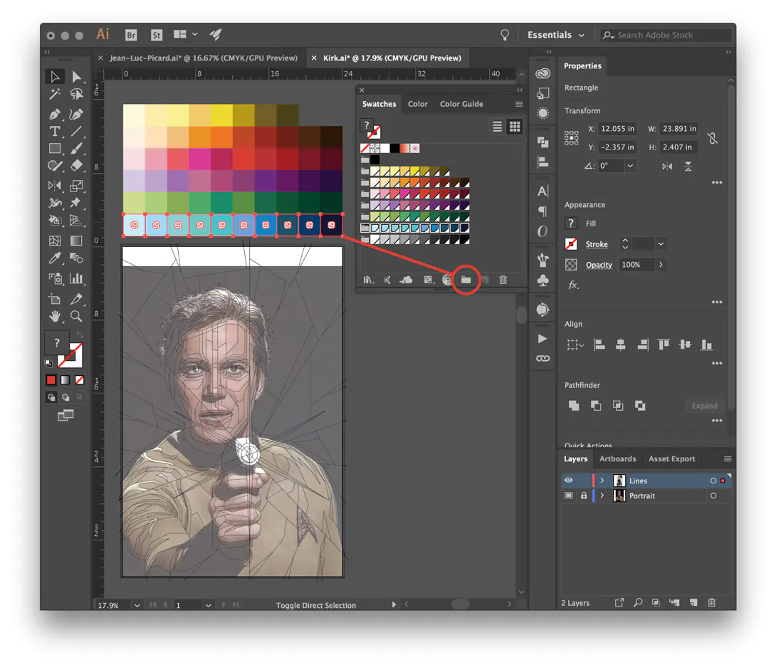
Step 4: Outline your image specifics
After image selection, before moving on to the actual creativity step, you should import your image to let it appear on the canvas. Do it by clicking “File” and then “Place” to select and drag your image into the canvas.
Preserve your original image integrity by creating a new layer of it. Your later modifications are to be targeted at the new layer. After creating, click on that new layer to open it and start outlining the subject.
Select the Pen Tool from Illustrator’s tool menu to outline the essential shapes or objects within your chosen image.
After completing the outlining phase, you can reset the outlining stroke colors and breadth of the boundary line. Black is preferred in Lichtenstein Pop Art; however, red, orange, and yellow also look compelling.
Maintain your layer sequence and create separate layers for significant modifications.
Tune your composition, check over shading, and consider adding dots and tiny patterns using the Pen Tool.
Keep saving your additions regularly to avoid wasting any of your creative effort.
Step 5: Illustrate the image with Lichtenstein’s art colors
Create a color palette including essential colors like yellow, red, blue, etc. Adobe Illustrator allows you to pick a pre-existing default color palette or create your own.
Next, select the Selection Tool to surround the region where you want to put specific colors. You can select a single area at a time or pick up multiple regions if you have chosen the same color to fill all those areas.
After area selections, pick the color from your palette and click the ‘Fill’ button to paint those regions.
Maintain color coherence. Don’t overuse bold colors randomly. Pop Art is not only about filling in sharp colors; you must also maintain their consistency.
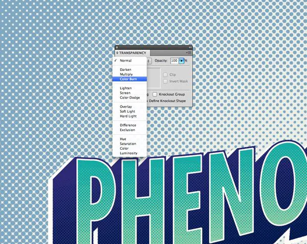
Consider playing with a halftone pattern using the Halftone Pattern Tool to evoke shading and texture variations. It will enhance your artwork’s comic feature.
Create a separate layer to add a halftone pattern or remove or alter it later from your original work.
Tune your overall color adjustments. Look for areas where color touch-ups are necessary. Once satisfied with color manipulations, move on to the next stage.
Step 6: Use the Ben-Day Dot technique
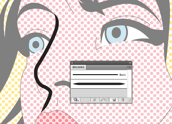
Specify the image area using selection tools, wherever you want to add Ben-Day dots for increasing depth and shading effects.
To create Ben-Day, you must use a separate layer so that no mishap happens to the already finely-tuned composition.
Select the Ellipse Tool from the tool menu, mainly responsible for creating Ben-Day dots.
Before creating dots on the layer, adjust the dot color and size as you like. Typically, black is preferred for this art.
Use the ellipse tool to create tiny circles that will be filled as dots later. Adjust the size of the dots and place them evenly.
After creating a few dots, you can copy and paste them wherever you want for a rapid process.
Consider different sizes of dots for creating natural-looking flaws that have comic appeal.
Set the opacity and transparency of the blend or superimpose the dot on the composition.
After finalizing your Ben-Day dots, check your overall composition. Make any necessary adjustments. Check every corner by using zoom-in tools.
Step 7: Add comic texts
Use the text tool from the toolbar to give a more pop cultural appearance to your Roy Lichtenstein Pop Art illustration. First, create a new layer to integrate text or captions without effect already finetuned effects.
Adjust the font design, like the bold font style of comic books, and reconsider the message you want to convey in your comic art.
Select the text box option and drag that box onto the area you want to caption. You can create unique designs of chatboxes for captions, like circles, balloons, or clouds.
Select any of Lichtenstein’s signature colors in your text that coordinate with the general color pattern of your composition.
Set text placement, opacity, and transparency, but don’t let it hide your image’s prominent features or outlines.
After adjusting all text parameters, you can re-edit the text, including size, color, and placement.
Evaluate your overall composition for further tweaks and save your textural manipulation.
Step 8: Polish your Roy Lichtenstein Pop Art
Recheck your artwork, considering each aspect, including outlines, color effects, and text additions.
Use the zoom-in and zoom-out options for a minute and thorough review of your image.
Review colors and their use in different shapes to make your image recognized as an identical copy of Roy Lichtenstein’s works. Primary colors should be highlighted in it.
Check the Ben-Day dot spacing, shade, and shape. They should be in harmony with the overall effectiveness.
Reassess your text style, shape, size, color, and all other factors, and remodify your fonts if needed.
Compare your images with the personal artworks of Lichtenstein to create more similarities in your compositions.
After the necessary final touches, save your final creation in good-quality settings, using SVG or AI for printing purposes and JPEG or PNG for digital platforms.
Conclusion:
In conclusion, creating Roy Lichtenstein Pop Art is a significant contribution to the art world. It induces an extreme appreciation and recognition of colors—vibrancy and boldness. Despite the contemporary art preference for muted shades associated with advanced aesthetics, bright and bold colors are still welcomed by various viewers. The revival of Lichtenstein Pop Art compositions affirms human inclination towards vigor and liveliness, even for palette colour choice. Moreover, the comic text feature also refers to the communal art culture that emerged in the late 19th century, thus engaging viewers with technological aspects of the past.
