
How To Create A Heatmap Effect
The traditional heatmap is a data visualization that uses a colour-coding scheme to indicate various values. Heatmaps are used in a variety of data analytics, yet they are most typically used to demonstrate user behaviour on specific web pages or webpage layouts. Also in the field of image processing, heatmaps have an ample role in enhancing images, especially for frequency, intensity, and pixel-level data visualization. It highlights critical image areas by applying colour gradients, aiding in enhancing the visual appeal of the photographs. Moreover, when a heatmap is applied to a photograph, it presents an interesting view in which the composition appears to be unusual yet interesting for viewers by crossing the norms of common visual art aesthetics. This blog will go on in a step-by-step process to creating a heatmap effect turning an ordinary image into an outstanding one. We will address the necessary tools and techniques, like the gradient tool, histogram, hue and saturation sliders, brightness and contrast settings, layers panel, blending modes, colour balance settings, and some others, required to create this effect.
Step 1: Open The Image In Your Software
To start the editing process initiate your preferred image editing program considering alternatives like Adobe Photoshop, GIMP, or any other tool that features advanced layer control and intricate effects.
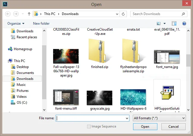
After initiating the software, reach to File > Open options to load the photo you want to edit. Choose the photograph from your image collection, and be sure that it is in high resolution. Choosing a high-resolution photo is critical to applying effects without pixelation.
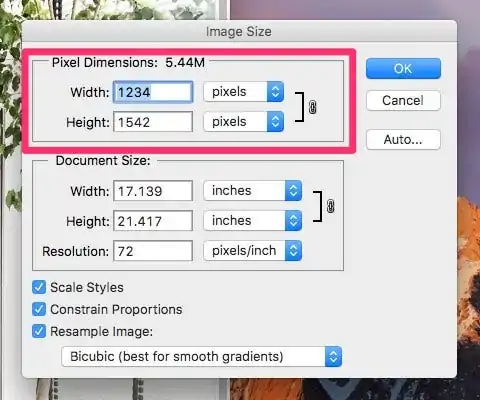
It is critical to confirm that your image resolution is suitable for editing, especially if you intend to modify the photograph with a heatmap effect. Low-resolution pictures may blur once you apply hefty manipulation. Opt for at least 300 DPI for print images or 72 DPI for digital usage.
Before driving any modifications, duplicate the base photograph into a new layer. That backup will ensure that if you make a mistake or wish to get back to the initial version of the photo, you can do so effectively without losing any data.
Before you move on to step 2, be sure that the essential tools including Layers, Gradient Tool, Brush Tool and Color Palette are easily obtainable.
Step 2: Analyze The Regions Of Your Image That Require Enhancement
The second step involves examining the regions of your image that require enhancement. You may need to highlight portions of the photo considering brightness, contrast, or particular focal points. For instance, in a landscape photo, you may want to highlight certain regions of the scene that have more increased exposure or any other point of interest.
To confirm that your image holds particular bright and dark zones, change the brightness and contrast of the photo before applying the heatmap. In most editing apps, you will see sliders for these alterations within the Image or Adjustments button.
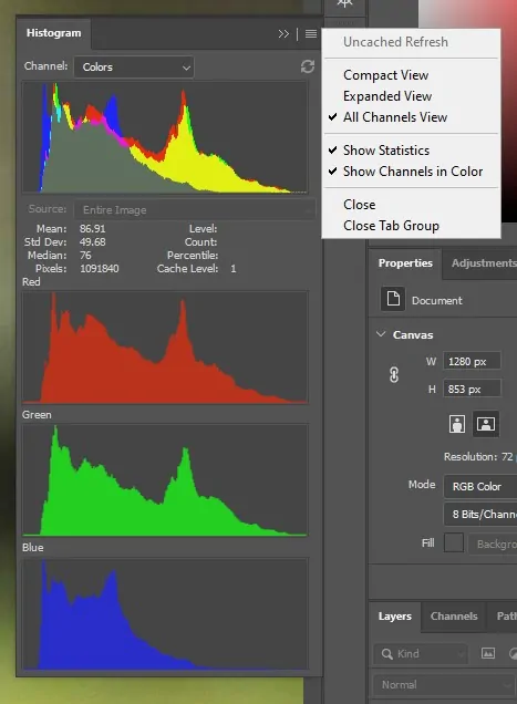
You can utilize histograms or data panels that provide you with a more precise view of how light or dark certain details of the photo are. If using Photoshop you’ll get to this from Window > Histogram. Study the photograph’s distribution of pixels for way better agreement with heatmap colours.
After the contrast and brightness are properly balanced, concentrate on the ranges of the image that require the most improvement. That may incorporate the brightest spots, ranges where the shadows are profound, or particular areas like the focal point of a portrait. Appropriately recognizing these zones will guarantee that the heatmap brings attention to what counts most in your photograph.
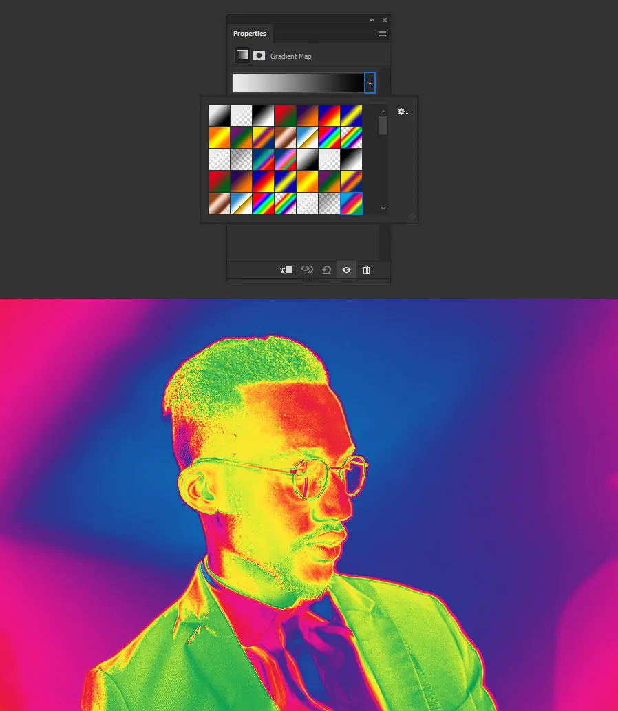
Step 3: Create Heatmap Overlay Using Gradient Tool
Within the Layers zone, include a new clear layer over the picture. That will be the layer where you will create and put the heatmap overlay, so ensure it is situated accurately to function appropriately.
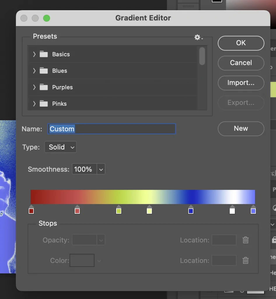
To create the heatmap, you can utilize a gradient tool which permits you to apply a colour gradient that easily transitions across diverse parts of the picture, emphasising ranges with higher or lower intensity. You will usually set a range from warm colours like reds or yellows to cooler shades including blues or greens.
The colours on the gradient define the intensity or concentration levels of the data in your image. High-value or highlighted ranges, like regions with intense focus, may accommodate red or yellow, while less intense regions, such as shadows or blurred areas, could be assigned blue or green.
You can alter how the gradient spreads over the photograph by adjusting gradient stops. These points within the gradient map depict the transition between various colours per pixel intensity or focus ranges.
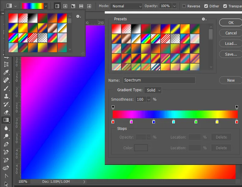
After creating the gradient, ensure that the colour scheme adapts to the data you need to convey. Some heatmaps function best with high-contrast colours that actually pop, whereas others might need more quiet tones that don’t divert too much from the base photograph.
Step 4: Apply The Heatmap Overlay Onto The Image
Your heatmap layer should be situated above your initial photo layer. That setup will permit the heatmap effect to sit as an overlay and visually direct you to critical image regions without changing the underlying image’s properties.
In case your picture is more convoluted like a landscape or metropolitan photo with shifting brightness, be sure that the heatmap conforms well with the zones you like to highlight. You may need to alter the arrangement of the heatmap overlay so it echoes the areas you have examined.
After the heatmap is appropriately aligned, modify the opacity of the heatmap layer. Begin with a 50% opacity to allow some visibility of the fundamental photo while confirming that the heatmap is discernible.
Utilize a soft brush or the eraser tool to dispose of unnecessary regions of the heatmap. If there are particular regions of your picture that do not require the heatmap you can make those regions of the photograph visible without the overlay.
Repeatedly toggle the heatmap layer on and off to confirm that the heatmap goes with the photograph’s composition.
Step 5: Add A Suitable Blending Mode
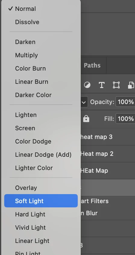
To modify the heatmap’s interaction with the photo, choose the heatmap layer from your software’s layers panel.
Play with different blending modes accessible in your program, including Overlay, Soft Light, or Multiply. These modes impact the emergence of the heatmap layer with the photo.
For instance, Overlay upgrades the photo’s contrast, Soft Light nuancedly blends the heatmap with the picture, and the Multiply mode darkens the complete picture, which can be useful in the event that you need to focus on more profound regions or darker portions of the photo.
Altering the layer opacity of the heatmap will help you handle its visibility without losing the fundamental photo’s vital details. Such adjustments make sure the heatmap does not take over the photo, instead adding guidance for certain regions.
Proceed with modifying the blending mode and opacity while previewing the changes to guarantee that the heatmap effect goes smoothly with the initial picture. The objective is to preserve visual appeal without messing up the photo.
Step 6: Refine Opacity And Color Settings
After finding a suitable blending mode, you’ll make final alterations to the opacity. In some cases, a modest heatmap is all that’s required, so decreasing the opacity can provide you with fair enough contrast.
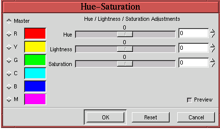
With opacity, you may need to tune the colours by utilizing sliders related to hue and saturation. You can change the colour spectrum to guarantee it blends with the photo’s tone and does not conflict with key zones.
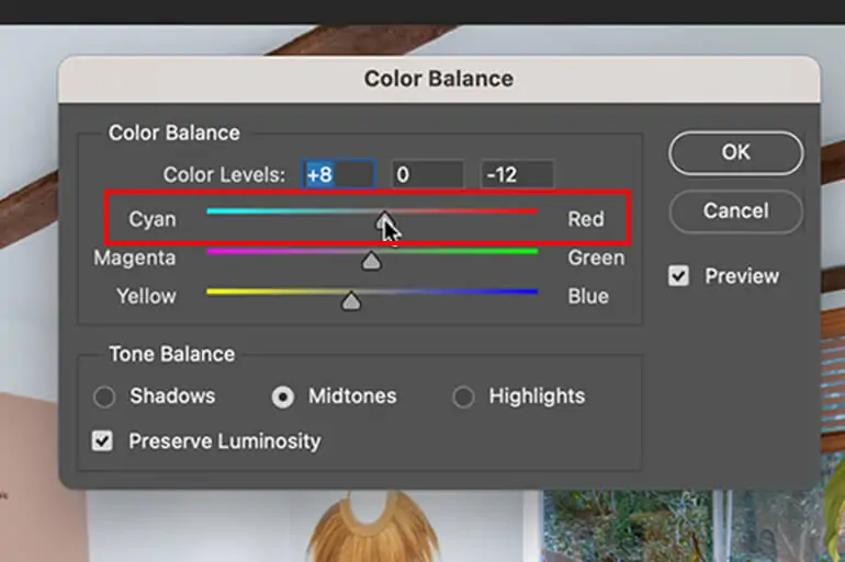
If you are dealing with more specific zones, the Color Balance feature can help you shift colour tones like expanding the warmth or including more cool tones in your heatmap. It is especially beneficial for photographs with prevailing colour themes such as blue skies or orange tones.
Always audit your work to make sure that you are making essential changes to upgrade, not overwhelm, your photograph. Continue toggling the heatmap layer to survey your changes before concluding.
Attend to any discernible, sharp transitions within the heatmap’s colouring. The final effect ought to be smooth and realistic-looking, helping the photo dazzle rather than detract from it.
Step 7: Analyze And Export The Final Image
Once done with refining your heatmap, survey the photograph for the last time to guarantee it enhances particular regions without distracting from the general composition. Seek for ranges that require slight alterations or adjustments.
In case the heatmap seems immaculate and you do not need extra layers, you can flatten the picture. That will blend the heatmap layer with the initial photo, making it a single, unified image file.
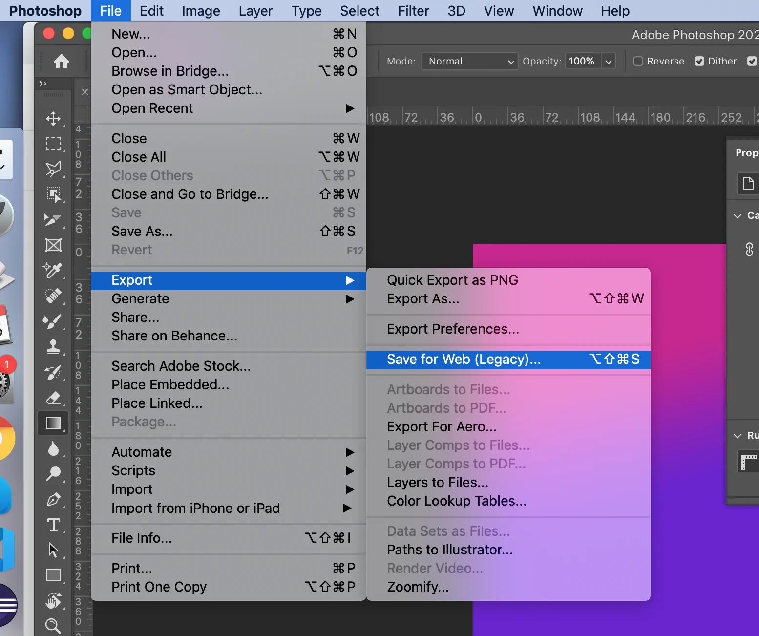
After that, move to File > Save As and select a suitable format like JPEG for web use, or PNG to protect transparency.
As you export, you can alter picture resolution or compression based on your necessities.
At last, title your photo file and keep it in a location on your PC for further utilization or sharing.
Conclusion
In summary, applying a heatmap effect to your images highlights the critical areas, objects, or patterns, making the visual data more engaging and compelling. This editing technique adds exciting drama and emotion to the photos. It elicits a wide range of feelings by emphasizing some areas with vibrant colours while neutralizing others. The heatmap inclusion is an excellent way to draw in viewers or elevate the impact of your images as well as graphic content. In brief, the unusual appearance of the heatmap effect fascinates anyone trying to add something incredible and unusual to their compositions.
