How To Choose the Right Colour Gamut For Your Image
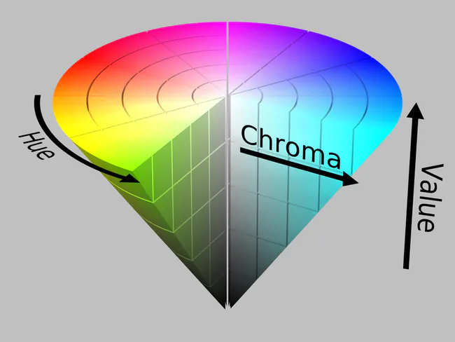
Color gamuts are fundamental in tailoring the visual influence of images across diverse mediums, encompassing the entire spectrum of colors that a specific device or medium can display or reproduce. The requisiteness of color gamut lies in defining an image’s range and accuracy of colors, ensuring fidelity to the original scene, and enhancing visual appeal. It directly influences image quality, enabling realistic color representation, vibrant visuals, and consistency across devices. Wider gamuts empower precise color manipulation, elevate print accuracy, and facilitate artistic expression. As the groundwork for photographers, designers, and artists, color gamut significantly influences accuracy and visual allure, while its understanding and management remain essential for maintaining consistent and faithful color reproduction. In the contemporary digital age, selecting the right color gamut is crucial for effective image creation and manipulation. It impacts the outcome by accurately translating intended colors across devices and mediums. Choosing the right color gamut for your images takes a mix of technical knowledge and creative sensibility, allowing images to animate passions and nab audiences’ obsession in ways only the language of color can achieve. This blog provides a comprehensive approach to selecting the right color gamut using the easily accessible tool, Photoshop.
Step 1: Open Your Image
Initiate your Adobe Photoshop application and open the image you intend to work on. To achieve this, navigate to the “File” menu at the interface’s top left corner and select the “Open” option. Locate your image file within the file explorer window, choose it, and click the “Open” button. Alternatively, expedite the process using keyboard shortcuts: “Ctrl + O” for Windows or “Command + O” for Mac. This foundational step is integral as it grants you access to your chosen image within the Photoshop environment, setting the stage for the subsequent stages of refining its color gamut. Your image is now ready for intricate adjustments to ensure accurate and impactful color representation in line with your creative objectives.
Step 2: Go to Edit
With your image open, direct your attention to the top menu bar. Locate and click on the “Edit” option. A dropdown menu will unfold as you do so, revealing various editing-related functions and tools. By choosing “Edit,” you are gaining entry to a realm of possibilities within Photoshop, where you can wield a variety of techniques to enhance and transform your image. This pivotal step serves as a gateway to an array of creative opportunities, positioning you to delve into the intricate process of adjusting the color gamut of your image. With “Edit” selected, you are poised to harness the capabilities of Photoshop’s versatile editing toolkit, enabling you to finesse the visual elements of your image and achieve your desired color representation.
Step 3: Choose Color Settings
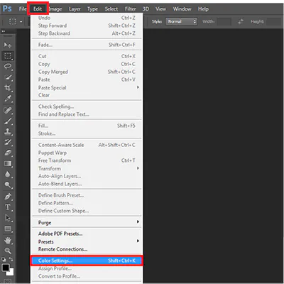
Within the “Edit” dropdown menu, locate and click on the “Color Settings” option. This action will open the Color Settings dialog box, a central hub for configuring various color-related preferences in Photoshop. In this dialog box, you’ll find options to fine-tune the color management settings, including selecting the appropriate color gamut for your image. The Color Settings dialog box is a critical juncture where you can make informed decisions about how colors are displayed and interpreted within your editing environment. Choosing the right color gamut in this step lays the foundation for accurate and consistent color representation throughout your editing process, ensuring that your image looks its best across different devices and output mediums.
Step 4: Set Color Space
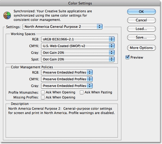
You will see a “Settings” drop-down menu within the Color Settings dialog box. Click on this menu to see a list of predefined color profiles or color spaces. Choose the color gamut that aligns with your intended output and creative goals. Common options include “sRGB” for web and screen display, “Adobe RGB (1998)” for a broader range of colors suitable for printing, and “ProPhoto RGB” for maximum color flexibility. The selected color space defines the range of colors available for your image and ensures consistent color translation across different devices. Carefully consider your target audience and the medium through which your image will be viewed or printed when making this selection. Setting the appropriate color space establishes a foundation to influence how colors are interpreted and reproduced.
Step 5: Customize Gamut (Optional)
If you require specific adjustments beyond the predefined color spaces, click the “More Options” button within the Color Settings dialog box. That opens a secondary window where you can fine-tune advanced color management settings. Here, you can define custom gamut boundaries by adjusting parameters like white point, black point, and gamma. These settings impact how colors are mapped and interpreted within the chosen color space. Customizing the gamut can be useful when working with specialized output devices or aiming for precise color accuracy. However, it’s essential to possess a solid understanding of color management principles before delving into these advanced options. Making informed adjustments at this stage ensures that your color representation remains accurate and consistent throughout your editing process. After adjusting any custom settings, proceed to the next step to preview how your selected color gamut affects your image.
Step 6: Preview Gamut
Activate Preview: Within the Color Settings dialog box, locate and activate the “Preview” option. This feature provides a real-time snapshot of how your selected color gamut affects the appearance of your image.
Visual Assessment: Take a moment to carefully observe and assess any changes in color, saturation, and overall visual impact. Compare the preview to your original image to gauge the extent of the gamut’s influence.
Evaluate Color Shifts: Attention colors that fall outside the chosen gamut. Note any shifts in hue or saturation, as these areas may undergo the most noticeable changes in appearance.
Assess Overall Appearance: Consider the overall aesthetic and mood of the image as influenced by the gamut. Evaluate whether the preview aligns with your creative vision and intended outcome.
Fine-Tune if Necessary: If the preview reveals any unexpected or undesirable color shifts, you may need to revisit your color gamut and settings to ensure they align with your artistic goals.
Confirm Alignment: Ensure that the previewed gamut resonates with your creative intentions and enhances the visual impact of your image.
Once you’re satisfied with the preview and its implications for your image, move forward to the next stages of your image editing process.
Step 7: Adjust Rendering Intent
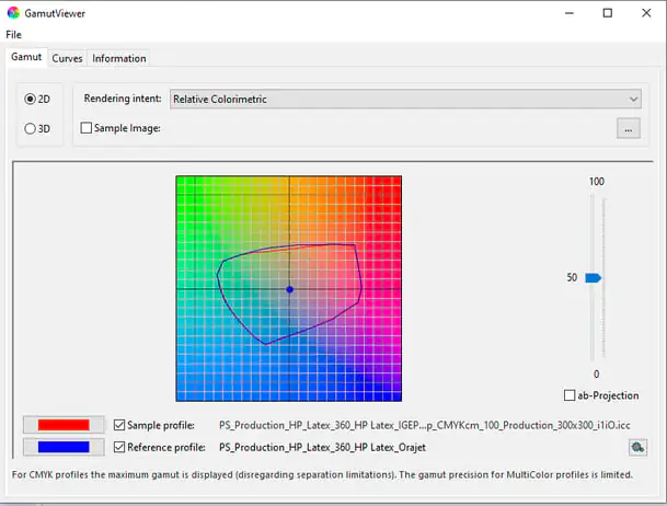
The “Rendering Intent” drop-down menu is in the Color Settings dialog box. This setting determines how colors that fall outside the chosen color gamut are handled during conversion. There are several rendering intent options, each with a specific approach to preserving color relationships and visual appearance. The available rendering intents typically include:
Perceptual: Prioritizes overall color appearance, often resulting in smoother transitions but potentially altering the relationships between colors.
Saturation: Focuses on maintaining color saturation, which can lead to more vibrant but possibly less accurate colors.
Relative Colorimetric: Aims to preserve color relationships, mapping in-gamut colors accurately but potentially clipping out-of-gamut colors.
Absolute Colorimetric: Maintains color accuracy at the expense of preserving relationships, which can result in a less visually pleasing output. Choose the rendering intent that aligns best with your image and intended output.
Step 8: Save the Preset
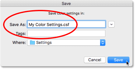
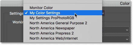
For future convenience, you can save your color settings as a preset. Within the Color Settings dialog box, click the “Save” button to access the “Save Color Settings” window. Give your preset a descriptive name that reflects the specific color gamut and settings you’ve chosen. This way, you can easily access and apply these settings to future images without manually adjusting the color gamut each time. Presets are especially useful when you frequently work with specific output mediums or have consistent color management requirements. Once you’ve named and saved your preset, click “OK” to exit the Save Color Settings window. Your custom preset will now be available for selection in future editing sessions, streamlining your workflow and ensuring consistent color management across your projects.
Step 9: Apply and Save
After finalizing your color gamut settings, rendering intent, and any custom adjustments, click the “OK” button within the Color Settings dialog box. This action applies the selected color gamut and settings to your current image. Any adjustments you’ve made will now affect how colors are displayed and interpreted during your editing process. It’s important to note that while the color gamut settings are now applied, you can continue to make other edits and adjustments to your image as needed.
Before proceeding further with your image editing, ensure you regularly save your work to avoid losing any changes. Use the “File” menu and choose “Save” or “Save As” to save your edited image under a new file name or overwrite the existing file, depending on your preferences. By applying and saving your color gamut adjustments, you’ve successfully tailored your image’s color representation to your chosen output medium and creative vision, setting the stage for a visually impactful and consistent final result.
Conclusion
Finally, the importance of color gamuts in image generation and modifications cannot be underscored. As a basic element, color gamuts can shape and heighten the visual impact of pictures across a wide range of mediums and platforms. Color gamuts’ importance is demonstrated by their ability to establish the authenticity and depth of colors inside a picture. Their rigorous calibration guarantees visuals engage viscerally with viewers, generating emotions and forging connections beyond digital media’s limitations. By enabling precise color manipulation and vibrant visuals, color gamuts empower creators to assemble images that call forth awe and admiration.
