How To Apply Color Blocking To Images
Color blocking refers to the use of SOLID colors with minimal or no textures, gradients, or patterns. In order to produce incredibly powerful and spectacular imagery, the colors are usually kept quite bright, often combined with other colors that have a striking contrast. The technique can be regarded as experimentation in creating complementary schemes by combining opposite colors on the color wheel. Finding a particular balance between the hues is crucial for effective color blocking. That entails selecting striking yet rhythmic color schemes that contrast with one another. The adaptability of color blocking is one of the primary factors contributing to its growing popularity. This approach can be used for anything from graphic design and art to branding and home interiors. While there aren’t any rigid rules when it comes to color blocking, there are certain specific considerations that might help you get the most out of this procedure. This blog can also help you in the effective utilization of color blocking techniques to enhance the colors of your photographs.
Step 1: Selecting The Image Zones
Start by loading the photo you need to edit in your chosen photo editing software such as Photoshop.
Considering the complexity of the range you need to color, select a selection tool. Standard choices comprise of:
Lasso Tool, which is incredible for freehand selections of inconsistent shapes.
Pen Tool, which serves in creating exact, straight-line selections.
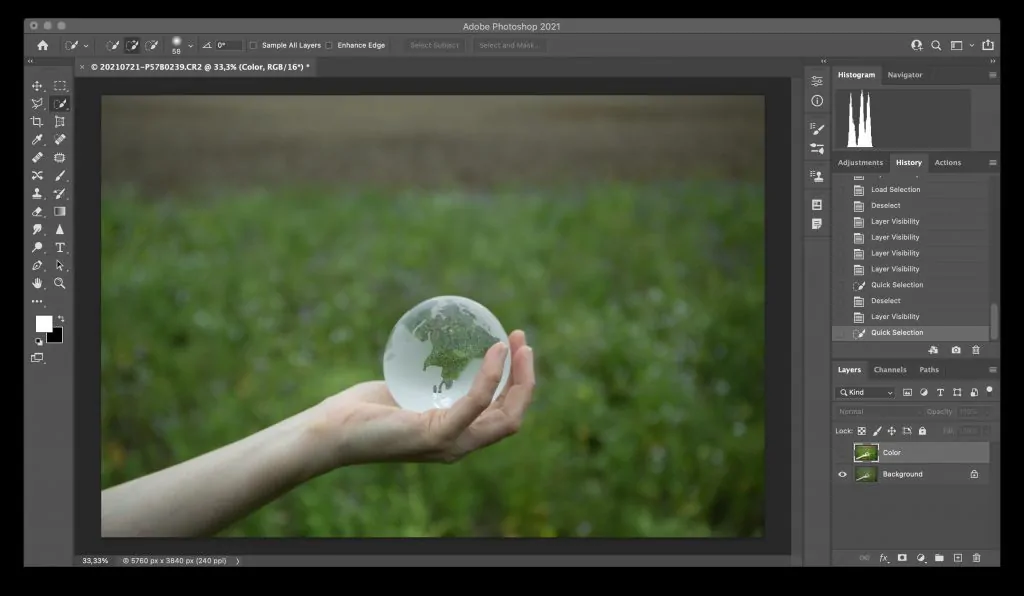
Quick Selection Tool, which is awesome for consequently selecting ranges according to color and surface.
Utilize your chosen device to outline the zones of the image where you need to apply color. Be as thorough as possible to form sharp, defined segments.
In case required, tune the selection by adjusting the edges utilizing the Refine Edge or Select and Mask features. It will confirm that the selection is smooth and precise.
In case you are working with multiple color blocks, repeat the method for each segment. Each block needs to be chosen separately to permit color application on isolated layers.
Once done with the selections, zoom in and check that the outlines are neat and well-defined to guarantee color won’t spill over undesirable ranges.
Step 2: Adding New Layers
For each color block, make an isolated new layer. That permits for autonomous editing of each color block, making it simpler to modify or alter them afterward without influencing other ranges of the image.
In Photoshop, move to the Layers panel. You can make a new layer by clicking on the New Layer symbol at the bottom of the Layers panel or by getting to the menu bar and selecting Layer > New > Layer.
It is helpful to title each layer based on the zone it coordinates to for sounder organization, particularly if you keep numerous color blocks.
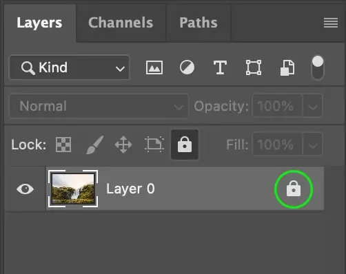
To avoid inadvertent changes to the original picture, lock the foundation layer within the Layers panel by tapping on the lock icon. It confirms that only the new layers are edited.
Put the new layers over the background layer, and make sure that they are visible by reviewing the eye symbol next to each layer. It helps you focus on one section at a time without distracting from the photograph’s original design.
Step 3: Selecting The Colors
Before choosing colors, think about the general tone or disposition you need to communicate. Striking, dynamic colors create vibrancy and contrast, while milder pastels bring out tranquility. Look into the existing colors within the image to harmonize or contrast with them.
Involve essential color theory to direct your selections, which includes:
Complementary Colors that are inverse to each other on the color wheel, including blue and orange, make high contrast and visual appeal.
Analogous Colors that are subsequent to each other on the color wheel, such as blue, green, and teal, make a unified and cohesive look.
Monochromatic Colors that are varieties of a single color create a harmonious, minimalist look.
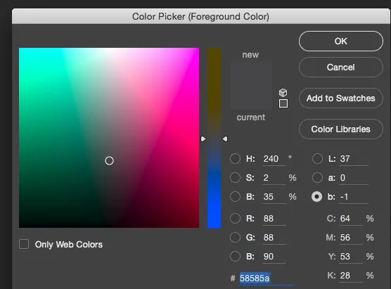
Utilize the color picker tool in your app to select the precise shades you need. Alter the hue, saturation, and brightness to tune the colors to your fancy.
If you are uncertain about the precise shades, make swatches of potential colors before laying them on the image. That will allow you to instantly try different combinations and choose which functions best.
Apply colors in small areas first to catch how they communicate with one another within the composition. If vital, change the shades for an adapted and visually engaging result.
Step 4: Filing The Chosen Region
Confirm the range you need to color is still chosen. You would see the marching ants or a dotted outline around the chosen area.
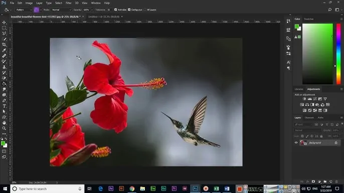
Choose the Paint Bucket Tool within the toolbar, or utilize the Fill option, with Shift + F5, from the Edit menu. This device permits you to fill a chosen region with the color you have selected.
Press inside the chosen region, and the color will fill the whole selection. If utilizing the Fill option, a dialog box will show up where you’ll be able to select the color and apply it.
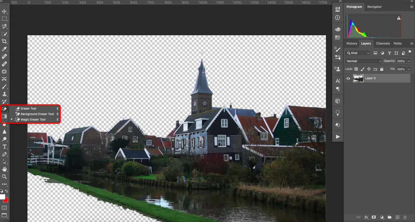
Once done filling the selection, use the zoom in and deliberately scan the edges. In some cases, the color might slop over the selection region if the selection is not excellent. In that case, employ the Eraser Tool or modify the selection by utilizing the Lasso Tool to clean up the edges.
If the color seems too light or too dark, you can alter its power using the Hue/Saturation or Brightness/Contrast tools. It offers you more control over the ultimate appearance of each block.
Once the primary section is filled, move on to the next chosen zone and repeat the method until all the required color blocks are applied.
Step 5: Adjusting The Layers
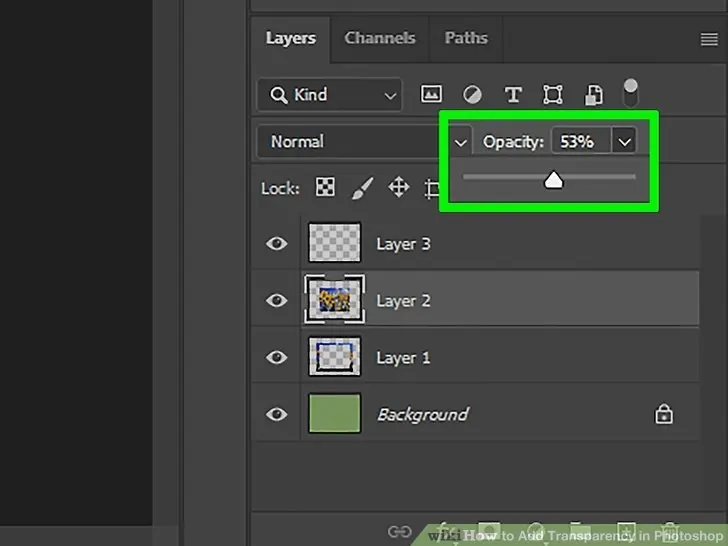
Once done with the color application, alter the layer’s opacity if the color block shows up too intense or overwhelming. Bringing down the opacity can help integrate the color with the initial picture, creating a more modest impact. That can be especially valuable for accomplishing a translucent or washed-out appearance.
Play with different blending modes such as Overlay, Multiply and Screen within the Layers zone to adjust how the interaction of color block with the layers beneath it.
If the colors seem disconnected from the image, alter the layer order within the Layers area. You can reposition the color layers over or beneath other layers to attain a proportional visual impact.
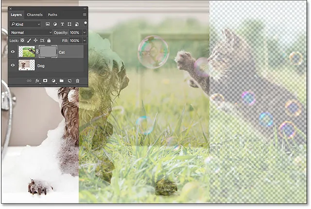
Utilize layer masks to integrate the color blocks more naturally into the picture. As paint with black on the mask, you’ll eradicate parts of the color block, making smoother shifts and cleaner edges.
In case the color requires further alterations, utilize Hue/Saturation or Color Balance to regulate the shades and tones, confirming that they conform with the overall plan.
In case you are working with numerous color blocks, group the color layers together for simpler oversight. It will assist you in keeping everything systematized as you make further alterations.
Step 6: Tuning Edges And Finalizing
Use Zoom into the ranges where the color blocks meet the initial photograph to examine the edges closely. It helps you catch any flaws or color spillovers that happen amid the selection or filling phase.
To groom up any unpleasant or overfilled edges, utilize the Eraser Tool with a soft brush.
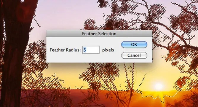
In case the edges of your color blocks are excessively harsh or uneven, head back to the Selection Tool and set the selection. You can alter the feathering or utilize the Refine Edge alternative to soften or sharpen the edges.
For smoother moves between color blocks and the foundation, apply a feather impact using the options Select > Modify > Feather option.
In case you have utilized a layer mask, utilize a soft brush of low opacity to delicately paint on the mask. It will help blend the color block more naturally into the photograph, making a consistent transition.
Give a last glance at the composition to ensure that all color blocks are visually adjusted and accommodated with your creative vision.
If any colors require tweaking or if there are petty details left to clean, alter them as required and preserve your edited photograph in a high-resolution format like PNG or TIFF to protect quality.
Conclusion
To sum up, using the color-blocking technique to enhance images is an amusing form to play with colors and create dynamic visual narratives. Color blocking is unquestionably a strategy worth trying, as it can be used for more than just photo editing. It is additionally useful in design projects to try out new concepts. Likewise, color blocking provides a means of displaying your individuality and creative expression. You can produce original and remarkable compositions and designs that intrigue people on a more in-depth level by selecting striking color combinations and arranging them in startling ways.


