How To Visualize Data With Tableau
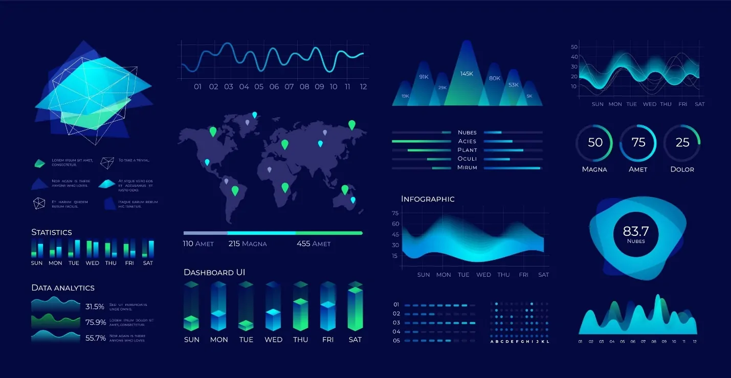
Raw data can be transformed into engaging visual narratives through data visualization. The process embodies relationships and patterns in data using maps, graphs, charts, and other visual aids. In this way, complex data can be made easier to comprehend and more accessible with the usefulness of this useful process. Many tools are available for visualization. Yet, to get productive outcomes, you must choose a proper data visualization tool. Tableau is one such tool that helps transform raw data into precise, interactive visualizations to transmit insights adequately. Many individuals and large corporations use Tableau because of its user-friendliness and incredible data visualization power. Multiple data sources can be connected to it, and a variety of charts and maps can be produced. With the use of filters and editing tools, Tableau can create interactive dashboards that let users interact with data. It aids users in choosing particular data points and producing insights in real time. This blog will further proceed with the practical steps to employ to use Tableau in data visualization till getting effective outcomes.
Step 1: Connecting To Your Data Sources
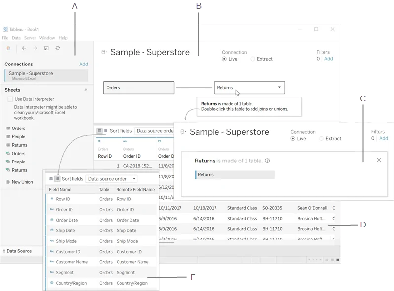
The initial step in visualizing data with Tableau is binding to your information sources. Tableau presents adaptability in data integration, permitting you to connect information from myriad sources, including local files, cloud capacity, or databases. Typical file styles like Excel, CSV, and text files are effortlessly compatible, as are more intricate sources including SQL databases, Google Sheets, and even massive data stages such as Hadoop.
Once done with launching Tableau, you will be prompted to link to a data source. Here, choose the specified file or server, and Tableau will load the information, showing a preview to let you confirm that it is imported accurately. That preview is particularly accommodating for analyzing data structure and column titles. In case you have data spread over numerous tables or sources, Tableau also allows you to blend them utilizing joins or blends, guaranteeing that all significant data is accessible in one view.
Connecting to data is more than just connecting files; it is also setting the foundation for examination. A solid connection guarantees that all data is accessible, precise, and prepared for the following steps within the visualization process.
Step 2: Preparing And Tuning Your Data
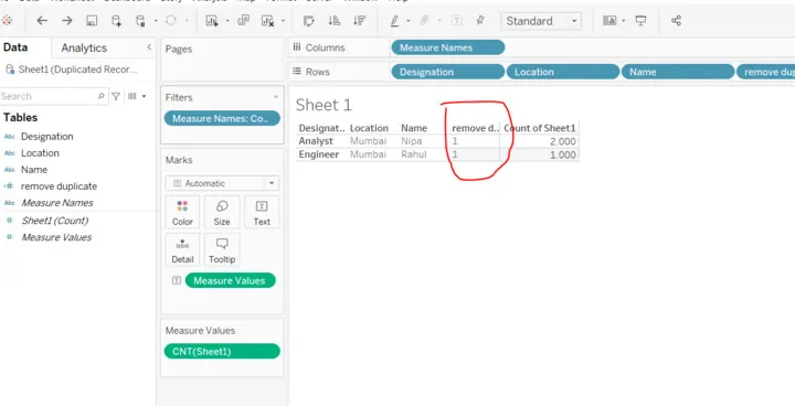
After connecting your data, you need to plan and clean it to guarantee precision and pertinence for visualization. Tableau offers various tools for information preparation, including choices to rename fields, remove duplicates, and filter out unimportant rows. This stage helps you polish the dataset, centering only on the most valuable data and clearing errors or irregularities that could skew your examination.
For instance, on the off chance that your data includes blank cells or unimportant entries, utilize Tableau’s data pane to determine and handle these gaps. You can moreover make calculated fields, which authorize you to include new columns based on particular formulas or criteria, making it more manageable to segment or categorize your information. Furthermore, Tableau shows data type adjustments, permitting you to set suitable formats such as dates, text, or numbers for each field.
A comprehensive data cleaning guarantees that your visualizations are aligning with high-quality, consistent data, improving the reliability of your insights and making your visualizations more significant.
Step 3: Creating Visualizations In Tableau
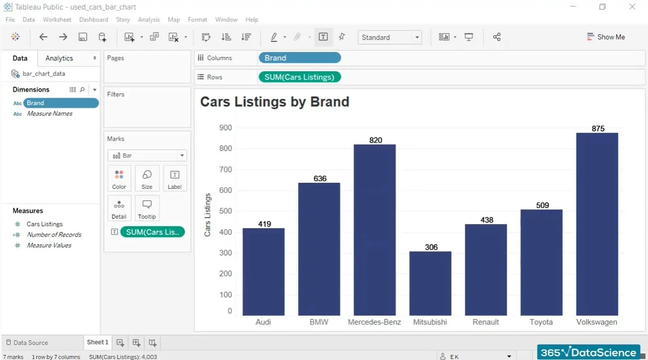
Having clean, well-organized data makes you prepared to begin creating visualizations in Tableau. Tableau’s drag-and-drop interface makes it easy to construct different charts and graphs, like bar charts, line graphs, scatter plots, or maps. Start by choosing the fields you need to visualize and drag them onto Tableau’s workspace, where they can be set on Rows and Columns shelves to shape the chart’s layout.
Tableau consequently proposes chart types according to the data you choose, but you’ll select others if you favor them. For example, bar charts are incredible for comparing categories, while line charts are valuable for tracking trends over time. Tableau, moreover, gives customization choices for each visualization, permitting you to adapt colors, labels, and sizes to make the visual clearer and more interesting.
This step is pivotal for revealing patterns, relationships, or outliers in your data, aiding you in transforming raw numbers into visuals that are easier to translate and share. The proper visualization highlights critical insights, making complex information available and functional.
Step 4: Creating A Cohesive Dashboard
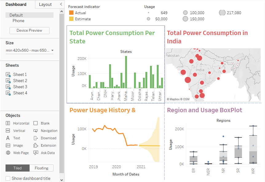
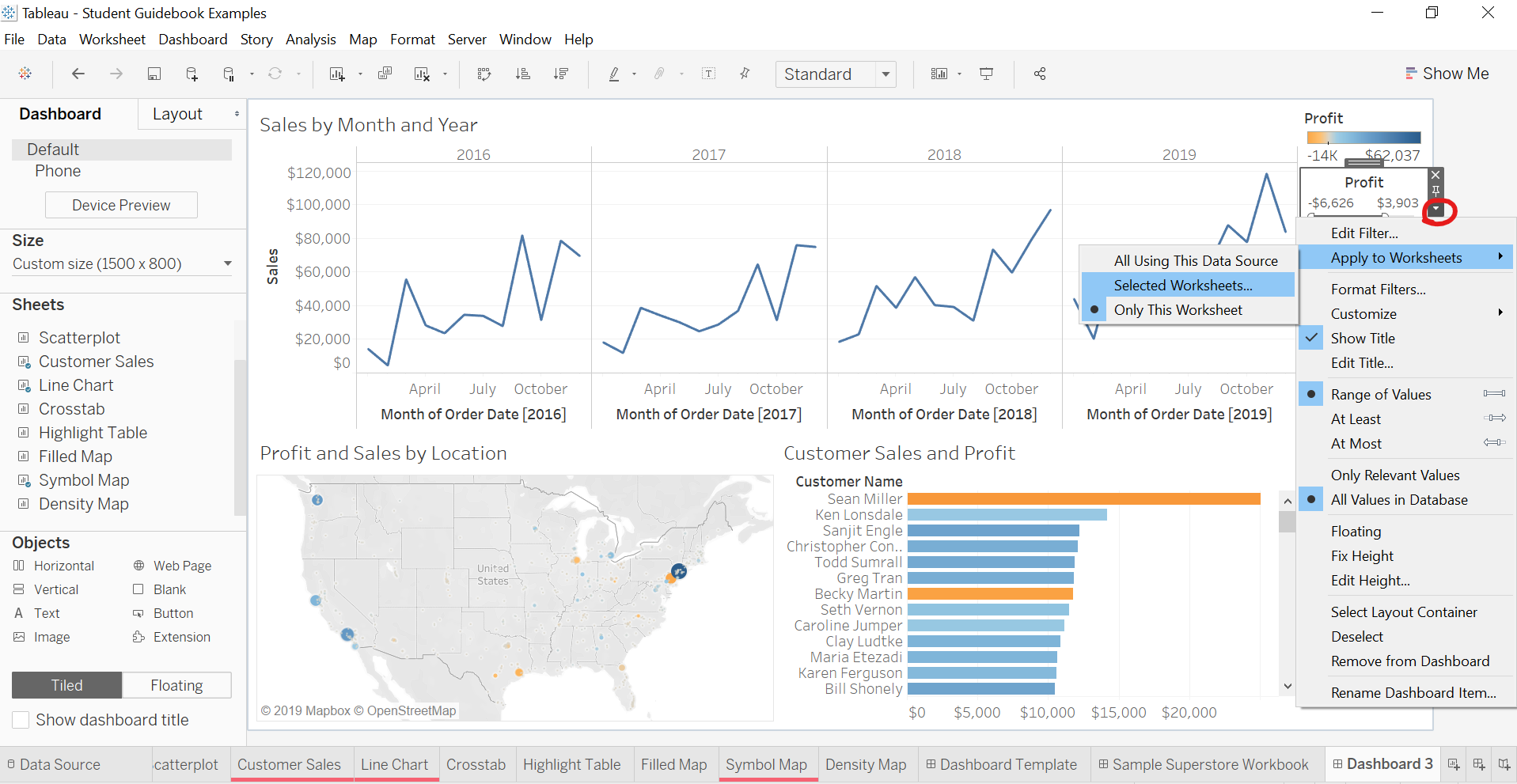
Once you have created individual visualizations, the following step is to join them into a cohesive dashboard. A dashboard in Tableau permits you to show different charts, graphs, or maps on a single screen, presenting a comprehensive display of your data story. By organizing different visuals together, you’ll make a dashboard that offers an all-around view of your insights, making it simple for users to study relationships and trends over distinctive data points.
To begin constructing your dashboard, choose the “Dashboard” tab in Tableau and drag your visualizations over the canvas. Tableau gives choices to resize, align, and arrange each component, facilitating you to structure the layout per your objectives and audience. You’ll moreover include text boxes, pictures, and interactive components such as filters and legends to improve the dashboard’s usability.
A well-ordered dashboard makes it simple to get the bigger picture, permitting viewers to compare data from various points. This phase converts individual visuals into a capable, interactive report that conveys insights in a clear and effective manner.
Step 5: Upgrading Your Dashboard With Interactivity And Filters
Upgrading your dashboard with interactivity and filters in Tableau assists users in exploring data themselves, which can make the visualizations more interesting and insightful. Filters permit a user to alter the view based on particular standards, like dates, categories, or regions, giving a tailored analysis encounter. For instance, a user may filter a sales dashboard by a particular region to see pertinent information for that area only.
To include interactivity, you’ll join tools such as drop-down menus, sliders, and highlight actions. The “Actions” highlight of Tableau empowers users to interact with one chart and witness its impacts on others. For example, if a user clicks on a data point in one chart, it might filter or highlight related data in another chart on the exact dashboard.
Including these interactive highlights makes your dashboard active and user-friendly, enabling viewers to get deeper into the data and pick insights that matter most to them. This action converts an inactive dashboard into an interactive data exploration apparatus that can respond to diverse questions per user input.
Step 6: Publishing And Sharing Your Dashboard
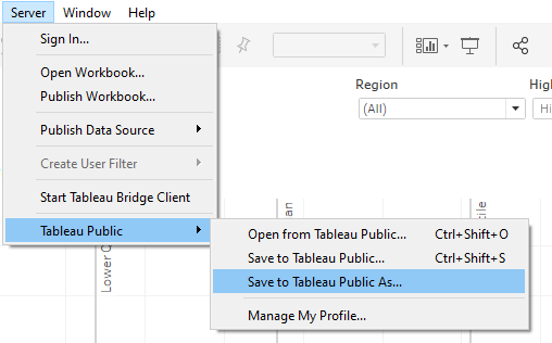
The ultimate step within the Tableau workflow involves publishing and sharing your dashboard, making it open to stakeholders or team associates. Tableau gives several choices to share according to your audience and platform preferences. You can publish the dashboard straight to the Tableau Server or Tableau Online, permitting people to approach it via a web link. That can be especially valuable for sharing insights with teams because it enables real-time cooperation and updating.
In case you are offering the dashboard in a more supervised setting, you’ll export it in PDF form or a picture for offline viewing or embed it inside a mail or website. Tableau also proposes choices to embed dashboards into other apps, giving consistent integration for broader groups of people.
Publishing makes sure that your visual insights reach the intended audience viably. With dashboard sharing, you permit others to interact with the data and make their own conclusions, making your analysis more effective and also empowering data-driven decision-making all over the organization.
Conclusion
Unquestionably, data visualizations play a role in the way we convey information about our data. Beginners may find Tableau intimidating at first, but it is a scalable solution that is for both amateur and adept analysts. Moreover, there are also simple-to-understand tutorials available to help with learning. To lead viewers through a data narrative, Tableau users can develop storyboards, which are simply connections between many visualizations. It increases the impact of data analysis for audiences by presenting insights clearly and coherently. And finally, compared to other solutions, Tableau simplifies data visualization and analysis for everyday users.


