How to use MS Excel for Data Visualisation?
Excel is among the most popular software tools for small businesses, allowing them to collect precise and visual data. Most companies and data entry services use Microsoft Excel for data entry, analysis, and visualization. This post will tell you how to visualize data with MS Excel.
Excel is a versatile program that lets users create spreadsheets and visualizations like charts. The creation of a data visualization within Excel can provide users with a comprehension of the information they’re reading as well as assist in managing large data sets. Learning how to make an effective data visualization using Excel could also allow you to use it more efficiently and improve your efficiency at work. In this article, we will define data visualizations, explain how to create them, list the different types of visualizations, and provide helpful strategies for making them.
What is MS Excel?
Excel is spreadsheet software by Microsoft and is part of the Office product line of business applications. Microsoft Excel enables users to create, organize, and analyze data within the spreadsheet.
When organizing data using software such as Excel, Data analysts and other users can make data easier to read when data is added or modified. Excel has a lot of cells or boxes that are organized by columns and rows. The information is then placed inside these cells.
What are the visualizations of data in Excel?
Data visualization in Excel is a visual representation of numbers in a graphic format. Data can be organized in spreadsheets into an easier-to-read and well-organized structure, such as line graphs, Gantt charts, or bar graphs. Charts are usually helpful to show more significant amounts of data, more complex data sets, or to highlight patterns and trends in the data set. For instance, you could employ a bar graph to show the number of interviews you’ve had throughout the year in your job search.
How to visualize data in MS Excel?
Specifying Data Requirements
You must specify the information requirements to create a convincing presentation from the start. Let’s assume that the information is relevant to website users and includes the following variables: income, age, and so on.
Data Collection
After you’ve defined the crucial variables, begin an actual survey.
Data Processing
The data you gather must be organized to facilitate evaluation and process. This is how you manage your data in a specific way to make it easy for analysis.
Data Cleaning
Even if you have an organized database, it might need fixing, for example, duplicates, insufficient variables, and other errors. Perform data cleaning to eliminate mistakes.
Data Analysis
When data is processed and passes through essential phrases, like cleanup and process, it’s prepared for analysis. Additionally, you can use data visualization tools like Excel to visualize data and present the data’s insights.
Excel Data Visualization Tool for Analysis
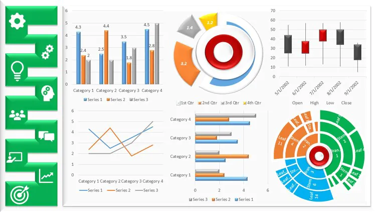
Excel, an instrument for data visualization, has an abundance of graphs, charts, and maps that you can utilize to tell stories.
However, it lacks ready-made charts like Pareto Chart and Grouped Bar Chart.
Pareto chart
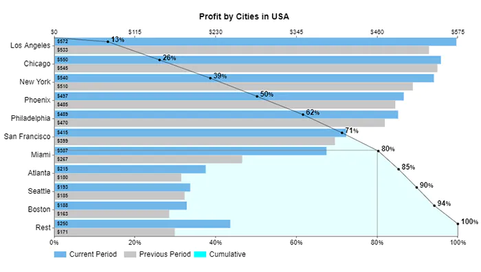
The Pareto Chart in Excel empowers users to classify occurrences about their effect on a shared objective or strategic goal. This visual design is intended to classify crucial variables within your data according to the frequency of their occurrence.
This chart offers a detailed and thorough insight into the issues that require immediate focus and attention.
Pareto Chart is based on the famous 80/20 rule. The rule states that 20 percent of causes cause 80 percent of the overall results. For instance, according to the 1992 United Nations Development.
Program report that 80% of the world’s wealth is owned by only 20% of the world’s population.
The simple-to-read chart will prevent you from randomly tackling the root of the issue by revealing the top 20% of the problems that negatively impact 80 percent of the overall efficiency.
It’s not available in Excel visualizing tool for data.
Grouped Bar Chart
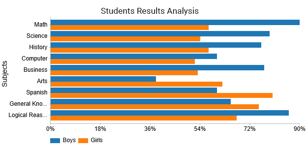
The Grouped Bar Chart is made of bars facing each other on both sides. The bars for males have a blue hue. On the other hand, the bars for girls have a beige color. The chart can be used to examine two or more factors.
For example, the graph above compares the performance of girls and boys in tests.
Data Visualization Best Practices
Establish the Key Objective
The goal is to keep data visualization focused on a particular purpose. Refrain from overloading it with data and confusing readers. In addition, you must keep your readers in mind and consider the data relevant to the audience.
Avoid Cluttered Data
You may be tempted to enhance any data display or to make it appear more attractive, but you should stop there.
Before you add an element of design, ask yourself if it’s adding value. Good data visualization is clutter-free. They should be easy to present and easy to comprehend. An excessive amount of data or a messy graph could defeat the entire objective of the data visualization.
Choose the Correct Visualization Methods
Be sure to select the appropriate visualization model to display your data. Select a chart that reflects the data. A wrong choice of visualization can confuse the viewer, creates confusion, and spreads false information.
Use Different Colors
Select only one hue (with variation in the gradient) to display continuous data and contrasting colors when comparing.
You may also employ a bold color to emphasize a specific data area. Also, ensure that you utilize bold fonts to ensure that the text in the graph is simple to comprehend. Stay within three fonts in the exact visualization, as you could easily confuse the viewer.
Choose the Right Type of Visualization
Selecting the correct type of chart to produce a compelling data visualization. Think about the kind of data you’re working with, the size of your database, and the audience you’re targeting.
An inconsistency between the type of data used and how you show it can harm the viewers’ understanding of the data. The kind of data you’re working with, whether qualitative or quantitative data, for instance, affects the way you present the data.
Remove Irrelevant or Inaccurate Data
In the end, the quality of your visualization can only be as excellent as the data quality. After collecting data, it is crucial to eliminate any irrelevant or incorrect information. This is commonly described as data wrangling or data cleaning.
The inability to properly cleanse data before use can cause damage to its integrity and could generate inaccurate visualizations of data.
Applications, for instance, Excel Data Visualization tool, are helpful in this stage.
Provide Context for the Visualization
Include a legend or key and additional context to aid viewers in understanding the illustration.
To gain a complete picture of the data’s story, the viewers must be aware of particulars like the data period, the source of data, and what each color signifies.
Make Data Story
The final step is creating a stunning visualization using data to convey a story. If the data demonstrate an underlying trend or confirms the hypothesis, your chart will help to make it easy to understand. The primary purpose of graphs is to display results in a manner that is easy for the viewer to understand and comprehend.
A story can make you’re visual more attractive and compelling and helps in making data-driven decisions.
Data Visualizations Tools
Tools like the Excel data visualization tool will help your business gather specific sales and marketing data. Also, these tools can provide insight that will help you make better choices.
Final words
A valuable and plentiful source that businesses can access is data. With vast amounts of data generated each minute of every single day and the information gleaned from it can guide almost every business decision, frequently leading to positive outcomes.
There are a variety of tools for data visualization out there that are designed to produce illustrations for business reasons. The good news is that one of the more well-known and user-friendly options is available on your PC: Microsoft Excel.
Although Excel isn’t a visualization program, it is a flexible, effective tool for professionals who want to analyze and visualize data. As with all visualization tools, the chart feature of Excel increases the reader’s engagement and comprehension of data. The capability to embed charts directly on top or beneath the data, exceptionally when the dynamic stuff in Excel charts is turned on, permits users to switch between the images and the data at their will. The mutual embedding feature of Excel and other MS Office tools like Word and PowerPoint allows users to use the visualization across office reports, presentations, and many more.
