How to plot a graph in MS EXCEL?
Spreadsheets are essential for managing data. They are, however, often difficult to use and don’t give team members an easy-to-read view of patterns and relationships in data. However, Excel can assist in converting your spreadsheet data graphs to provide a comprehensive overview of your data to make the best decision for your business. In this article, we will give step-by-step instructions on how to draw a graph using Excel.
It is an outstanding tool for recording data, processing it, and storing it. It is possible to add the required information in columns and rows and calculate them in minutes. Excel function allows you to create simple data visualizations that delight your eyes.
Why are graphs and charts significant?
A chart is an excellent tool with MS Excel to interact with your data visually. Charts and graphs can simplify data and make it easier to comprehend. There’s a saying, “A good picture is worth a thousand numbers.”
Charts also help your viewers understand the hidden meaning behind the numbers. In this course, you will discover how to add charts and alter them so that they effectively communicate information.
Types of graphs in MS EXCEL
Below are some examples of various kinds of graphs you can include in Excel documents:
Line Graphs
Line graphs in 3D and 2D graphs are accessible in MS Excel. These days, Line graphs are famous for displaying patterns across time. In addition, you can show more than one element. For example, employee compensation and the average number of hours spent in a month, and the average number of annual absences for employees against the same X-axis, or time.
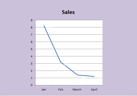
When you draw a line graph, It is recommended to use it when charting the continuous data set. Line graphs can be created with a variety of styles and colors. In this blog, you will be taught how to draw lines in Excel.
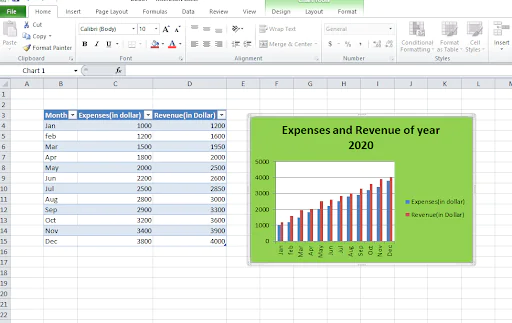
Column Graphs
Column graphs enable people to understand how the parameters of comparing items change over time. They are referred to in the context of “graphs” when only a single data parameter is used. If more than one parameter is implemented, viewers cannot understand how each parameter changes. A Column graph can be seen below:
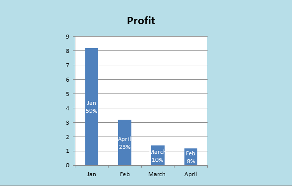
By utilizing column graphs, it is possible to look at the average hours you work in a week and the average amount of annual leave days when plotted in a row, but they have different clarity than the Line graph.
Bar Graphs
Bar graphs share many similarities with column graphs. However, they are horizontal column graphs required to prevent clutter from appearing when one label for data is very long or when the number of items you compare exceeds 9-10.
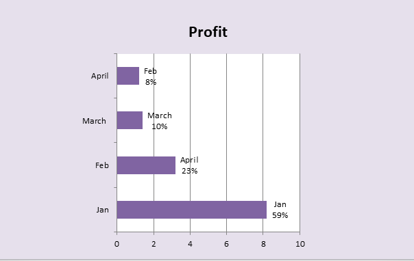
There is an example of a bar graph in this photo. This graph type also serves to display negative numbers. You can change the style and color of the bar to give it a more appealing appearance.
Pie Chart
Pie charts are very well-known, and pie charts show how items can be the components or the structure of something. Below is a pie graph:
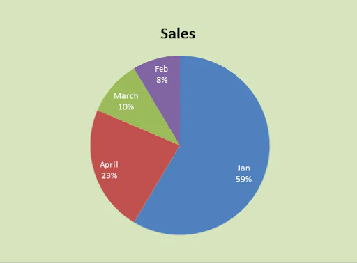
A pie chart shows figures in percentages, and the value of the whole segment should be equal to one hundred percent (100 percent). Pie charts are visually appealing and straightforward for those who see them.
Area Chart
The area chart is one of the line charts, and it is the area between the x-axis’s x, and the line is filled in with a color or pattern.
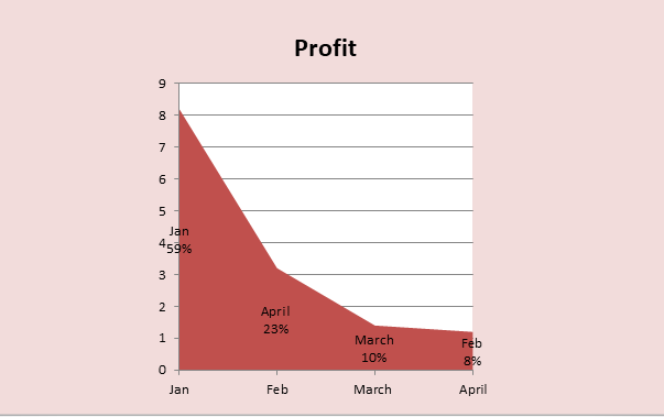
It helps display the whole thing’s relations, like showing your contribution to total revenue over a year. Additionally, it helps in calculating both the overall as well as individual trend data.
Scatter Plot
The scatter plot, also known as a scatter chart, can show the connection between two variables. Take a look at the graph of the scatter plot below:
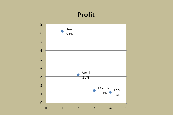
It is a good option in situations where there are a lot of information points, and you wish to concentrate on commonalities within your data collection. It is also helpful in searching for outliers or understanding how your data is distributed.
How to Plot a Graph in Excel
Let’s take a look at how to draw an Excel graph Excel using a few simple steps:
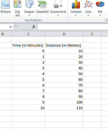
Step 1: Determine the measurement units
In the first place, how to draw an XY graph using Excel? The first step is to enter the data you want to use. To do this, you must label the axes with the following:
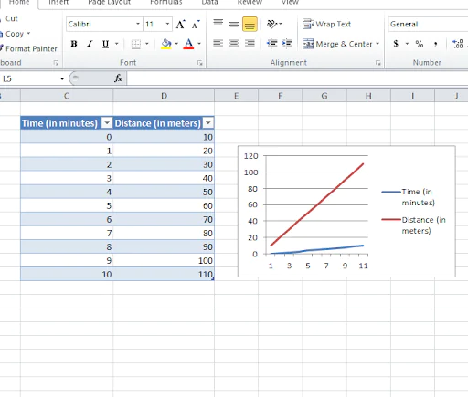
Let’s first consider the X-axis for “time” (for a unit, you can use the number of minutes) in addition to the Y-axis for “distance” (with the units’ meters).
Note the Time and Distance in two adjacent cells.
It is also possible to include the year in one axis and sales or profit in an additional axis to view the graph of sales or profit over time.
Step 2: Enter your data into an Excel sheet
Select the cell and input your first number; start at 0 minutes and increase it increments by 1 minute till you get to 10.
Now, input the first value for distance in the form of 10, and increment the distance to 10 meters per minute.
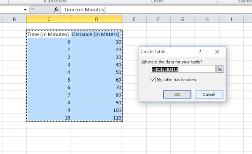
Step 3: Create a table of data
In MS Excel, you will find the “toolbar” at the top of the page, and the grid is located at the bottom.
Choose the cells that hold your data in the table.
Select the “Insert” tab and locate the “Tables” group.
To continue, click on the “Table” option. The “Create Table” dialogue box will appear.
The column’s heading is the one you want to highlight; you must check in the field “My table has headers.”
Verify that you have the correct range. Check if the range is correct, and click [OK.
Modify and shape your columns to make headings clear.
Select a cell on the table, and activate “Table Tools” by clicking on the “Table Tools” option.
Then, click the “Design” tab and locate the “Table Styles” group.
Choose a style or color you like.
Now, you’ve got your table.
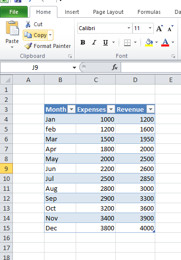
You can select from more than two data sets. For example, Months of operation and sales and revenue simultaneously.
Step 4: Select the most appropriate option for graphs and charts that will work for your particular business
In Excel, you can choose from a wide choice of graphs and charts to design. This includes the line, column, pie, area, and scatterplot (Stock Surface Radar, Bubble Doughnut, etc.) charts. You can, of course, pick any graph or chart you’d like.
Step 5: Choose your table of data and then insert your graph of choice
To create your chart, you’ll need to select all the information you’ve generated by clicking and then moving all the data elements. After that, you must choose the Insert tab and click it. Then, scroll down to your preferred graph. There are options for line, column bar area, pie, and many other chart options. Choose one that is the most effective way to present your information. In the upper right bottom of the box for charting, you will find the alternative “create a chart.” Click the option to personalize your chart.
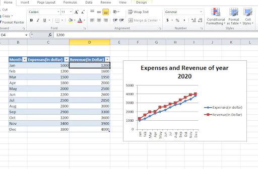
Step 6: Create an appropriate title for the chart
The addition of a title for the chart is essential. Click the chart, then select the layout option. Click “Chart Title.” Then, select the title option you prefer. Write your title into the Chart Title box. To make the headings appear professional, select the title text box. Next, you can click select the home tab. Choose the style of formatting you would like to use. The chart can be placed with the text above, beneath, or on any side of the graph.
Step 7: Refine the layout of your data and colors
Choose the layout you love the most since it displays your axes’ names and your chart’s title. It is also possible to choose a range of colors for your graph.
Step 8: Adjust the size of the legend and labels for the axis
For a better display of your graph, increase the size of the legends of your charts and labels for axis like the following:
Step 9: Edit your data, if necessary
Last but not least, if you alter your data, the graph will reflect the changes. You can remove or modify your rows, cells, and columns based on your requirements. When you select the data and then right-click your mouse, you’ll be able to choose options such as “insert,” “delete,” “clear content,” and so on.
Conclusion
Microsoft Excel is a very efficient tool for managing data extensively used by nearly every company today to analyze and interpret information. The graph in Excel is an instrument for a design that can help users visualize the data. Excel offers a range of charts and graphs you can use to display data in various ways. This article will help you comprehend the different kinds of graphs you can create in Excel and show you how to make graphs using Excel.
In simpler terms, the term graph refers to an image used to represent information within an Excel worksheet. It is possible to analyze the data more effectively when looking at Excel graphs instead of the numbers within a data set. Excel provides a broad range of graphs you could use to present your data, and making a graph with Excel is simple.
