How To Create A Dithering Effect In Gimp
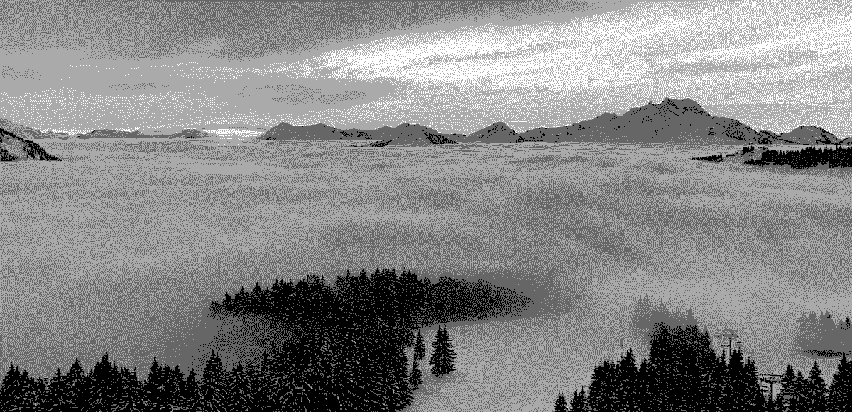
The dithering effect creates granular and noisy textured photographs that appear to be in retro style and inspire a feeling of nostalgia and enhanced appreciation. It can enhance the images with minimal colors by introducing shaded patterns that ornate simple-looking images, creating a classic look for them. To dither an image, color gradients are adjusted to possible near shades to create a smoother color transition while keeping down the abrupt changes of colors. It generates a varied range of shades for similar colors that are pleasing to the eyes with dotty or linear patterns. The technique does not rely on already available realistic wear-and-tear textures; instead, it introduces digital weathering effects to graphics. These designs immerse images in a blend of classic and digital elements that excites viewers with a dazzling blend of both antiquity and modernism, which is more enchanting than individual vintage or futuristic edits. This blog will mentor you through the steps to create a dithering effect for images to boost their visual desirability. For a simplified and more practical approach, let us consider the robust digital tool GIMP, which has all the features and tools specific to dithering.
Step 1: Image Opting and Composition Adjustment
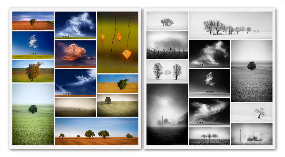
To get down to the process of image dithering, you have to pick a photograph, digital artwork, or graphic illustration that fits the dithering effect.
Secondly, carefully choose the quality and resolution values. Your image should be high quality and have high-resolution features, yet you can rotate or orient it for the best results.
Assess if your image has any flaws, like spots or blemishes; in that case, use the GIMP clone tool to clean those spots.
Check the color space of your images and limit the color types in your image color palette. You can alternatively turn the picture into grayscale to make it more suitable for dithering.
Evaluate your overall image before bridging it to the spotlight; you can consider cropping or resizing it according to your creative notion.
Step 2: Reshaping the Colour Range
Pick and apply a specific color mode to your chosen photograph. You can pick standard modes like RGB, CMYK, or grayscale as long as you can minimize the color types in your image.
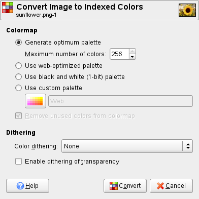
Consider using color reduction options in your software, like “Image -> Mode -> Indexed,” selecting “Generate optimum palette,” and setting the desired number of colors.
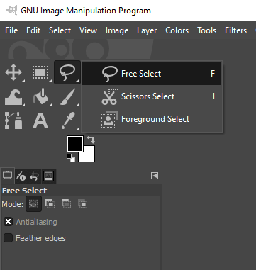
Next, you can use GIMP selection tools like Free Select to apply your selected color to selected areas or the overall image.
Use the preview option to observe the overall effects of color manipulation on your images. Confirm that it aligns with the dithering effect that you are going to apply in the coming steps.
Play with the different dithering design parameters and algorithms available in your software to assess the wild speculation about the outcomes your image will have.
Step 3: Tool Choice for Dithering Effect
Explore the tools that can help you in dithering images, like dots, lines, grids, patterns, and much more.
It would be best if you also visualized the effect of each dither on your image, which helps in choosing the best option.
You can also try different dithering design adjustment options, like sizing colors and gaps, to create a more intricate composition.
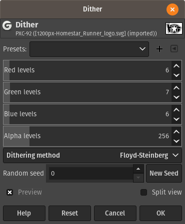
Access the help of a dithering algorithm for shading accuracy and aesthetics in your visual. These algorithms also control color distribution and transition.
You can examine your artwork using the real-time preview button that guides you through adjustments that can tune the visual appearance of your image.
Step 4: Polishing Your Patterns
Review your dithering patterns and evaluate their consistency, like spacing, placements, and shapings; fine-tune the intensity of all these factors.
Focus on the regions where color transitions occur using gradients and refine the pattern specifically for those areas.
To increase the innovative impact of your dithering effect, use varying density values, letting different image areas be less dominated by those patterns.
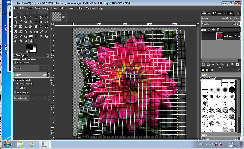
For advanced dithering projects, GIMP enables you to apply designs specifically, like heightening designs in particular regions, drawing attention to central focuses, and building up visual progression. Using GIMP’s exact tools, you can give every aspect of your image precise attention.
You can also test distinctive design configurations using real-time features on Canvas for inventiveness. You can see the results and make informed choices by trying different settings right away.
Step 5: Reconciling the Color Gradients
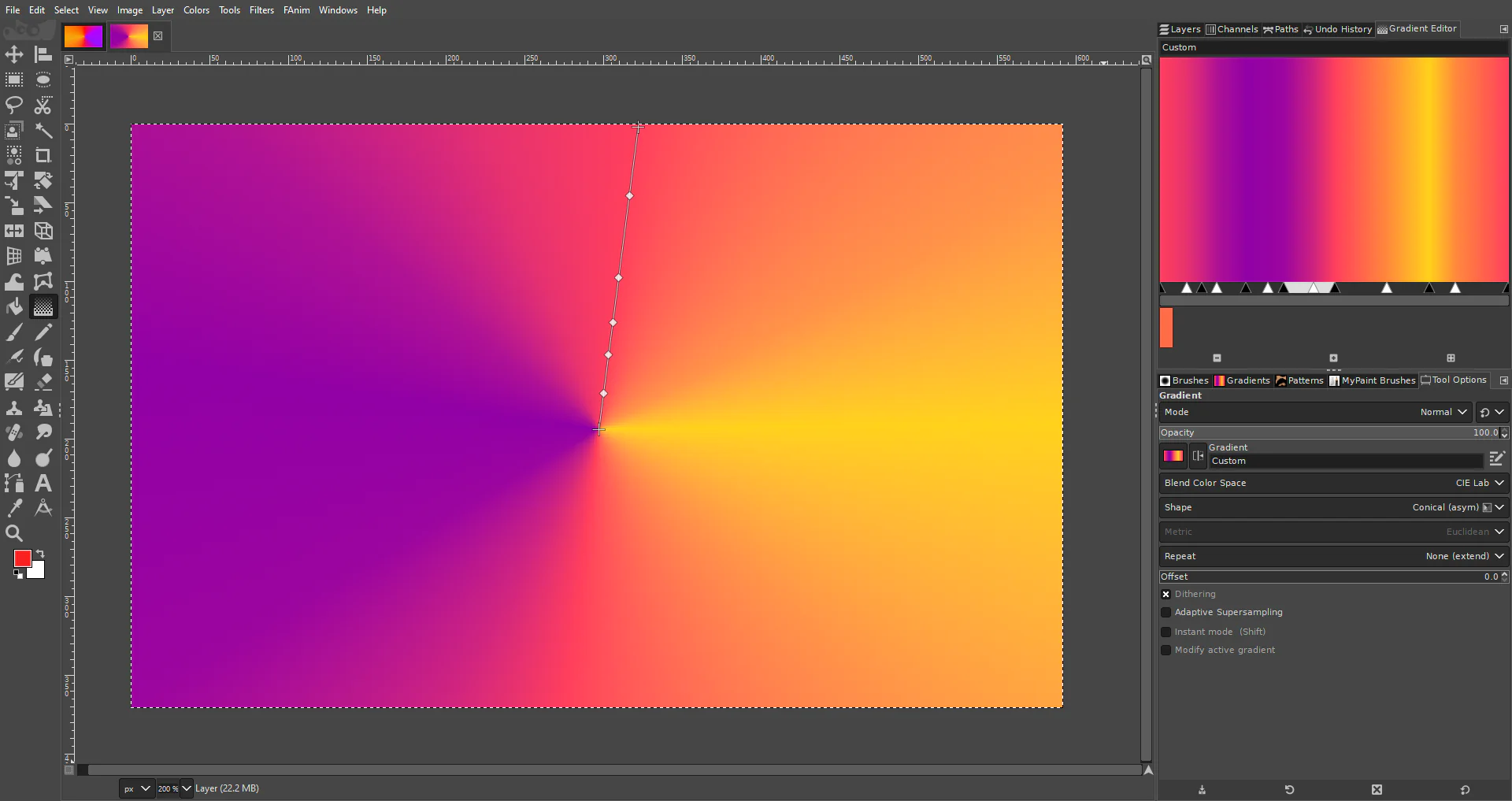
Start working on color transitions in your composition by giving a thorough look to your image.
Choose the Gradient tool and experiment with different gradients, such as radial, solid noise, and linear, to find the one that best aligns with your image.
Incorporate your chosen gradient into the regions of color transitions to smoothen any abrupt color blends or shifts. It will result in gradual and accurate color conversions.
You can also readjust or shade the colors as you like for a more customized outcome.
Here again, go for the real-time review option to check or assess the practical outcome of the effects of different gradients.
Step 6: Amplifying the Textures
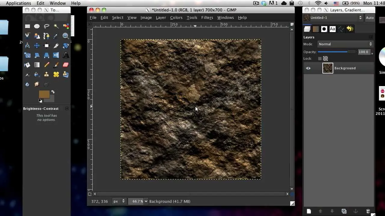
Make a new layer for making textures and enhance your artwork without disturbing the already-designed patterns. You can remove or recreate the texture layer if something goes wrong.
GIMP offers several texture options, like grainy, sandy, or noisy textures, that can improve your dithered image appearance. Pick the texture that harmonizes your image design.
Next, move on to the blending mode settings, experimenting with choices like Hard Light, Soft Light, Overlay, or Lighten. All of them are best suited to dithering effects.
Use the layer masking feature if you want to apply texture to only a specific region of your composition.
Finally, play with real-time effects to witness the outcomes of different textures, blending modes, and masking in your images.
Step 7: Final Developments and Revision
Rectify the general color balance and saturation using the color correction tools. It affirms the symmetry of your dithering effect and the composition’s color scheme.
Set the contrast and brightness values to add more profundity to the visual sequels.
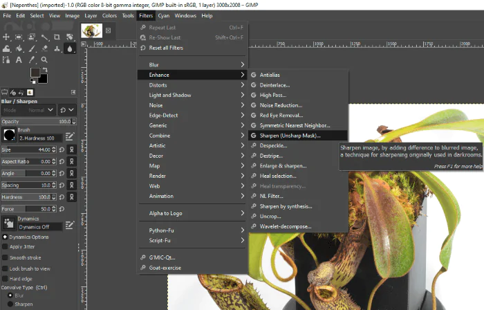
Adjust the sharpness of your image by selecting the sharpen tool from the tool menu, or you can use a sharpen filter to increase the sharpness by tweaking the Radius, Amount, and Threshold settings.
Audit the whole composition, including all the details like the dithering, gradients, textures, and other components, and check if they work together rhymingly. Make any vital alterations to form a lucid and attractive image.
Once you’re content with your dithered photo, save your project in GIMP’s available formats to protect your work. After saving, you can export your final artwork in any suitable format, file size, and resolution.
Prior to sharing your dithered work of art with the world, conduct a quality check. Examine fine, subtle elements, survey the picture from zoomed-in and zoomed-out perspectives, and progress toward sharing.
Conclusion
In summary, dithering an image is a distinctive form of photo manipulation that can promisingly make the image look like a marvel of time. It creates a climate of aging and imperfections, making images adored like precious old photographs. At the same time, the use of digital patterns takes viewers back to modernism. Thus, they can relish both the scene of vintage settings and a modern touch of refined, uniformly spread patterns. Dithering also equalizes the abrupt color shifts by controlling color gradients and making the visual less wavy and smoother.
