How to analyze data using SQL and Excel?
Excel and SQL Server are frequently used by many businesses and data entry services as the best data management strategy. There is more data than ever in the world today, and everyone in the workplace needs to feel at ease using it in some capacity. The majority of individuals prefer using Excel as their data tool, however, it has several drawbacks. This is where SQL comes into play, which is why you must utilize both.
In this post, we will tell you how to analyze data using SQL and Excel.
What is SQL?
SQL is a Structured Query Language. A database can be communicated using SQL. It is the standard language for relational database management systems as per the ANSI (American National Standards Institute).
To change data on a database or to obtain data from a database, SQL statements are employed. Oracle, Sybase, Microsoft SQL Server, Microsoft Access, Ingres, and other popular relational database management systems are a few examples of systems that employ SQL.
What is Excel?
Microsoft’s Excel spreadsheet program is a part of the Office family of business software programs. Users of Microsoft Excel may format, arrange, and compute data in a spreadsheet.
Data analysts and other consumers can make information simpler to examine as data is added or updated by organizing data using tools like Excel. The boxes in Excel are referred to as cells, and they are arranged in rows and columns. These cells are used to store data.
How to analyze data using SQL and Excel?
In this example, we’ll use SQL to query a database that contains sales information for a company and import the findings into Excel. Once the data is in Excel, we’ll make some reports and a basic dashboard layout to give the organization some helpful information.
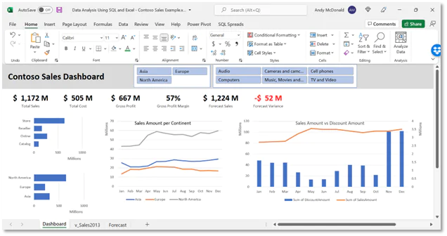
The dashboard we’ll be building is shown below:
Pre-requisites
We’re going to utilize Excel, SQL Spreads Add-In for Excel, and SQL Server Management Studio (SSMS) for this example.
Step 1: Obtain the data from SQL Server
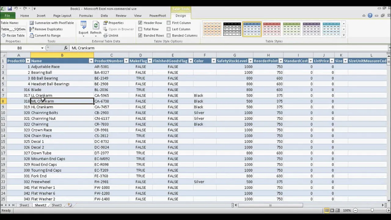
There are several tables in the Contoso Sales database. The Sales table is the one in which we are most interested. However, we must join the Sales table to many other ones and build some computed columns to make it simpler to examine the data and slice by the primary dimensions. In the database, we will also create a new view specifically for the data we require.
The script below demonstrates how to make the necessary view in SSMS:
CREATE VIEW [dbo].[v_Sales2013] AS
SELECT
Sal.SalesKey,
Sal.DateKey,
Cha.ChannelName,
Sto.StoreName,
Sto.StoreType,
Sto.Status,
Sto.EmployeeCount,
Sto.SellingAreaSize,
Geo.GeographyType,
Geo.ContinentName,
Geo.RegionCountryName,
Prm.PromotionName,
Prm.PromotionLabel,
Prd.ProductDescription,
Prd.Manufacturer,
Prd.BrandName,
Prd.ClassName,
Cat.ProductCategory,
Sub.ProductSubcategory,
Sal.SalesQuantity,
Sal.ReturnQuantity,
Sal.ReturnAmount,
Sal.DiscountQuantity,
Sal.DiscountAmount,
Sal.TotalCost,
Sal.SalesAmount,
(Sal.SalesAmount – Sal.TotalCost) AS ‘GrossProfit’,
(Sal.SalesAmount – Sal.TotalCost)/Sto.EmployeeCount AS ‘GrossProfitPerStoreEmployee’,
(Sal.SalesAmount – Sal.TotalCost)/Sto.SellingAreaSize AS ‘GrossProfitPerSqFt’
FROM [Sales] Sal
JOIN [Channel] Cha on Sal.ChannelKey = Cha.Channel
JOIN [Stores] Sto on Sal.StoreKey = Sto.StoreKey
JOIN [Geography] Geo on Sto.GeographyKey = Geo.GeographyKey
JOIN [Promotion] Prm on Sal.PromotionKey = Prm.PromotionKey
JOIN [Product] Prd on Sal.ProductKey = Prd.ProductKey
JOIN [ProductSubCategory] Sub on Prd.ProductSubcategoryKey = Sub.ProductSubcategoryKey
JOIN [ProductCategory] Cat on Cat.ProductCategoryKey = Sub.ProductCategoryKey
WHERE DateKey > ‘2013-01-01 00:00:00.000’ AND DateKey < ‘2014-01-01 00:00:00.000’
ORDER BY Sal.DateKey asc offset 0 rows
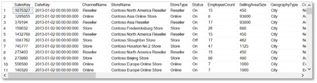
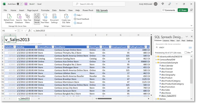
After executing this script, you can use SSMS to execute a select query to verify that all the necessary data is present:
Step 2: Data import into Excel
The data from the freshly built SQL view will be imported into Excel using the SQL Spreads Add-In for Excel. For this, first, install Add-In. Once the Add-In is set up, SQL Spreads will appear in the tab menu.
It is easy to import the data into Excel:
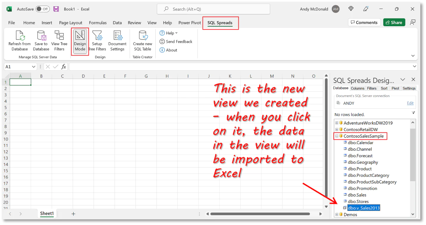
Select the SQL Spreads tab from the menu.
In the SQL Spreads Designer box, select Design Mode.
Enter your connection information after clicking on Edit.
The list of databases on your SQL Server will be shown in the SQL Spreads Designer pane once the connection has been established. From there, you can select a database and the table or view you want to import from that database. It is the v_Sales2013 view in the ContosoSalesExample database in our example.
The current sheet’s table will display the data from the SQL view.
Step 3: Make a visualization.
We can use the analytical capabilities in Excel now that we have the data on that spreadsheet. In this example, our main emphasis will be on using pivot tables and charts to analyze our sales data and draw conclusions. Four charts and a list of the summary are included in the dashboard.
Make simple summary values.
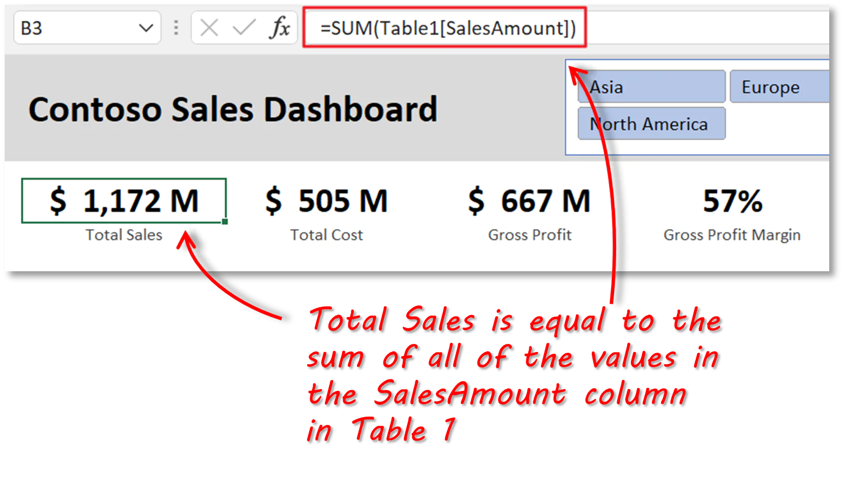
We will first generate the fundamental summary data that will appear at the top of our dashboard. These numbers will be added to a new sheet called “Dashboard,” which shows totals for sales, costs, and profit.
The Total Sales, Total Cost, and Gross Profit figures are computed by applying a SUM formula to the appropriate columns in Table 1, which was generated by SQL Spreads during the import of the data from SQL. Gross profit divided by total sales is the gross profit margin.
Make pivot tables
Because pivot charts are quick and simple to use, they are really used for all of the dashboard’s displays. A pivot chart is a visual depiction of a pivot table.
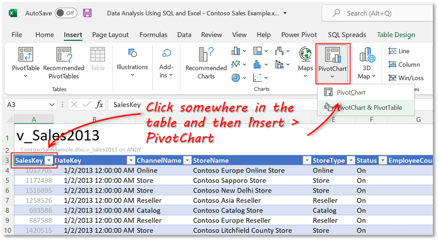
Click anywhere in the table containing the sales data to add a pivot chart by selecting Insert > Pivot Chart > Pivot Chart.
Leave the default value of “Table1” for the “Select a table or range” choice in the dialogue. Select “Existing Worksheet” for the “Choose where you want the PivotChart to be placed” option, then use the right arrow button to travel to the Dashboard sheet and select a location in the sheet. Since we can move things about later, don’t worry too much about the actual position right now.
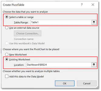
Select “Ok.” The Dashboard sheet has now included a blank pivot chart, and we can choose the fields to include in the chart.
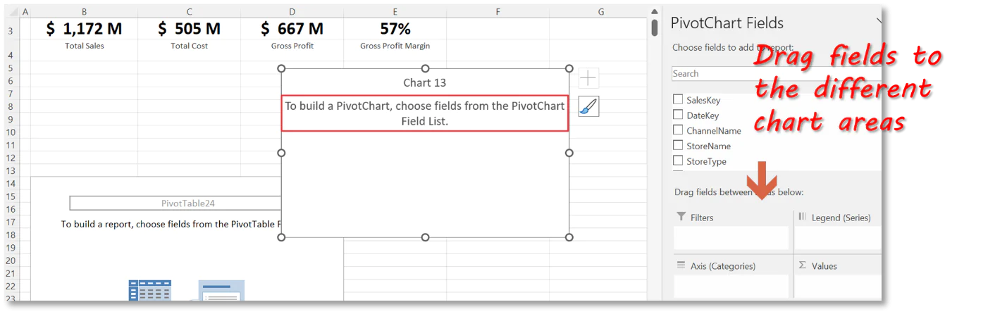
We’re going to add the following fields to this chart, which shows the total sales amount by month:
Values: SalesAmount field; take note that Excel will apply a sum aggregate by default because we are adding this field to the Values aggregate, but you may adjust this if necessary.
(Categories) Axis: Note that Excel, being as smart as it is, recognized that we were using date values and that we would likely want to organize them into months. As a result, it produced a Month object in the Axis area.
Legend (series): ContinentName- This will display data series for each continent in our data.
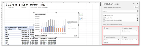
Now, we must format and arrange our chart as follows:
Change the type to Line – select the chart, then click on Design > Change Chart Type > Line.
Select one of the field buttons, right-click, and choose “Hide all field buttons on the chart” to remove the field buttons from the chart because we’ll be using slicers to filter the data instead.
Reposition the legend to the chart’s bottom- choosing the legend, choosing “Format Legend” from the context menu, and selecting “Bottom” as the position
Move the pivot table that accompanies the pivot chart out of sight- Choose the entire pivot table, then move it down the spreadsheet such that it is hidden from view in the dashboard section.
The other 3 charts can be made using the same process.
Develop slicers
Tables, pivot tables, and charts can be filtered using the buttons provided by slicers. Slicers not only do speedy filtering but also display the filtering status, making it simple to grasp what is currently being displayed.
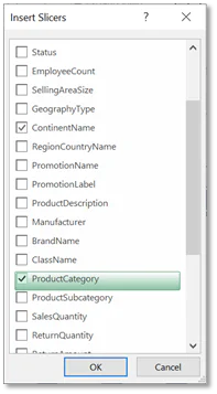
We’re going to add two slicers to our example so that we may filter by Continent and Product Category, respectively.
Pick one of the pivot charts, then select PivotChart Analyze > Insert Slicer to add a slicer. The fields that can be used to filter the data are listed in a window that appears. Both the continent and the product category must be selected. Now, our dashboard has two slicers.
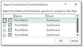
By default, the slicers we made are only linked to the chart we used to make them initially. Select a slicer, use the right-click menu to select “Report Connections,” and then check the other 3 pivot tables to connect each slicer to the other pivot charts as well.
Format the dashboard
Now that we have all the components for our dashboard, all that is left to do is format it properly and clean it up. This includes the following:
Stop the pivot tables from automatically resizing the columns: The columns of our dashboard will alter every time a slicer filter is updated because pivot tables by default automatically adapt the width of columns when the data is refreshed. Select a pivot table, then use the right-click menu to deselect the “Autofit column widths on update” checkbox.
Make the chart’s axes so that values are displayed in millions: Change the Display Units setting to millions after selecting the axis values, right-clicking, and choosing “Format Axis”.
Align and space charts and slicers: The standard Excel alignment tools can be used to do this.
The final words
If you work with data, you’ll need to be familiar with Excel and SQL. Both software is considered industry standards for data analysis, even though various data entry services, organizations, and team members may choose one over the other. Excel is helpful for rapid data visualizations and summaries, but SQL is required for handling massive amounts of data, maintaining databases, and making the most of relational databases. That’s why it is recommended to use both while analyzing the data.
