How to Adjust Color Spaces
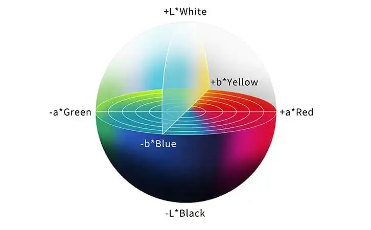
Color space pertains to the range of colors that can be successfully represented properly in a digital image. It is a three-dimensional paradigm specifying how colors are defined and shown inside a medium or device. Color spaces are critical for ensuring consistent and correct color representation across various devices, including displays, printers, cameras, and more. Various color spaces are created for various purposes and mediums, each having its own set of reproducible colors. Color spaces often used include sRGB, Adobe RGB, and ProPhoto RGB. These color spaces are created for specific applications such as online display, print replication, and professional photography. Each color space contains a distinct set of fundamental colors that govern how colors are viewed and interpreted by devices such as displays, printers, and cameras. Choosing the correct color space for your image is critical since it directly influences the appearance and accuracy of colors in the final output. This blog post might help you adjust color space for digital projects or creative undertakings. Understanding the complexities of color space and following the simple steps indicated in this article will provide you with the knowledge to modify the visual impact of your photographs.
Step 1: Choosing the Right Color Space
Purpose Clarity: Define the purpose of your image – whether it’s for web display, printing, or other mediums. This clarity will guide your color space choice.
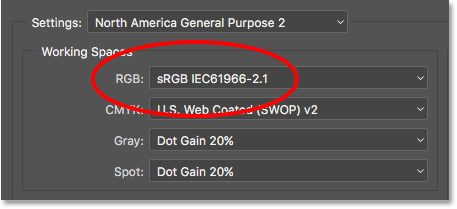
sRGB for Web: Opt for sRGB if your image is primarily for web display. It ensures consistent colors across different devices and browsers.
Wider Gamuts: If your image will be printed professionally, consider Adobe RGB or ProPhoto RGB to capture a broader range of colors.
Print Requirements: Understand the requirements of the print medium. Some printing processes might have specific color space recommendations.
Matching Devices: If your image will be viewed on specific devices, research their preferred color spaces to ensure accurate representation.
Editing Flexibility: Assess how much editing flexibility you need. Larger color spaces like Adobe RGB offer more room for adjustments.
Conversion Awareness: Be mindful that converting between color spaces can alter colors. Choose your color space early to minimize conversions.
Document Metadata: Embed color space information in your image’s metadata to ensure proper interpretation by software and devices.
Following this step-by-step approach, you’ll efficiently select your image’s most suitable color space, setting the stage for effective color adjustments without unnecessary theoretical complexities.
Step 2: Navigating Editing Tools
Tool Familiarity: Get acquainted with the image editing software you’ll use. Familiarity will streamline the color space adjustment process.
Color Space Options: Explore the software’s color space options. Locate settings related to color profiles and color management.
Real-time Previews: Look for features that offer real-time previews of color space changes. That helps you visualize adjustments before finalizing them.
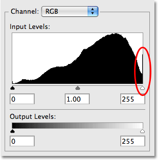
Histogram Insights: Utilize the histogram to understand the color distribution in your image. This insight informs precise adjustments.
Channel Control: Identify tools that allow you to adjust color channels individually. This level of control is valuable for fine-tuning.
Sample Images: Practice with sample images to grasp the impact of different color space adjustments. Experimentation builds confidence.
Undo and History: Understand how to undo changes and access editing history. This safety net encourages experimentation without fear.
Profiles Export: Learn how to export images with embedded color profiles. That ensures various devices accurately interpret your adjustments.
By mastering these tool-related aspects, you’ll be well-equipped to navigate your editing software effectively and make the most of its features during color space adjustments.
Step 3: Dynamic Contrast Enhancement
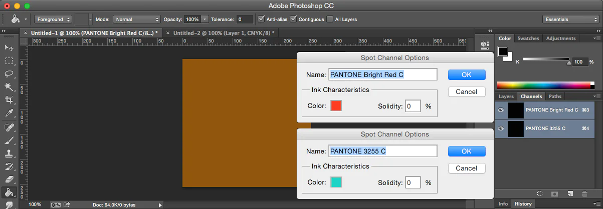
Channel Isolation: Begin by individually isolating color channels (red, green, blue). That allows targeted adjustments for precise contrast enhancement.
Histogram Study: Examine histograms for each channel. Identify peaks and gaps to understand the distribution of tones.
Contrast Boost: Increase contrast by adjusting the tonal range. Expand the gap between highlights and shadows for added depth.
Curves Adjustment: Utilize curve adjustment to fine-tune contrast. Manipulate points on the curve to control highlights and shadows.
Selective Brightness: Enhance brightness in specific areas using localized adjustments like dodge and burn tools.
Texture Enhancement: Pay attention to texture details. Adjust contrast to highlight textures without compromising overall balance.
Color Channel Balance: Balance color channels’ contrast to ensure a harmonious blend of tones and colors.
Subtle Iterations: Make incremental adjustments, observing the impact on image quality. Avoid overdoing contrast, which can lead to unnatural results.
Following these steps, you’ll transform your image with enhanced contrast, capturing attention and imbuing it with dynamic visual appeal.
Step 4: Harmonizing Color Balance
Color Cast Identification: Detect any color casts present in the image. These shifts can lead to unnatural or undesirable color balances.
White Balance Adjustment: Begin with white balance correction to neutralize color casts. Use reference points like neutral gray areas.
Color Wheel Insights: Understand the color wheel’s relationships – complementary, analogous, and more. This knowledge guides harmonious color adjustments.
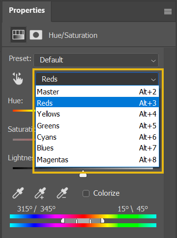
Selective Hue Tweaks: Adjust specific hues to achieve the desired color balance. Focus on colors that contribute to the image’s overall tone.
Saturation Control: Fine-tune saturation levels of individual colors. Avoid oversaturation, which can result in unrealistic visuals.
Natural Skin Tones: Prioritize accurate skin tones. Adjust red and yellow hues to maintain a natural and flattering appearance.
Global vs. Local: Decide whether global color adjustments suffice or if localized adjustments are needed for specific image areas.
Comparative Checks: Regularly compare your adjustments to the original and reference images. Ensure your color balance remains visually pleasing and natural.
These steps create harmonious color balance, elevating your image’s visual impact and ensuring colors work together cohesively.
Step 5: Achieving Shadow-Highlight Equilibrium
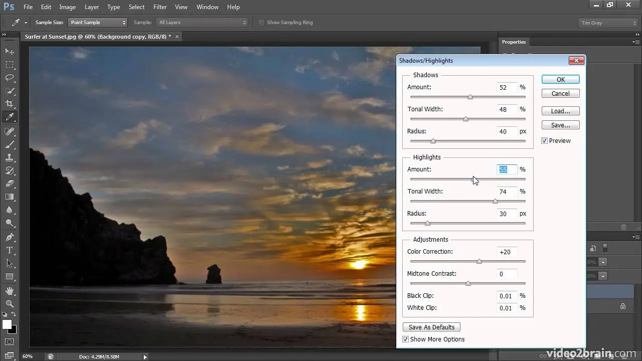
Shadow and Highlight Analysis: Assess your image’s distribution of shadows and highlights. Identify areas that need balance.
Shadow Lift: Increase shadow brightness to reveal hidden details without causing a loss of depth. That brings out nuances in darker areas.
Highlight Control: Adjust highlights to maintain detail and prevent overexposure. Ensure bright areas retain texture and visual interest.
Graduated Filters: Implement graduated filters to target specific areas. Gradually adjust shadows and highlights for a seamless transition.
Blend with Surroundings: Harmonize edited areas with their surroundings. Avoid sharp transitions that could appear unnatural.
Luminance Considerations: Adjust luminance levels to refine shadow and highlight contrast. Maintain subtlety to avoid a flat appearance.
Dynamic Range Balance: Strive for a balanced dynamic range – not overly compressed or expanded – to achieve a visually pleasing image.
Visual Checks: Regularly zoom in and out of your image to evaluate shadow and highlight adjustments at various scales.
By executing these steps, you’ll strike a visual equilibrium between shadows and highlights, resulting in an image rich in texture and tonal details.
Step 6: Real-time Color Refinement
Interactive Adjustments: Utilize tools that offer real-time adjustments. These tools allow you to witness changes immediately as you make them.
Split Screen Comparison: Use split-screen views to compare the edited version with the original. This visual reference aids in evaluating changes.
Slider Precision: Adjust color parameters using sliders. Observe how each slider impacts the image in real-time.
Instant Undo/Redo: Take advantage of instant undo and redo options. That encourages experimentation without fear of making irreversible changes.
Live Preview: Opt for tools that provide a live preview of color adjustments while you hover over different settings.
Mobile Device Compatibility: If applicable, use mobile-friendly apps that showcase real-time adjustments on the go.
Continuous Assessment: Continuously assess the impact of changes as you refine color adjustments. Make iterative adjustments as needed.
Feedback Loop: Engage with the software’s feedback loop – what you see is what you get. That minimizes the gap between expectation and reality.
By embracing these methods, you’ll effortlessly fine-tune your image’s colors in real-time, ensuring optimal adjustments that align with your creative vision.
Step 7: Precise Export for Chromatic Brilliance
Profile Persistence: Ensure the selected color space remains embedded in your image during export. That maintains color accuracy across devices.
Format Selection: Choose an export format that supports color profiles, such as JPEG or PNG. That preserves your adjustments during the export process.
Metadata Inclusion: Confirm that color space information is included in the image’s metadata. This metadata guides software in accurately interpreting colors.
Online Display Considerations: If the image will be displayed online, consider optimizing for web display by converting to sRGB color space.
Print Medium Adaptation: For print, consult with printing services to understand their color space preferences. Adjust your export accordingly.
Quality Assessment: Before final export, zoom in to inspect color transitions and details. Ensure the edited colors appear as intended.
Comparative Evaluation: Compare the exported image to your editing software’s preview to ensure consistency in color space and adjustments.
Backup Archiving: Keep a copy of the edited image in its original format to retain adjustments for future edits or different uses.
Following these steps guarantees that your exported image retains the adjusted color space and enhancements you’ve meticulously applied, whether for online display or print.
Conclusion
Color space modification can convert you into a conductor of colors and tones, composing visual compositions that resound with passion and power. You can progress from theory to practice by navigating the complex environment of color space. With an option to select an ideal color space and make modifications, your photographs can surpass the screen or page. They are sensory experiences that arouse sensations. Your creative efforts bear fruit as creativity and ity collide to create art that makes an unforgettable impression on those who witness it.
