
Your Ultimate Guide To Mobile SEO
Over the last few years, mobile devices have become the most easily accessible source of connection. According to a general survey, around 60% of total American households have mobile devices to browse through Internet Explorer. Professional expects the number of users to rise exponentially by the year 2025. Statistics reveal that almost three-quarters of the world will become smartphone users hence adding up to the importance of understanding mobile SEO. In this blog, we will be discussing mobile SEO best practices to consider before building your site. Let us get started:
What Is Mobile SEO?
Mobile SEO or Mobile Search Engine Optimization is a process by which professional marketers and developers can incredibly improve their brand positioning and web page performance by estimating the results on smaller screen devices. To become successful, you need to build a strong mobile SEO strategy and a suitable one for the desktop as well. The concept of both is very different; let me tell you how Mobile SEO utilizes the user’s location, device screen, and operating system to gain more search engine rankings. A professional developer must use a mobile-first approach to create a website that doubles your content’s chances of getting delivered to potential visitors, irrespective of the platform they use.
Mobile SEO Vs Desktop SEO
Marketing professionals must stay connected with the new trends of SERPs (Search Engine Results Pages) for both mobile and desktop. Google and other popular search engines show wide results based on your user expectations which can vary with the type of device they use to search content. For instance, mobile device search results generally involve photos and videos. These search results are portrayed in a card-like format and take up more vertical space by showing fewer results on a single page. This means that you have to scroll a few times to get a full review of search results. Therefore, it is important to land on the first few pages to get noticed by the visitor. On the contrary, desktop results in few lines of text, in this way, more search results are displayed on a single page. Nowadays, people look for easy means to search for readily available content, and most of the time, it is a mobile phone. If you do not optimize your content to land on the first page, then you may lose revenue.
Use Data Analytics To Boost Your Mobile SEO Strategy
Good SEO techniques are a must-have for both desktop and mobile SEO. This being said, it is vital to have a sound SEO strategy up your sleeves to target a good percentage of prospective visitors who use mobile devices daily. You can use data analytics to boost your site search rankings in the right direction. Google Analytics Tool is the right tool if you wish to accomplish this goal in your life.
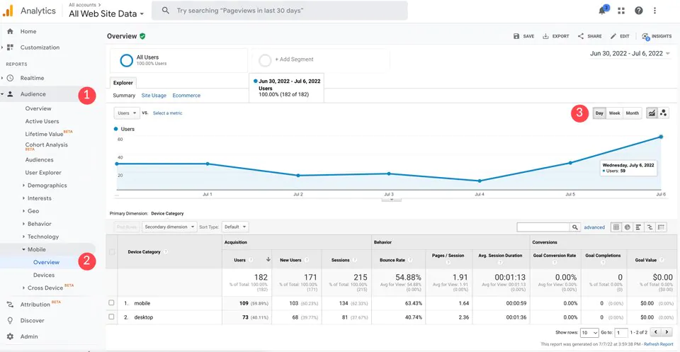
How to View Mobile Device Usage on Google Analytics?
At first, you will have to log in to your Google Analytics account and select a web property you are interested in. After this, you can click to select ‘audience’ and later ‘mobile’ options. Under the overview section, you can view all the users who have visited your site in the month, week, or current day.
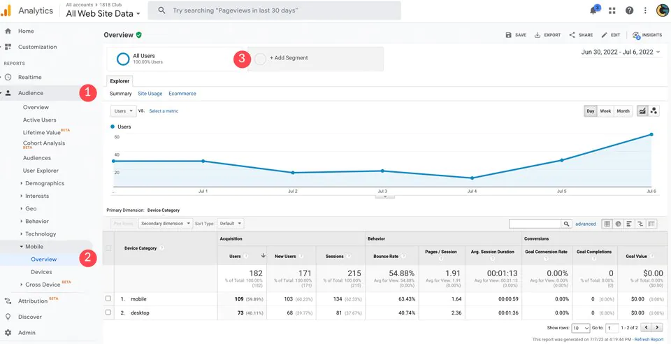
You can even compare user results to mobile results by clicking ‘+Add Segment’ to add a mobile traffic view.
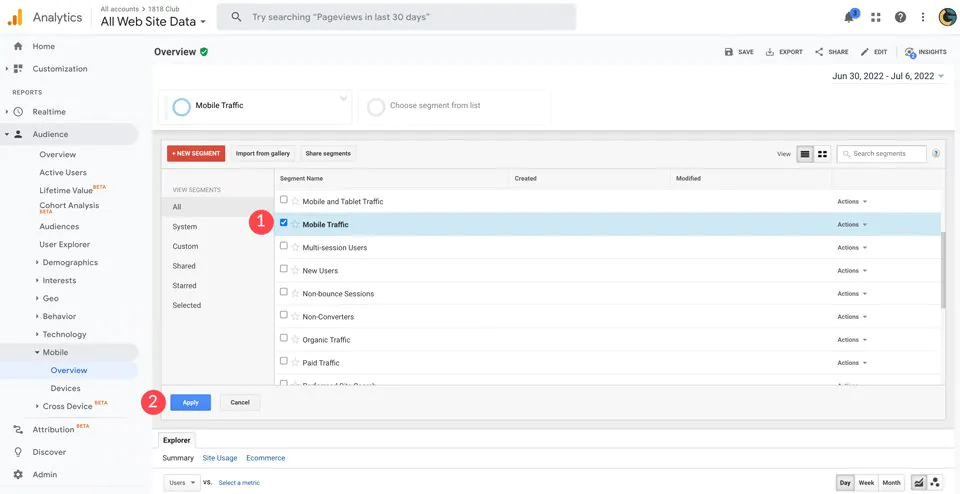
As soon as the dialogue box appears, you can select the ‘Mobile traffic’ option and then double right-click to apply changes. Doing so will enable you to see the complete percentage of users that are visiting your site using mobile devices.
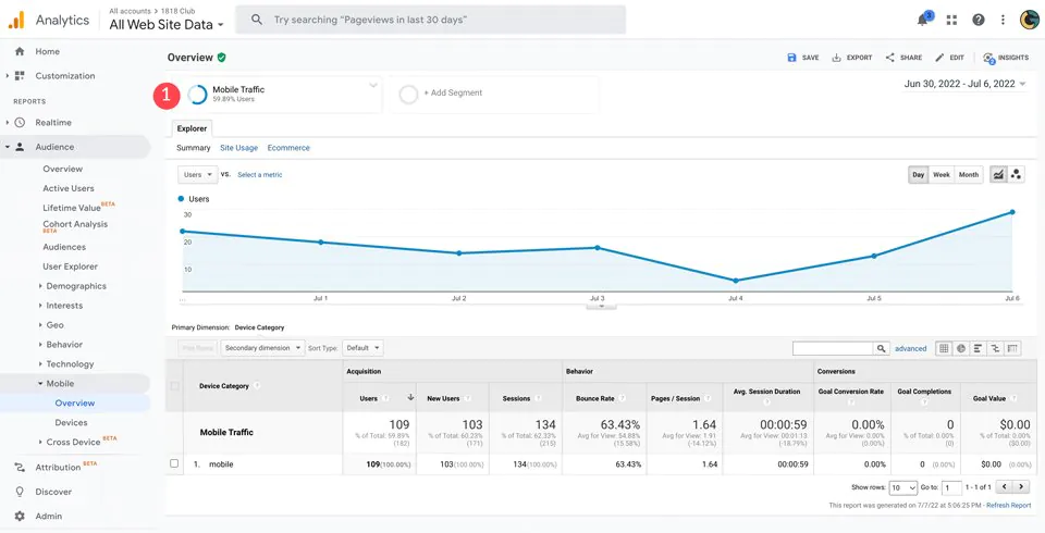
In this example, you can see there are almost 60% of on-site visitors used a mobile device to access our site.
Mobile SEO Best Practices
Once you make up your mind to implement mobile SEO for your site then you need to consider a few important things to ensure your content ranks higher in search engine search results for mobile devices. Certain specialized SEO tools prove helpful in upgrading your ranks which you must become aware of, and at the same time, you should also take notice of SEO practices that you need to avoid. For now, let us just stick to the best practices part that can work to noticeably improve your Mobile SEO strategy.
1. Improve Page Speed For Mobile Site SEO
Your page speed is what matters a lot and is one of the most crucial factors why visitors abandon your website. Therefore when optimizing your site, you must pay special attention to improving your page speed for mobile SEO. On average, 53% of mobile device users will abandon a site if it takes more than 3 Seconds to load. Hence, this point is crucial to enhancing your on-page SEO. To improve your page speed, you can work to optimize your page images and reduce their sizes, making them faster to load. Secondly, you can think about hosting videos on Vimeo or YouTube. Videos that get hosted on your site can reduce your on-site speed. You can also think about creating AMPs (Accelerated Mobile Pages). Google’s AMP plugin can assist you in speeding up your website to deliver good content faster for all users connected via mobile devices. For starters, you can also check out a tool named GTmetrix to perform page load testing.

2. Optimize Titles, Meta Descriptions, and URLs for SERPs
It is very essential to understand that the device screen size is a central factor for mobile SEO and SERPs. While preparing your SEO strategy keep strong notice of your headings are not too large sized on smaller screen device; having bigger titles take a longer time to load and the same is sad for SERPs listing. Using a good SEO plugin just like Yoast can assist you in optimizing your snippets in the SERPs. Using it, you can easily create well-optimized meta descriptions, SEO titles, and URLs for mobile devices.
3. Configure Your Site for Mobile Devices
In the past years, professionals demanded a separate platform to optimize content for mobile phones for SEO where the landing page can direct users to a mobile or desktop version of your site. However, with the advancement in technology and new platforms being created, the problem was sorted on its own. WordPress themes and advanced operating systems no longer require this distinction. You need to be very vigilant when creating content based on Google Analytics; Google can view it as duplicate content, which can decrease your search rankings as a penalty. Another method is to use dynamic serving. Users can see a version of your site that consists of a different set of HTML and CSS rules which is compatible with the device through which they access your site. However, everything has its downsides as well; there is no such guarantee that all things will go according to plan. A good way to minimize this uncertainty level is to configure what works well for your site and set up a responsive mobile SEO design.
4. Use Responsive Web Design
The good part is that if you are using WordPress, then you will have this point covered. If you don’t have a WordPress account you can use a responsive theme like Divi to make your site responsive such that it will be able to perform on all platform sizes. If you are creating a static HTML, then you can make use of media queries and flex display CSS to ensure that your site is all set to operate on desktops, tabs, and smartphones as well.

5. Don’t Use Popups
Popups can benefit you with better client engagement or prove to be a good advertisement on your site. But these factors may not be as nice in the case of mobile users as pop-ups consume a lot of space. This can limit your site’s tendency and hinder its performance in terms of page loading speed. In addition, these elements can lead to more bounce rates.
6. Design for Maximum Impact
Make good use of call-to-actions (CTAs) and buttons so that your visitors can easily access the information they want. If your CTAs or buttons are small for big fingers, then you might miss product sales. Do not give too many options to your mobile users. Limit their choices by reducing the number of CTAs for a larger impact. Therefore it is better to just stick to limited options to showcase and personalize your content.
7. Optimize for Local Mobile SEO
As mentioned earlier, Mobile SEO is quite different from desktop SEO because it uses the user’s location information based on user location. This is the reason why optimizing local SEO is important. You must include your business address, name, and contact information in your website’s metadata to further optimize your site for local search results. For advanced solutions, you must look into the Google My Business page and use Schema markup to create exciting snippets in the SERPs.
8. Leave the CSS and Javascript Alone
In the old days, developers used to block Javascript, CSS, and many images because smartphone operating systems could not handle them. With new technology being used to create smartphones today, operating systems have made this issue a non-issue. Google wishes to identify all your content, so it is not a good idea to hide away anything; doing this can only lower your site rankings in search engines.
Conclusion –
As it is evident, mobile SEO must be a vital part of your brand’s complete SEO strategy. With the mobile phone industry rapidly evolving and booming, developers need to devise a mobile-first mentality when designing their content or site. With all the aforementioned tips in this blog, along with website analytics, you can ensure a better experience for your real-time mobile phone visitors with quality content.
