How to Optimize Your Website Design With Enhanced Visuals
In today’s digital society, having a website representing your business is immensely important. However, beyond simply having an online presence, your website must be optimized to ensure a quality customer experience, or you could be doing more harm than good with your existing setup. If you find your current website is leaving a bit to be desired in the experience department, you might be tempted to trash it completely and hit the redo button. While that is possible, it’s also a great deal of work for really no reason when you could simply better optimize what you already have.
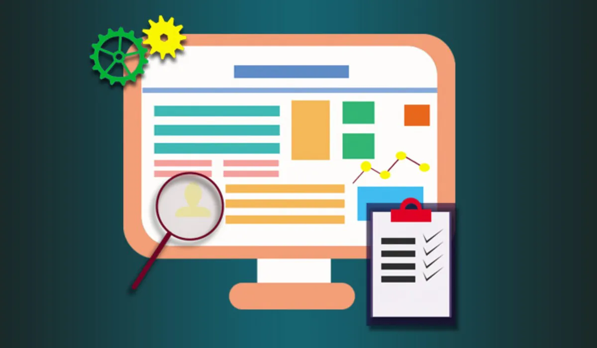
Website optimization is the process of improving various aspects of your website’s performance. This can include usability, conversion rates, and web traffic. Since some 88% of users state they are less likely to return to a website if they have an unpleasant experience navigating it the first time, it’s obviously very important to not only have a well-designed website representing your brand, but one that is fully optimized for user experience. Now that we have considered why it’s so important to optimize your website in today’s ultra-competitive market, let’s consider some actionable ways to make these improvements through enhanced visuals. Read on to learn more:
One main factor in the optimization process of your website is to enhance your website visuals to ensure they translate well to all devices as well as improve user experience overall. Keep in mind, above all, that a well-optimized and fully functioning website is engaging, offers positive aesthetics, is useful, and easy to understand and navigate. For businesses seeking to enhance their online presence, investing in Brandon’s professional web design services can be pivotal in achieving these optimization goals.
Take Devices Into Consideration
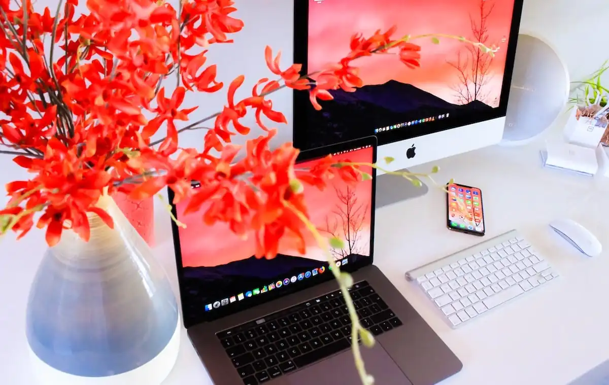
While some site visitors will use a desktop or laptop to access your site, many others will browse your site from either a tablet or their smartphone. Therefore, you need to ensure that your website takes all devices into consideration during display. In other words, you might have your site optimized to look great for a laptop but when it resizes for the mobile view, everything messes up. A study from Perficient found that based on 5.7 trillion visits, 57% were mobile, while 37% were desktop and only 6% were from a tablet in 2019. In 2020, the numbers increased even more with 61% being on a smartphone or mobile, while 36% were on a desktop and just 3% on a tablet.
This information showcases the importance of ensuring that your website is mobile-friendly. Otherwise, you could be missing out on an astounding 61% of your audience. Thankfully, by making some changes in your design elements, photo displays, and video options, you can ensure that your website is easy to navigate no matter what device is used by a customer. For example, estate agent websites are often designed with mobile users in mind to facilitate property searches and maximize user engagement across devices.
Use Videos Instead of GIFs
Speaking of which, while we all love a good GIF, having them as focal points on your website can actually harm your overall site performance. First of all, you can’t control playback on your site when it comes to GIFs. Also, GIFs will not play until all frames of content are fully loaded and they cannot be altered for web streaming purposes. This means that their presence can actually harm your website’s performance and negatively impact your user experience.
Choose videos over GIFs for most situations. Videos offer controlled playback aspects, feature unlimited color palettes, and can be optimized for website streaming. In addition, videos can be set to play as soon as the website’s first frame is ready. It’s important to keep in mind, although GIFs seem smaller when compared to videos, they actually have a very large file size which hinders the operation of your website. Thankfully, you can usually convert a GIF into a video for better website performance if you absolutely love the GIF itself.
Mobilize Whitespaces
Now onto the next design element, your whitespaces. The whitespaces on your website are often called the open space or negative space. It is the space left over between elements, the space surrounding images and text, the gutters and margins. Without whitespaces, your website would be hopelessly cluttered and impossible to navigate. It is in essence the whitespace that holds the entire page together. Therefore, it should be considered an active part of your page and a building block to utilize instead of simply the “left over space.”
When optimizing your whitespace, keep in mind that the more cluttered the space, the harder it is for visitors to navigate. Remove distractions and draw your reader’s eye to where you want by strategically utilizing whitespaces as a tool. For even better results, consider using white space as a way to add call-to-action prompts, such as a “subscribe now,” or “sign-up for free” button.
Add a Logo
While you might not consider your brand’s logo important when it comes to website optimization or enhanced visuals, this couldn’t be further from the truth. Your logo is the way your brand is instantly identified. It makes a good first impression, grabs your reader’s attention, and provides a measure of trust. In other words, when site visitors see your familiar logo incorporated into your website design, they know they are in the right place. They know they can trust what they find on your website. A good logo will help you trigger positive recall, will be pleasing aesthetically, and will be recognizable. In addition, when you use a standard format for your website, with your logo displayed, this creates a methodized and structured look that makes website navigation much easier for site visitors.
If you don’t currently have a logo associated with your brand that communicates all that makes your business great in a single image, getting a logo is your first step. Once you have it, then you can begin using it in all your advertising efforts, ensuring that your customers recognize your business in an instant when they see that logo. Just think about iconic logos over time to understand their importance. For example, the Nike swoosh is instantly recognizable, the McDonald’s arches are instantly recognizable, etc. In a similar way, create for your brand a logo that tells a story about your brand, is recognizable, and gives site visitors confidence that they are dealing with your business and not some knockoff company when they see your beloved logo displayed on your website.
You can use an online logo maker to create a logo easily even without any graphic design experience. Most Logo maker tools also offer a variety of branding tools and social media formats. This is a great advantage and can help kickstart your branding quickly.
Resize Images
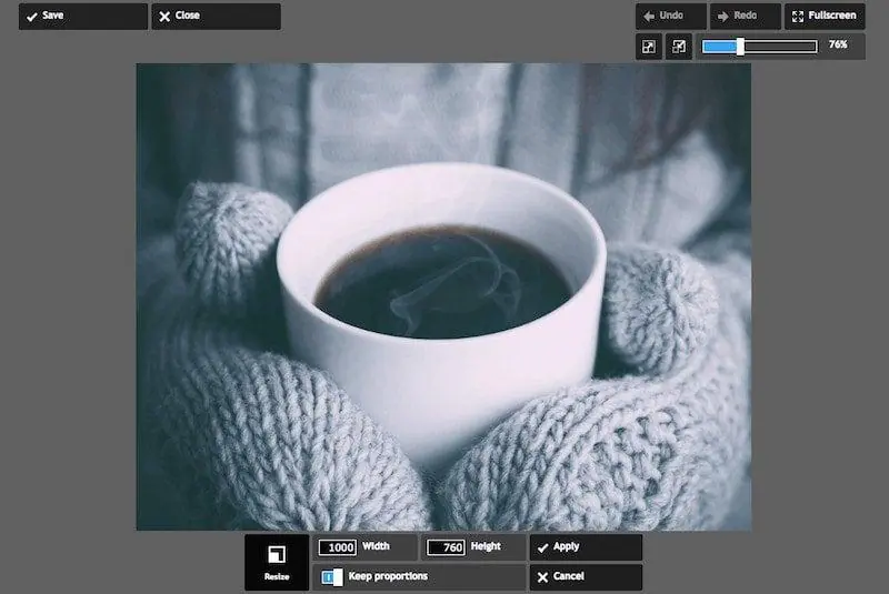
Another important aspect to consider when improving optimization overall and enhancing visuals on your site is resizing images to increase page speed and improve the overall appearance. It’s admittedly a balancing act. You want a high-quality image, but the higher resolution you choose, the larger the file size. Thankfully, through size modification, you can strike a balance between the two. While on display, photos are typically sized 8×10, 5×7, or 4×6, online they are measured instead by pixels. A good image size for a website would be something like 795×300 pixels.
In addition to adjusting the actual size, you can also alter the file size of an image to better optimize the user experience on your website. For example, a file size of 15MB for an image is huge and will slow your website down. On the other hand, modifying to a 125K is more applicable for website usage. Find your image size for both file size and image size by right-clicking on the image file and finding the properties section. Then go to the summary for the specifics. Once you find this information, you can resize an image based on how you plan to use the photo on your website. You can also significantly reduce your photo’s size with programs like TinyJPG or TinyPNG.
Keep Improving, Keep Testing
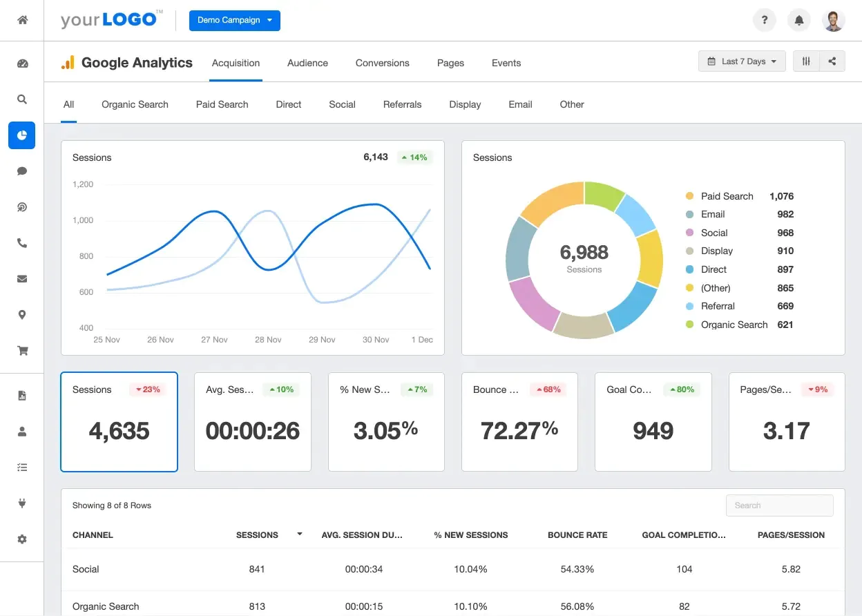
Last but most certainly not least, in order to optimize your website design via enhanced visuals and more, make sure you keep testing your site and keep improving it over time. Design trends change as do user tendencies. These factors can alter various aspects of optimization. Therefore, a good rule of thumb to remember is this: “Find the problems, follow the trends”. You can also test your website via various tools like Google Analytics and Mouseflow. This will show you how your website is performing on a daily basis and the way users are performing when visiting. It will also show you if your conversion rate is good. Keep testing your website as well as improving it as your business grows to ensure an enhanced customer experience.
Enhancing Visuals is Key
To optimize your website for user experience, you must take into consideration the way your visuals are laid out and displayed. The tips listed above all provide actionable steps to take to do just that. You want to ensure that your site is loading properly by avoiding large photos/files and GIFs while improving the overall layout and appearance with whitespace mobilization and your logo display. These elements will create a more pleasant user experience that will keep site visitors coming back again and again.