How To Get Pointillism Effects In Digital Art
Pointillism is a 19th-century art form that was about creating paintings at the micro-level by making small portions of art in the form of colorful dots and gradually unifying them into a coherent marvel of art. Instead of blending specific areas, the artists let colors separate in the form of multicolored points, giving viewers the freedom to imagine the blending per their optical perceptions. Pointillism is not just about artistic effects and abstraction; instead, even at that time, when science and technology were not that well advanced, it gave scientific research new dimensions by arising from the principles of color theory and how human eyes shape the visual effects as they assess them according to their structural aspects. This art moment is still influential in digital art for creating pointillism paintings or transforming photographs into pointillism effects. With the continuous development of digital software and the advancement of editing features, like various other ancient arts, pointillism has also gained immersive use in creating pointillism-inspired, mesmerizing images. For a detailed process of creating pointillism effects, you can consider the following steps:
Step 1: Image Choice and Canvas Settings
Though pointillism applies to various images, considering some specific attributes is vital while selecting your image.
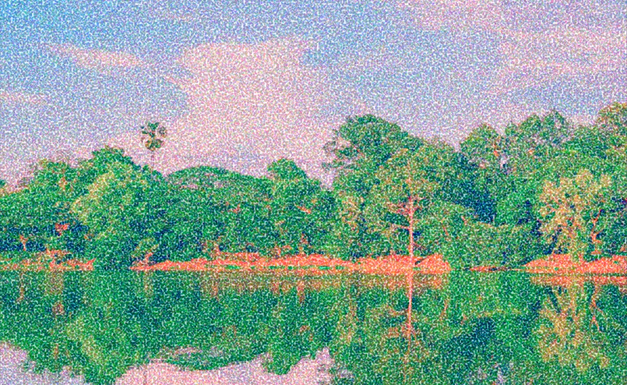
Look for photos with a clear subject and high contrasts; usually, less complicated images are more suitable for pointillism. You can select portraits, landscapes, or familiar images for the best results.
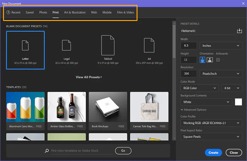
After finalizing the image, start working with canvas settings. Open any advanced editing program like Photoshop, GIMP, or Pcreate and navigate to the canvas proportions options.
You can choose the standard size of 1920×1080 and a resolution of 300 DPI; both values are commonly used for web image sharing.
Step 2: Image Import and Layering
After adjusting the general canvas settings, you can import your image to the canvas using the File option from the menu, then click Import.
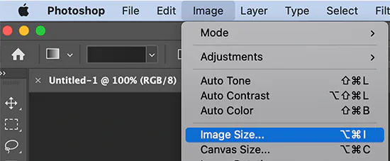
Compare the size of your image and the canvas to see if the image accommodates the canvas size. If you find any size difference, such as the image being larger or smaller than the canvas, consider resizing it using the available options. But do just what is necessary to avoid essential elements being removed.
To organize your art, you should layer your images in different aspects. You can create a separate layer as the “Base Layer” image you will use for editing. It also preserves your original image.
Create another layer for the pointillism dot, where you will focus on the design and distribution of dots across your image. You can name this layer the “Pointillism Layer.”
Step 3: Getting the Color Palette
When picking colors for your pointillism effect, consider the temperament you must communicate. An even palette with closely related shades can create a quiet, serene climate. Conversely, a palette with high-contrast colors can make your image dynamic and catchy.
To get an appreciable pointillism effect, try to use a smaller number of colors in your palette. Pointillism depends on comparing little specks of color, while utilizing many colors can cause visual disharmony. So, use a constrained palette of essential and secondary colors to upgrade the clarity of the image.
Observe the subject of your image to direct your color choices. For the landscape, consider natural tones and common greens and blues. Portraits require more subtle colors, which are best for skin tones and hair colors. Likewise, abstract art has multiple choices for a flexible palette.
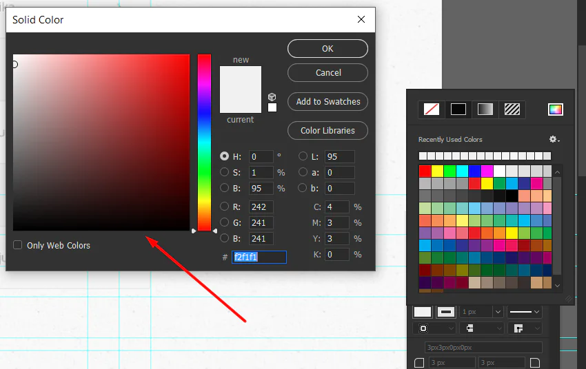
Most digital art software offers various options for addressing color palettes. You can save and organize selected colors for easy access while you work. Moreover, you can experiment with diverse color combos in real-time to refine your color choices.
Test a small artwork section before deciding on your chosen color palette. That allows you to evaluate how colors interact when applied to broader photograph areas.
Step 4: Adding Pointillism Points
After your color palette and image are in order, it’s time to begin fusing the essence of pointillism – dotting. This step requires persistence and a relentless hand.
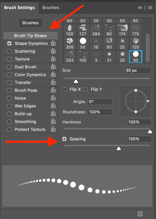
Select a brush that suits your desired speck size and shape. A small, round brush is perfect for making even dots, but you can also try different brush shapes to attain unique effects.
Modify the brush size to make dots at the desired level. The brush hardness should be set to 100% for clear and definite dots.
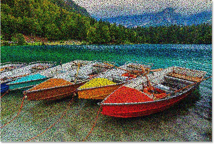
Choose a color from your palette. Your color choice will direct the tone of your dots. Begin doting the most noticeable areas and move on through the composition.
Modify the density of your dots to high for a smoother and more lively appearance and low if you need more divided dots to deliver a sense of openness and airiness. Alter the density according to the impact you need to attain.
Take your time and be persistent. Steady, uniform dots will result in an outwardly satisfying result.
Start working on layers from the base layer, where you include your primary dots. Make extra layers for shadows, highlights, and color modifications at that point. Work on Blending by Utilizing your layers’ opacity and blending modes for smooth moves and profundity in your craftsmanship.
Step 5: Trying Varying Densities
Increase density to produce darker dots on over-shaded areas for visual depth, and lower density level to make evenly spaced dots in well-lit areas to simulate a three-dimensional look.
You can also create texturing effects using high density to simulate a smooth surface, while lower density can create roughness or grain. The correct density and texture will enhance naturalism.
Adapt dot density to blend colors and tones deftly. Tune density incrementally to create transitions between colors, achieving smoother gradations and improving the overall appeal of your artwork.
You can direct the viewer’s focus by changing the density of points. Increase density around focal points to make them stand out and guide the viewer’s eye.
Assort layers of different densities to refine your art and boost the general appearance of your digital pointillist creation.
Step 6: Improving the General Appearance
To examine small details, closely examine your composition with greater precision and confirm that every point contributes to the overall picture.
Maximize highlights and shadow effects by morphing dot size and density. It will create appealing variations, bringing the details to life.
In case your composition has textured components, refine them by altering dot density and spacing. Aim at making the surfaces look genuine.
During this step, you can spot and rectify any inconsistencies or irregularities in your image. Ensure that the dotting is symmetrically adjusted over the overall composition.
Organize your layers for better control of different aspects of your pointillism art.
During image refinement, keep saving your progress and play with different adjustments to bring innovative elements to your final composition.
Step 7: Touch-Ups and Blending Settings
Take time to assess your whole composition. Consider the areas that will require alteration, including the color balance, dot density, or other details. Make any fundamental refinements.
Focus on blending modes and opacity adjustments on your layers to form consistent moves between colors and tones. That lets you get smoother gradients and improves the cohesion of your work.
Consider where highlights may be required to create your striking image. Add smaller dots of a lighter color to complement regions where light hits the subject.
Next, you can refine shadows by including darker dots deliberately. That can develop the contrast and include a sense of profundity in your work of art.
To add more profundity to your pointillism creation, try layering techniques. Overlay dots in numerous layers to form visual brilliance and variety.
After completing all the adjustments to your pointillism artwork, consider including your signature or watermark to add a personal touch. Perform final checks to guarantee everything is arranged and your work of art is all set for presentation and appreciation.
Conclusion
In summary, the antique art movement of pointillism has escalated in the digital era, characterized by more consistency and accuracy. While the contributions of 19th-century artists as true pioneers cannot be denied, modern viewers have higher expectations regarding diversity and precision in art. Digital tools have revitalized this approach by offering extensive variations in dot sizes, colors, spacing, and other dimensions. Pointillism art has become a thrilling visual challenge for viewers that excites their vision to explore the mysteries of art. Even with the intricacy of doted color splashes, one can easily get triggered to look forward to the actual narration the artwork intends to describe.
