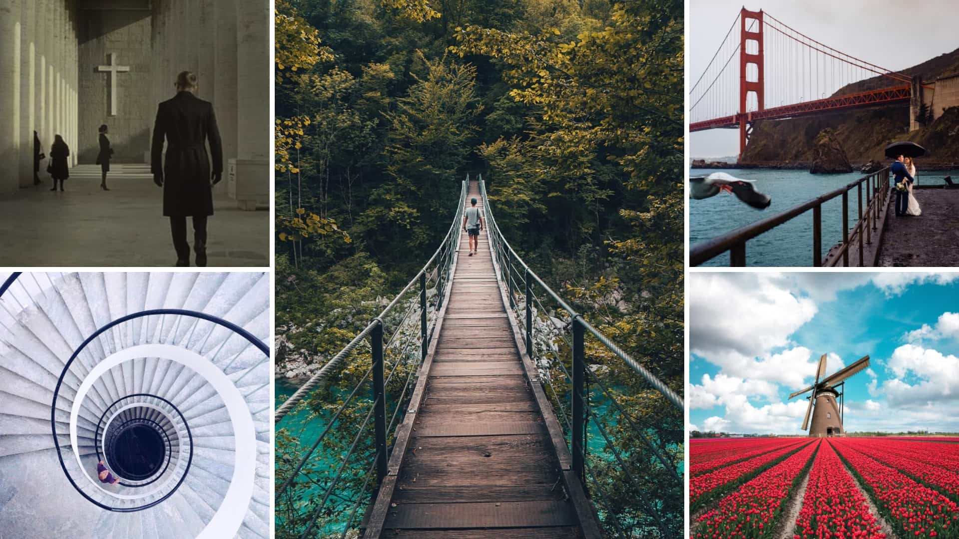
How To Create Leading Line Photos
Leading lines, either found naturally in a composition or deliberately included, always serve the purpose of focal points to direct attention in certain regions. These visual indicators add to the dimensionality and dynamism of the photographs, creating a perception of a visual trip from one area to another within the frame. The technique also accelerates the narrative features of images, like highlighting the enigma in a row of trees in landscapes and the astounding symmetry of architectural elegance or splendor found in road and railway networks. Furthermore, these lines can be multidirectional, including straight, diagonal, curvy, zigzag, and many others, which facilitates several creative options to include in the images to be edited. To enhance your visuals with leading line illustrations, various software programs offer related features and options for breathtaking compositions. This article exhibits a set of steps to create leading-line photos with optimal results. For a directional workflow, we will employ Adobe Lightroom as the primary mode for the image manipulation task.
Step 1: Analyze the already present lines
Start your editing activity by critically observing the image you aim to modify by boosting leading lines. Note any natural or constructed lines already visible, be they a winding way, architectural highlights, or straight elements.
Utilize the zoom function to have a closer look at the lines. This zoomed assessment helps you evaluate their impact and potential for enhancement during the altering process.
Examine how these lines contribute to the overall composition. Evaluate whether they draw the viewer’s eye successfully and if there’s space for improvement.
Assess the lines’ arrangement inside the frame. The objective is to guarantee that they direct the viewer’s look interestingly, contributing to the overall motif of the picture.
Find out if particular focuses along these lines may profit from more focus.
Investigate the common stream of the lines and how they are connected with other components within the image.
Step 2: Resize the image with the cropping tool
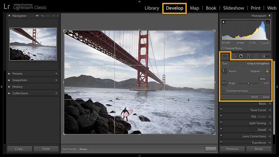
After consistent line identification, you can move on to image resizing using the cropping options offered by Adobe Lightroom.
Locate the cropping tool and begin resizing your image with exactness, paying attention to upgrading the effect of the distinguished lines. Crop wisely to highlight and refine the leading lines inside the outline.
Set the composition to direct the viewer’s gaze along the leading lines naturally. Utilize the crop to make a clear way, ensuring the lines play a central part within the visual story.
Play with diverse aspect ratios to discover the one that best complements your composition.
Strive for cropped-picture coherence while emphasizing the key lines. Avoid superfluous diversions on the edges.
Employ the rule of thirds for a nicely balanced image trim. Adjust the leading lines with the gridlines to make a visually satisfying and agreeable composition.
Try exciting viewpoints by cropping from distinctive points. This will impart a sense of profundity and dynamism to your picture, making the leading lines indeed more impactful.
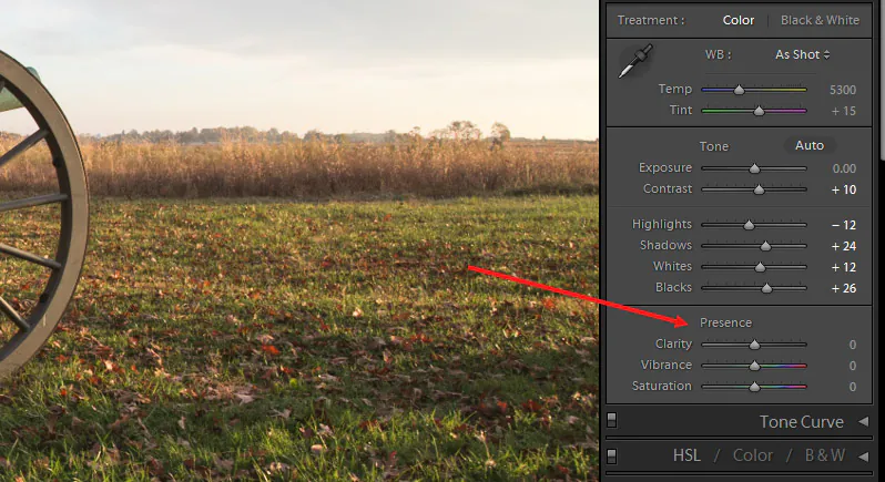
Step 3: Manipulate the image contrast and clarity
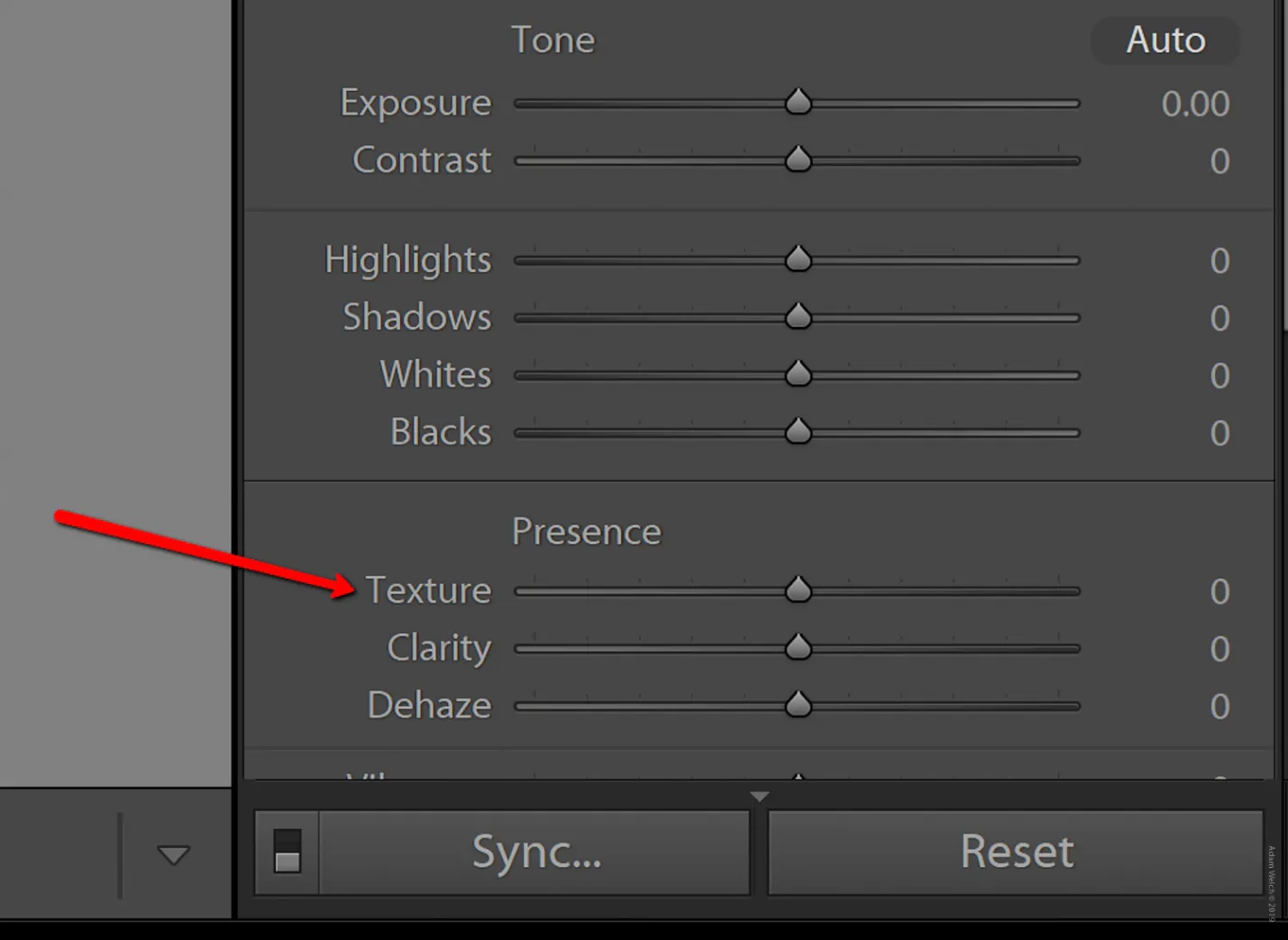
Move to the Contrast slider in the Basic Board. A minimal increment includes elaboration for leading lines, bringing out their presence inside the outline.
Go to the Clarity slider to amplify sharpness along the lines. This option brings out complicated details so that your leading lines stand out noticeably.
Find the Tone Curve panel for a refined approach. Modify the curve to adjust highlights and shadows, contributing to a realistic and engaging appearance.
Infuse texture with the Texture slider. This gives a tangible feel to the lines, highlighting their surface details without compromising their general smoothness.
Utilize the Graduated Filter tool for accuracy setting. Apply it specifically to specific ranges, fine-tuning contrast and clarity to suit the subtleties of your composition.
Keep up the consistency in the picture with these tools. Coordinate contrast and clarity alterations for a cohesive and uncluttered look.
Practice moderation for exquisite results. Minor increments in contrast and clarity avoid overcompensated impacts, protecting an organic aesthetic.
Consider the general temperament you need to communicate. Tailor the contrast and clarity settings to create an energetic environment.
Step 4: Explore the highlight and shadows sliders
![]()
Tune the Highlight slider setting to control the strength of bright ranges along the lines. Delicate alterations bring out details without overpowering the composition.
Next, move to the Shadows slider to refine the darker zones around the lines. for the lavishness and three-dimensional quality enhancement.
Accomplish a tuneful adjustment between highlights and shadows. Try for a distribution that complements the lines so that neither component overwhelms the other.
Even out moves between highlights and shadows. Progressive alterations aid in getting a smooth stream.
During alterations, keep the general contrast in your thoughts. Look for a reasonable contrast that emphasizes the lines while keeping up a natural appearance.
Add adjustments globally to the complete image and consider localized alterations utilizing brushes or channels for particular regions.
After making tweaks, audit the picture to confirm that the exchange between highlights and shadows increases the visual effect of the leading lines.
Review the lighting conditions in your scene. Altering highlights and shadows decisively adjusts your picture to different lighting settings, which leads to a responsive and impactful conclusive composition.
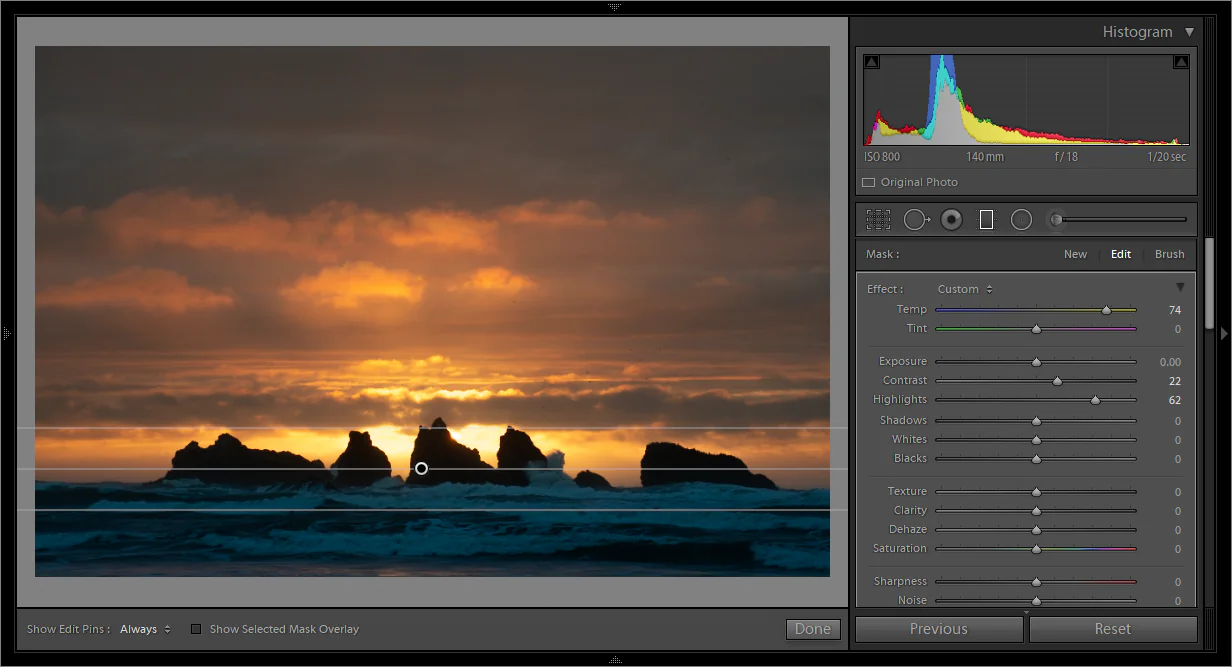
Step 5: Play with a graduated filter for selective region enhancement
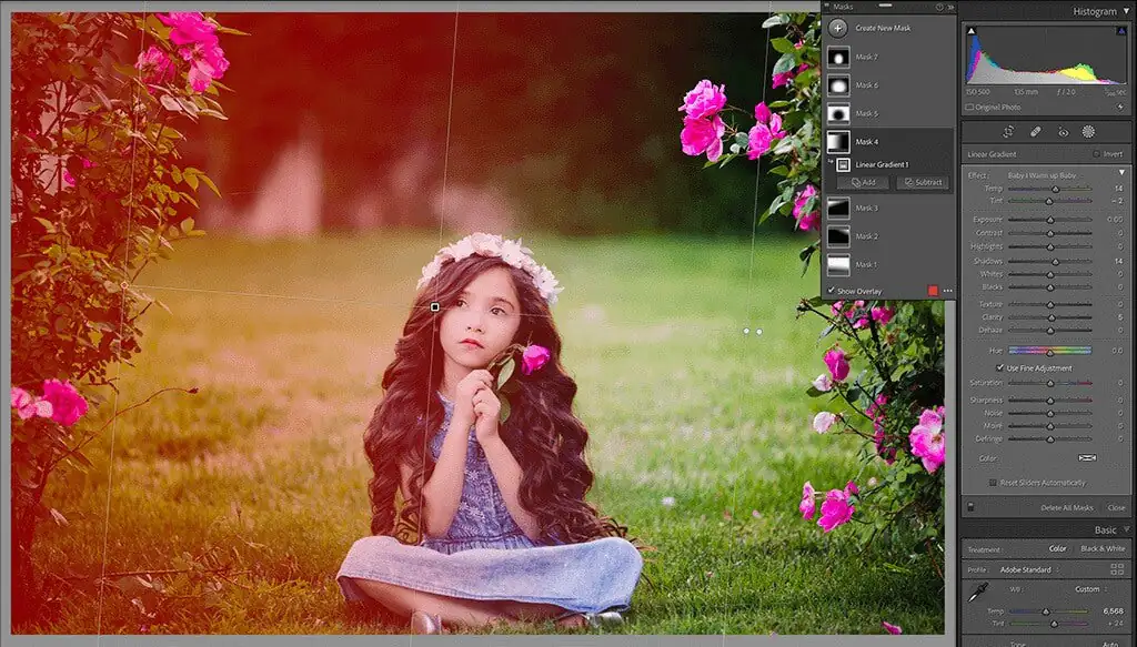
Find the Graduated Filter tool within the toolbar. This effective highlight permits particular alterations, culminating in improving particular regions along your leading lines.
Draw the Graduated Filter along the course of your lines. This gives a controlled slope for nuanced alterations to ensure the improvements are consistently coordinated.
Utilize sliders for exposure, contrast, and saturation inside the Graduated Filter. Tailor these alterations to key focuses along the leading lines while keeping up a coherent shift.
Make mild shifts between filtered and non-filtered regions so the alterations will blend consistently, dodging sudden changes that seem to divert from the leading lines.
After applying the Graduated Filter, analyze your image. Tune the settings to attain the required emphasis on the leading lines.
Step 6: Regulate the image’s vibrance and saturation
Explore the Saturation slider and carefully alter it to improve or tone down the intensity of colors along the leading lines. Keep up an adaptation that complements the overall temperament.
Locate the Vibrance slider to specifically improve muted tones without oversaturating the complete photo. that brings variation to the color palette, contributing to a more elegant visual encounter.
Opt for a coherent color palette that corresponds with the disposition and theme of your photo. Stifled or vibrant, your choice should improve instead of dominating the leading lines.
Consider utilizing local adjustment tools for specific regions. Brushes or filters assist you in targeting alterations to make saturation and vibrance upgrades absolutely complement the leading lines.
Try your best to attain a natural and genuine representation of colors. Modifying saturation and vibrance ought to improve the visual involvement without drifting from the inherent excellence.
Evaluate the effect of your alterations continuously. The objective is to inject enthusiasm into your leading lines, creating a noteworthy composition.
Step 7: Assess and tune the white balance
Go to the White Balance settings in the main panel. Utilize the temperature and tint sliders to tune up the color temperature and broad balance of your photograph.
Make efforts to create a natural and precise color portrayal. Alter the temperature to make the whites appear neutral, protecting the genuineness of the scene while fitting with the leading lines.
Reckon the general lighting conditions in your scenario. Set the white balance to coordinate with the winning light, creating a cohesive and harmonious environment.
On occasions where programmed settings are insufficient, consider employing a custom white adjust tool. This lets you sample a neutral zone within the picture for an exact color evaluation.
If you want to edit a series of photographs, retain consistency in white balance adjustments. That results in a linked-up visual encounter, letting your viewers consistently browse your collection.
Step 8: Observe the overall adjustment for necessary final tweaks
Take zoom-in and out views of your work to thoroughly observe it and to fine-tune any inconsistencies or diversions that will be brought to attention.
Confirm the consistency of your improvements and alterations made to contrast, clarity, saturation, and other parameters for a consolidated visual encounter.
Affirm that your refined composition keeps up symmetry. The leading lines should enhance, not overload, and the composition should pass on your expected message with clarity.
Survey the vital effect of your refined picture by noting that the leading lines should not only be eye-guiding but also maximize the viewer’s involvement.
Recheck the color harmony, confirming that the saturation, vibrance, and white balance adjustments are helping to attain a pleasing color palette.
At last, make any tweaks. as required, like a minimal change to exposure or a subtle refinement of color tones; these wrapping-up touches can propel your photograph to its full maximum potential.
Conclusion
In summary, the leading lines in photos enable the thoughts of the viewers to be carried away into an aura of symmetry and angular energy. These lines contribute to the image enhancement procedures being so directed and adaptive that the creators can drastically intensify the image’s potential by merely working on selected points. The leading lines are evident in almost every image in the form of different elements, either natural or created by humans. So this image manipulation strategy is practical for even a novice editor since it explicitly highlights the vital zones of an image, thus facilitating manipulation and optimization.
