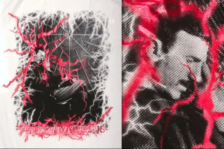
How To Create A Silkscreen Print Effect
For more than a century, silkscreen printing has been utilized in the creative and commercial sectors to attain innovative designs, as well as in the apparel and accessory industries to print images and designs. This printing technique can considerably create vigorous and enduring prints upon enormous materials, including fabrics, plastics, and paper. In this process, a thick coating of ink is applied directly onto the material, yielding results that are usually significantly more powerful and brilliant than digital printing, which uses dots of colour in the CMYK manner. Thus, silkscreen printing is considered a prime option to achieve the necessary effects if a print needs to be really bold and bright. To add the exquisite effects of silkscreen prints in images, digital artists and editors can employ different editing techniques. The main approaches include halftone effects, colour adjustments, contrast adjustments, manipulation of blending modes, and many more. This blog will provide a precise description of using different editing options to add a silkscreen print effect to an image.
Step 1: Image Selection
Start by selecting a high-resolution photo that simply needs to be converted with a silkscreen print effect.
Search for a photo with distinguishable features and surfaces that will stand out when converted to grayscale and conducted with halftone effects.
Prefer a photo with adequate resolution (such as 300 DPI or higher for print quality) to preserve clarity during editing and printing.
Note that the ultimate effect will be grayscale with halftone dots. Select a photo with a range of tones and contrasts that will make a fascinating visual mark in grayscale.
Prefer a photo with a captivating subject and composition that will benefit from the stylized effect. Factors like substantial lines, textures, and contrast between light and shadow can exalt the ultimate result.
Before continuing, guarantee the photo is saved in a format compatible with your editing program and make any essential backups to protect the initial file.
Step 2: Grayscale Conversion
After photo selection, the next step is to change it to grayscale to schedule the application of the silkscreen print effect.
Initiate Adobe Photoshop and open the chosen image file by going to File and Open options.
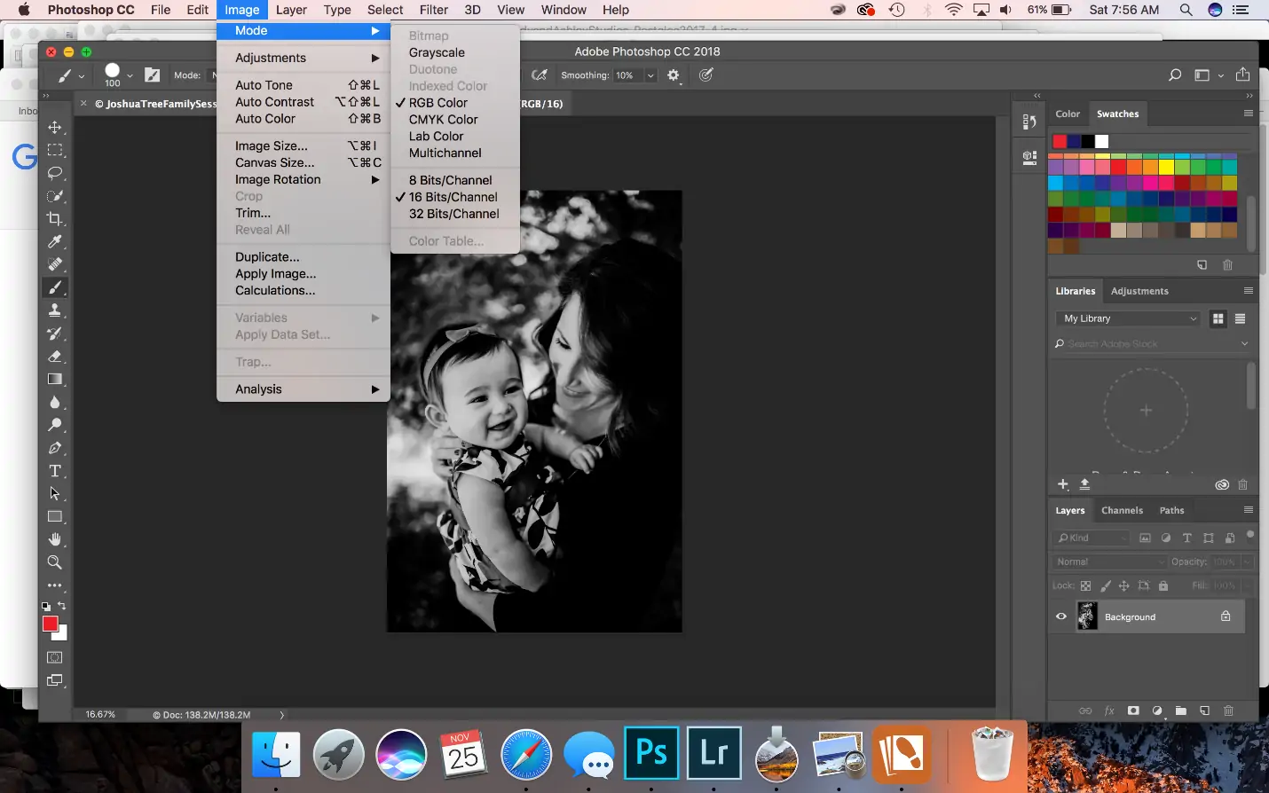
Proceed to Image > Mode > Grayscale to convert the photograph from colour to grayscale. Verify any prompts which will show up concerning colour mode transformation.
Next to the conversion, assess the grayscale picture to confirm it keeps up clarity and detail. Acclimate brightness and contrast utilizing Image, Alterations and Levels to emend grayscale tones.
Save a duplicate of the grayscale image with a new filename to protect the initial colour form for future reference or editing.
Changing over to grayscale simplifies consequent editing steps by focusing on luminance values instead of colour information.
Before continuing to the following step, zoom in on vital zones of the photo to ensure basic points of interest are protected and ready for enhancement with halftone patterns.
Step 3: Halftone Application
This step is about applying the grayscaled image with a halftone impact to reenact the characteristic dot pattern of silkscreen printing.
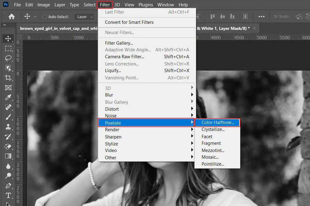
In Adobe Photoshop, head to Filter, Pixelate, and then Color Halftone to get to the Halftone parameters.
As a result, you will see a dialog box where you can adjust the Max Span parameter. This controls the dimensions of the halftone dots. Begin with a moderate value of almost 8 pixels, and observe how it influences your photo.
Halftone dots build the figment of shades and gradients by shifting dot sizes. Revise the Screen Angles as required to avoid Moiré patterns, particularly if printing later.
Utilize the preview checkbox to witness how the halftone effect changes your photo. Tune the Max Radius until you accomplish a proportional conveyance of dots that fulfils your photo.
Ensure critical segments in your photo are still perceivable after applying the halftone effect. You ought to adapt the contrast and brightness further using Image > Adjustments > Levels to facilitate clarity.
Keep saving your work intermittently beneath different filenames to protect different stages of editing.
Adding halftone imitates the formation of conventional silkscreen prints, where ink is connected in dots to form shades and tones.
Step 4: Levels Modification
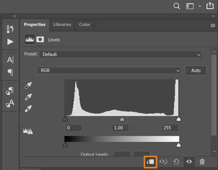
To alter the levels to polish the contrast and brightness, go to Image > Adjustments > Levels. That will open the Levels dialog box, where you’ll be able to control the tonal range of your picture.
Utilize the Input Levels sliders to alter the shadows, midtones, and highlights of your photo. Use the left slider to vary the shadows, the middle one to alter midtones, and the right one to work on highlights.
Drag the left (shadow) and right (highlight) sliders inward to modify the black and white points, expanding contrast.
Alter the middle slider to regulate the midtones, adjusting the general brightness of the image.
Utilize the preview checkbox within the Levels dialog box to flip between the adjusted and original forms of your photo. This lets you survey the influence of your adjustments before applying them forever.
Save your work routinely under different filenames to protect distinctive stages of editing.
Step 5: Separating Colours
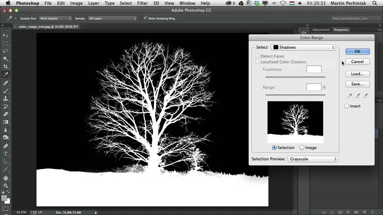
If your arrangement or photo includes different colours that you just like to isolate for silkscreen printing, you’ll continue with this step.
Create Duplicates of your grayscale photo layer for each colour component you need to isolate. For instance, if your design has three colours, make three duplicate layers.
Access selection tools via Select > Color Range, Magic Wand, or Pen Tool to separate areas of each colour on its individual layer. Upgrade selections as required to ensure precision.
Use layer masks for each colour layer to cover up undesirable zones and uncover them as they were the chosen colour components.
Regulate each colour layer separately utilizing adjustments feature to improve contrast, brightness, or colour tones as wanted.
Save each colour-separated layer as a partitioned file or inside the same document if planning for silkscreen printing. This approach encourages precise colour generation during the printing process.
Step 6: Blending Modes Setting
Select a reasonable surface image or pattern that goes with the style you need to attain. Surfaces like paper grain, fabric weave, and ink splatters work excellently in recreating conventional print media.
Open your texture file in Photoshop. Extract and drop the surface onto your picture. Confirm that the texture layer is situated over your artwork layers.
Try different blending modes like Overlay, Soft Light, or Multiply to correspond to the texture consistently with your artwork. Alter layer opacity is required to regulate the intensity of the texture creation.
Employ layer masks and eraser tools to specifically apply the surface to particular zones of your composition. This procedure allows you to preserve clarity in vital subtle elements while improving the general visual attraction.
Alter texture layers utilizing Image > Adjustments for brightness, contrast, or colour balance to coordinate the surface more concordantly with your work of art.
Step 7: Finalizing The Image
Audit the prevailing colour balance and contrast of your composition. Utilize alterations like Brightness/Contrast, Levels, or Curves to elevate the tones and improve the visual mark.
Zoom in to review for any ranges that will require sharpening or extra detail. Utilize tools like Sharpen, Blur, or Dodge/Burn to specifically improve or soften details as required.
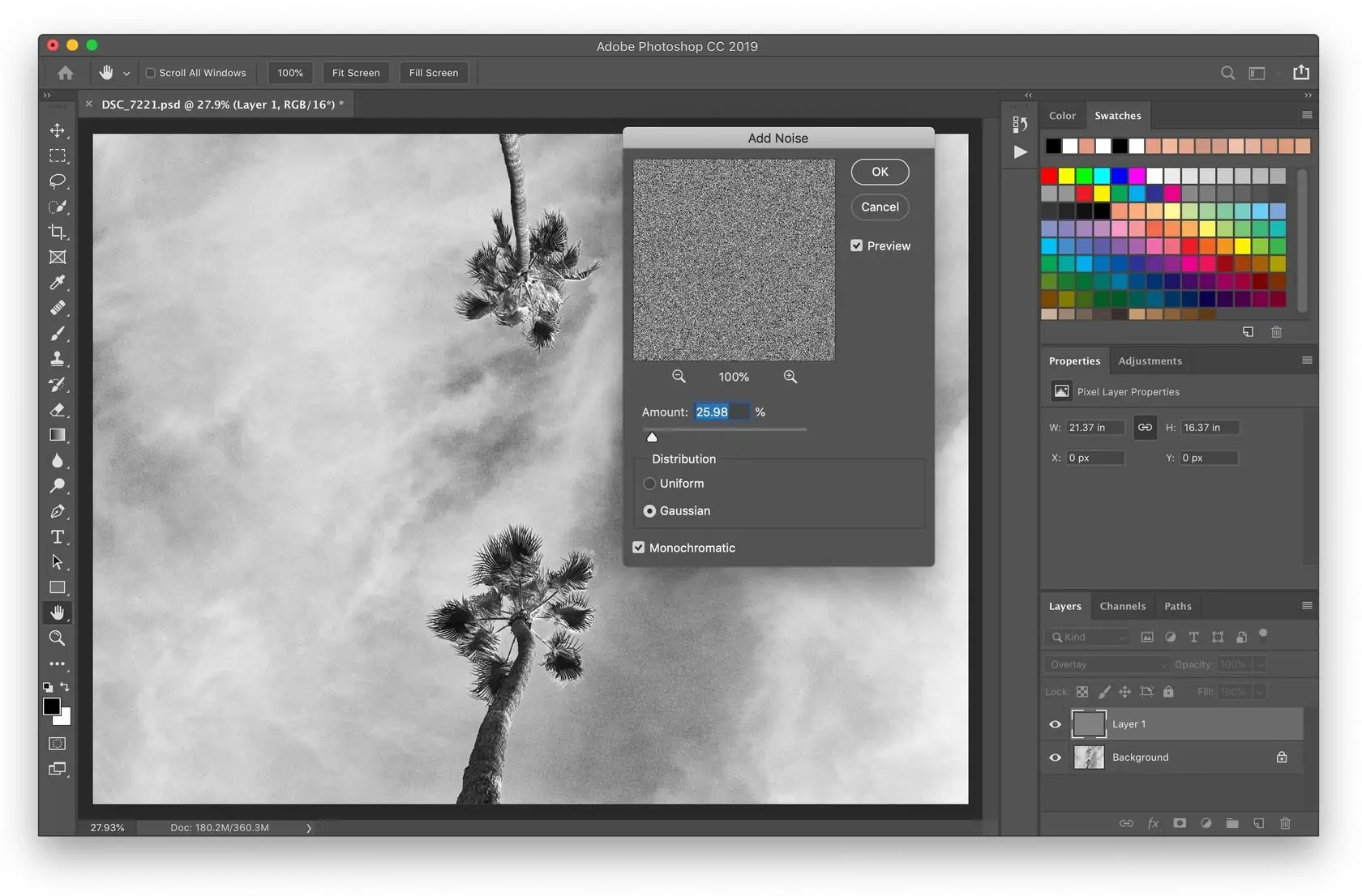
To recreate the texture of conventional prints further, consider including a subtle noise or grain effect. Utilize Filter > Noise > Add Noise settings with a descending value to present a fine-grain surface.
Check that the edges are neat and well-defined. Utilize tools like Eraser or Layer Mask with soft brushes to fix edges and dispose of any undesirable remnants.
Flip layer visibility and see your artwork at distinctive zoom levels to ensure consistency and coherence over the whole composition.
Save your final image within the fitting file format while Keeping up a high-resolution version appropriate for printing purposes.
Conclusion
In general, enhancing images using a silkscreen print effect gives your shots an unusual, phenomenal appearance suggestive of conventional screen printing. The resultant images feature flamboyant contrasts, charming dotted halftone surfaces, and an organic handcrafted feel. This editing approach can be utilized for aesthetic purposes, such as developing a retro look or formulating a design for real screen printing. Moreover, the inclusion of specified textures can recreate the impression of ink on paper or fabric, elevating the material feel. Multi-colour schemes further make the image memorable with its gripping and dazzling aesthetic, more than ordinary digital images possess.
