How To Create An Image Quilting Effect
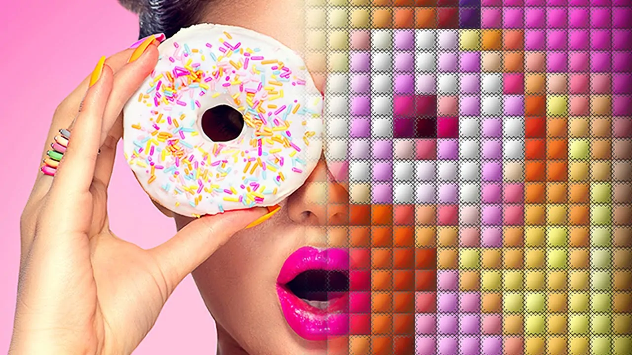
The quilting effect turns an image into an intricate patchwork, as seen on the actual quilts. The image is turned into evenly divided segments, each of which is then separately adjusted for a refined final appearance. The geometric shapes like squares or rectangles attain a unified yet fragmented layout mimicking the fabric art patterns of a quilted surface. This unique art practice highlights visual diversity while conserving harmony and symmetry across the whole composition. Furthermore, you can also try varying colours, contrast, saturation, and textures in different segments with aesthetic borders used to emphasize the participation of each segment in making a balanced artwork. The grainy and fabric-like textures are also used to elevate the tactile feel further, making it seem like an actual quilt. The image quilting effect is common in various art projects, as well as photo editing to enhance the visual narrative as well as multiformity. This blog will go on with a step-by-step process of creating an image quilting effect by integrating unique elements in a harmonious way.
Step 1: Image Segmentation
Determine how you would like to divide the photograph into segments, like squares, rectangles, or irregular patches. A grid-based design can be an awesome choice for symmetry and simplicity.
Utilize an editing program such as Adobe Photoshop, GIMP, or Canva to begin creating the sections. Photoshop is especially compelling for detailed formats.
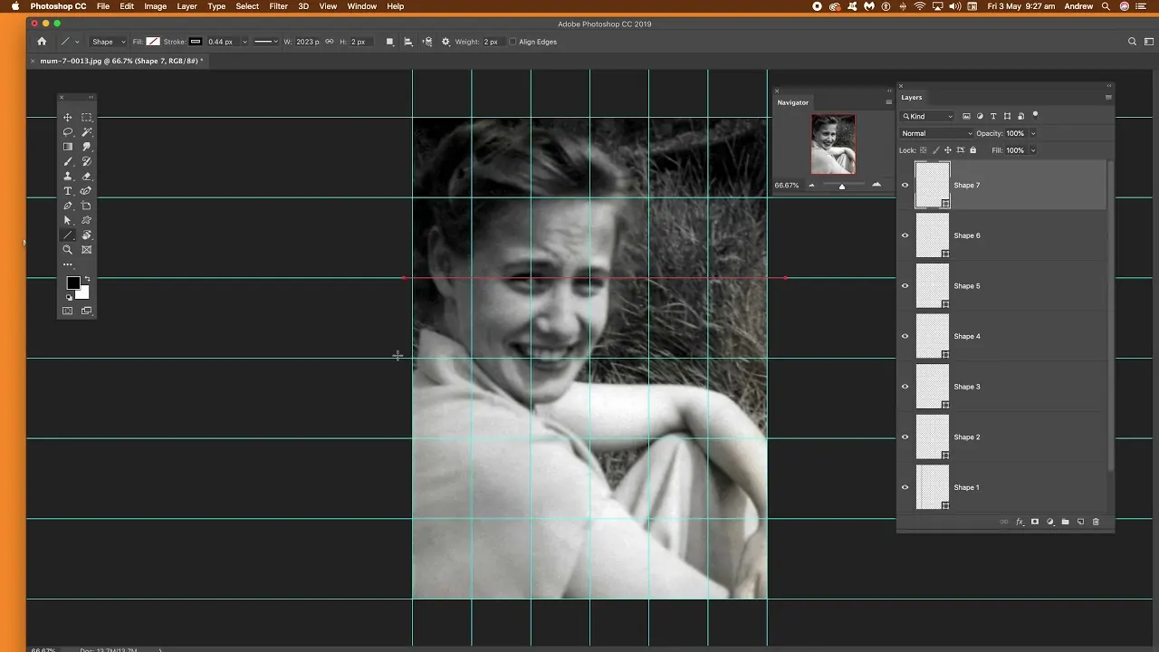
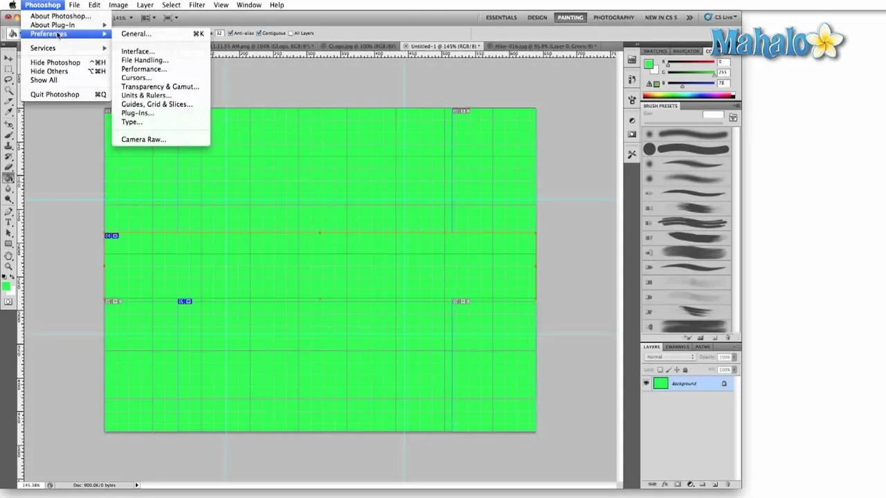
Initiate the grid feature in Photoshop by getting to View > Show > Grid. It exhibits a visual guide for dividing the image equally.
Modify the grid spacing for accuracy by going to Edit > Preferences > Guides, Grid, and Slices in Photoshop. Tailor the grid dimensions to correspond to your desired layout.
Pull guides from the rulers to make specific divisions within your photograph. These guides help make sure that your segments are accurate and well-adapted.
Make a duplicate of your picture layer to protect the initial and work non-destructively.
Utilize selection tools like the Rectangle Marquee or Lasso to confine each segment onto individual layers. It permits you to alter each portion independently afterwards.
Step 2: Selecting Individual Effects
Consider the general disposition or theme you need for each segment of the picture to communicate. Look into utilizing contrasting effects for variety or keeping up consistency for a unified appearance.
Select the editing software you are satisfied with, such as Adobe Photoshop or GIMP, as they provide refined tools for applying specific effects to distinctive image areas.
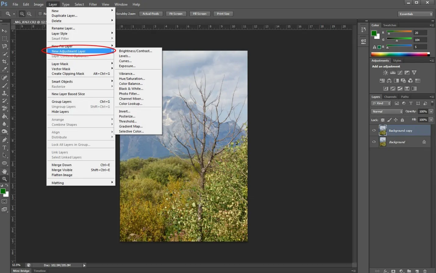
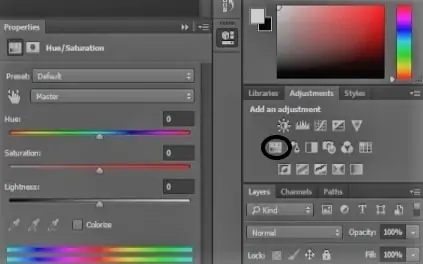
Utilize adjustment layers in Photoshop, like Brightness/Contrast, Hue/Saturation, or Colour Balance, to modify each section’s formation independently.
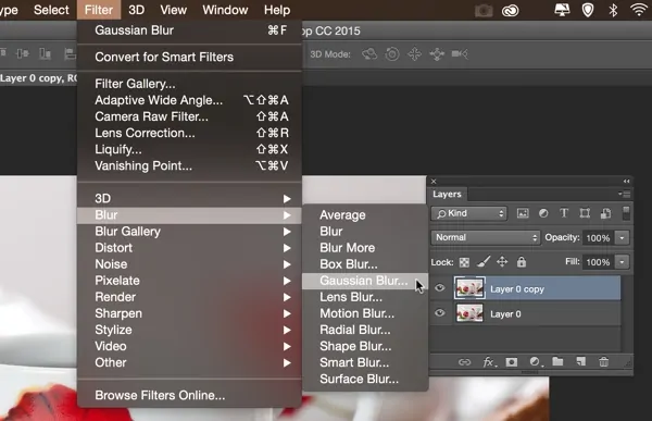
Try distinctive filters such as Gaussian Blur, Lens Flare, or Noise for some sections to include texture or depth. Each segment can have its own striking style.
Utilize colour overlays, gradients, or surfaces to provide each patch a special impression, from dynamic and saturated to quieted and pastel.
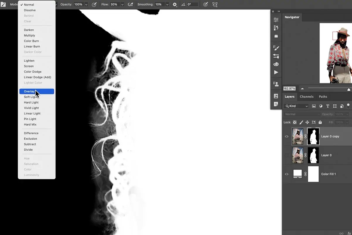
Try different blending modes, including Overlay or Multiply, for creative effects where textures or colours correspond in startling ways.
Step 3: Autonomous Editing Of Patches
Work on one area at a time to focus your edits on, guaranteeing that you work on the photo’s individual portions without influencing others.
Utilize the editing tools in your program, like brushes, filters, or adjustments, to apply changes to each segment. Make sure that you work on isolated layers for non-destructive edits.
Play with different colour treatments, including increasing or decreasing saturation, modifying the hue, or including vibrant contrasts, depending on the feel you’re opting for.
Try including texture impacts such as noise, grain, or fabric-like patterns in each area of the quilting design.
Consider the sharpness of each section, as some segments could look better with upgraded clarity, while others may benefit from a slight blur.
You can employ advanced techniques such as selective dodge and burn to create lighting contrasts, including dimensionality to individual patches.
After you are done with each patch, assess how sufficiently each edit stands alone while serving the whole. The objective is a harmonious balance of individuality over sections.
Step 4: Including Borders
Once you have edited each patch, look into including borders between them to get clear divisions. That can help highlight the quilt-like pattern of the photograph.
Utilize a thin white or black line to partitioned sections, confirming that the border is not too wide to distract from the picture itself.
If you like a more nuanced practice, test semi-transparent borders or delicate shadows to make the divisions look more fluid.
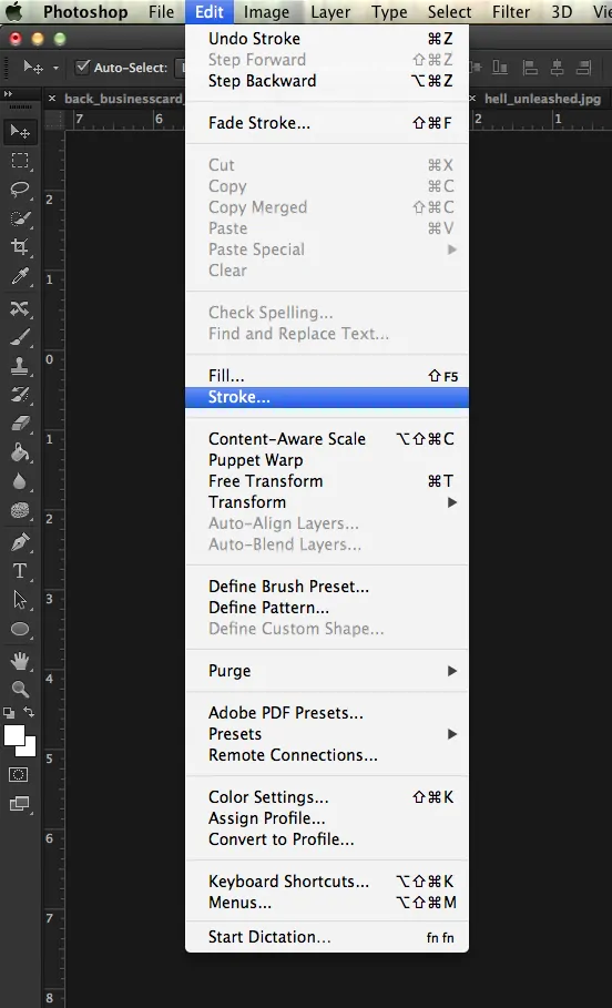
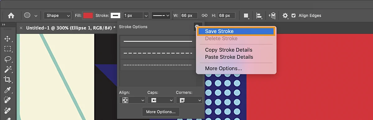
Utilize Photoshop’s Stroke tool to apply steady borders to each segment. Proceed to Layer > Layer Style > Stroke, and alter the size and colour till it corresponds to your craved look.
On the other hand, manual borders can be applied by selecting the area and making a modern layer for the border. Utilize the Rectangle or Brush Tool to create the lines around each segment.
Include subtle impacts such as gradients or textured lines to make the borders look blended more naturally with the image while still keeping the separation intact.
Observe how the borders look in the scene along with your whole image, accommodating them until they conform to the general design without being overwhelming.
Step 5: Texture Application
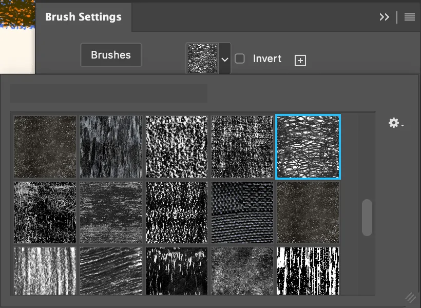
Select the textures you need to include, like fabric, grain, noise, or even paper, to provide your picture with a tactile, quilt-like formation. These surfaces ought to accommodate the aesthetic you are opting for in each patch.
Bring the texture files into your editing program or utilize built-in texture brushes available in apps like Photoshop or GIMP.
Spread the texture to each area individually. You can either paste a texture picture specifically onto the layer or make a new texture layer and specify the blending mode to Overlay, Multiply, or another mode for distinctive effects.
Play with opacity levels to control the strength of the texture. Decreased opacity makes the surface more nuanced, whereas higher opacity amplifies its presence.
Utilize masks to refine surface application, making sure that the texture only influences the particular region it is implied to. Masking permits you to paint or erase portions of the texture without changing the underlying layer.
Integrate multiple surfaces to make a layered, complex effect. For example, incorporate fabric-like surfaces with grainy noise for depth and visual appeal.
Study the finished result over all segments to guarantee that surfaces improve the photograph while keeping the overall quilt formation cohesive. Alter as required for consistency.
Step 6: Checking Visual Harmony
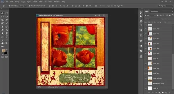
Survey the whole image to make sure that the different sections complement one another. Though each patch is independently altered, the entire picture should feel like a harmonious piece.
Attend to the colour balance between areas. If any one of the patches is too saturated or quieted, alter its colours to make sure it does not stand out too much unless it is part of your design goal.
Look at the textures you have included to be sure that they are consistent throughout the photograph. If a few areas look too finished while others look level, look into altering the texture opacity or including more detail in the underrepresented segments.
Be sure that the borders that are isolating the segments do not distract from the picture as a whole. As fundamental, soften or modify the borders, so they stay present but do not disrupt the composition.
Concentrate on the visual stream of the picture. Check that the divisions between the patches do not make unbalanced lines or shapes but instead direct the viewer’s eye naturally over the artwork.
Look into the photo’s contrast. Make sure there is a harmony between light and dark ranges, making sure that no segments end up too overwhelming or too light compared to others.
Step 7: Finalizing And Exporting
After refining each segment and ensuring visual agreement, conduct a last check for any irregularities or ranges that require adjustment before wrapping up.
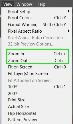
Utilize the Zoom in option to examine little details and ensure all edits are clean, with no stray marks or unfinished sections. Clean up any excess surfaces, lines, or adjustments.
Survey the general composition for equilibrium in terms of colour, textures, and contrast. Alter opacity levels or make minor alterations if any area feels imbalanced.
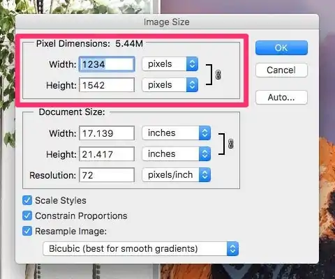
Reassure that the picture resolution is suitable for your final yield. If the picture is aimed for print, check the DPI and make any fundamental alterations to prevent pixelation.
After you are satisfied, you can export your composition using the desired format. Also, consider the file size, which depends on how the picture will be used.
Audit the exported file to affirm that it shows up as intended on diverse screens or in print. Modify settings as required and conclude your project to share or publish.
Conclusion
In summary, the quilting effect is becoming more and more common among modern artists and photo editors who want to recreate a scene in a creative flowing patchwork. This adaptable art approach is particularly fitting for artwork photos, collages and geometrical forms-based projects. Nevertheless, it can be applied to various types of photographs, including everyday scenes, portraits and even landscapes, which emphasizes the autonomous nature of art. Other than general variations like contrast, colour, saturation, and brightness, a quilting work also creates multiple moods integrated into a single frame. Finally, the final images exhibit a consonance between individual attributes of different elements or patterns as well as the unity emerging with the coordination of that individuality.
