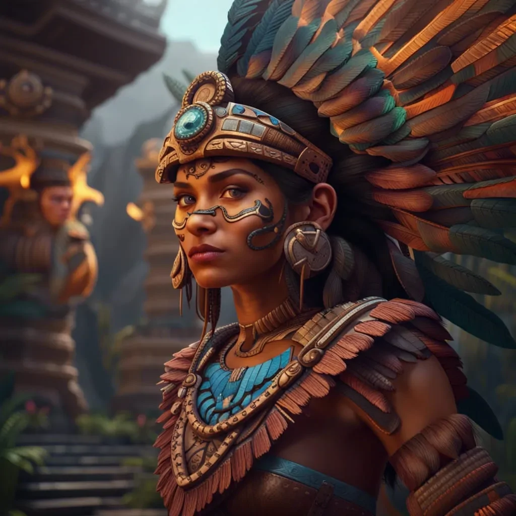
How To Create Aztec Art Effects
The Aztec civilization, which thrived in what is now Mexico from the 14th to the 16th centuries, is the source of the Aztec art. Aztec art generally concentrates on themes like history, sacrifice, and warfare and is said to have been produced for religious reasons. Stone sculptures, pottery, wall paintings, and codices are just a few examples of the various manifestations of this art form. Intricate features and abstract shapes set the Aztecs apart from their predecessors, demonstrating their own sense of style in art production. A major component of contemporary Aztec interior design is the use of colours and patterns. In order to incorporate that culture’s influence into contemporary homes, bright, vivid hues like red, turquoise, and yellow are frequently employed. Additionally, with the digitalization of art, the Aztec art effect has now made its significant place in digital art, designs and image creations; artists are taking inspiration from Aztec themes and transforming the atmosphere of their designs and images. Moreover, the Aztec art effect can also be employed in image editing to enhance photographs, infusing a cultural characteristic into them. The step-by-step process of editing an image with Aztec art effects is as follows.
Step 1: Choosing A Suitable Photograph
Choose a photograph with a clear focal point, such as portraits, architecture, or nature components that function well. The subject ought to be intense and well-lit to hold extra overlays and surfaces.
Utilize high-resolution photos to be sure that details stay fresh during alteration. Aztec designs are complicated and require clarity to look eminent against the base image.
A simple or moderately textured foundation makes it simpler to integrate Aztec designs without visual chaos. Active backgrounds can intrude on the lucidness of the effect.
On the off chance that the photo links thematically to indigenous culture or imagery, it’ll upgrade the authenticity of the Aztec effect. Prevent random pairings that need more effort to develop relevance.
Be sure the photograph’s existing tones can be harmonized to conform with conventional Aztec colours like earthy reds, golds, blacks, and greens. It will avoid colour clashes afterwards.
Select a photograph with sufficient negative space where patterns and symbols can be layered without hiding critical components. It will provide room for inventive enhancement.
Step 2: Enhancing The Colours
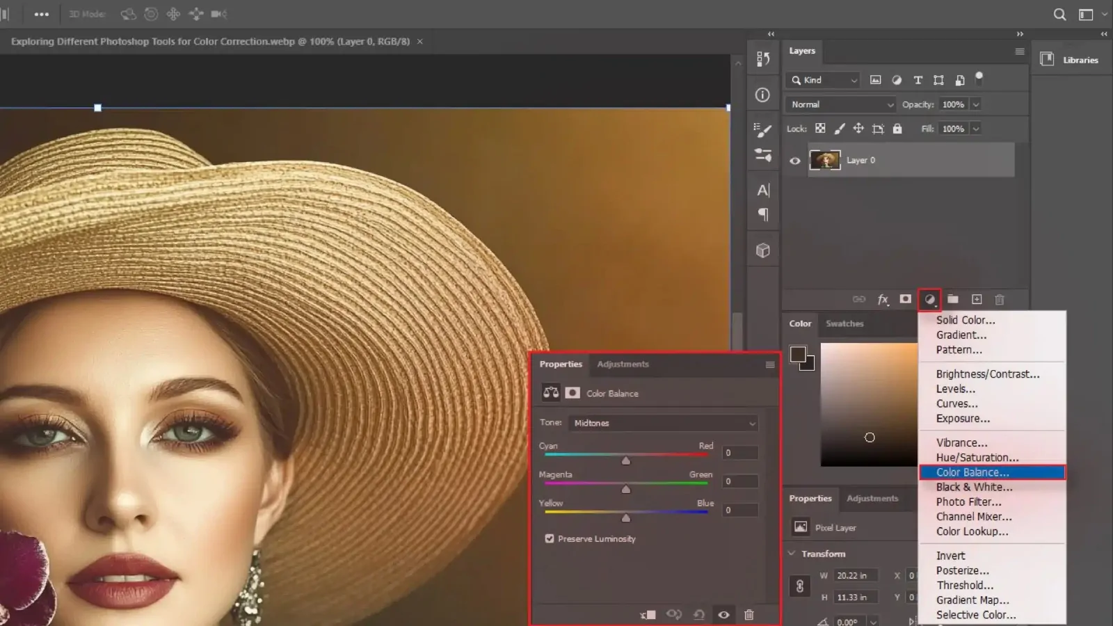
Start by modifying the general colour palette to coordinate conventional Aztec shades like deep reds, terracotta, gold, black, and turquoise. Utilize colour balance or selective colour tools to create the shift.
Somewhat desaturate the initial photograph to form a more aged or natural formation, giving room for the intensity of Aztec components to be distinct later.
Highlight warmth within the midtones and highlights. It will help harmonize the picture with the golden and reddish tones typical of Aztec artwork.
Increment contrast delicately to highlight textures and shape definition without affecting detail. It will make the photograph outwardly ready for layering.
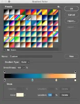
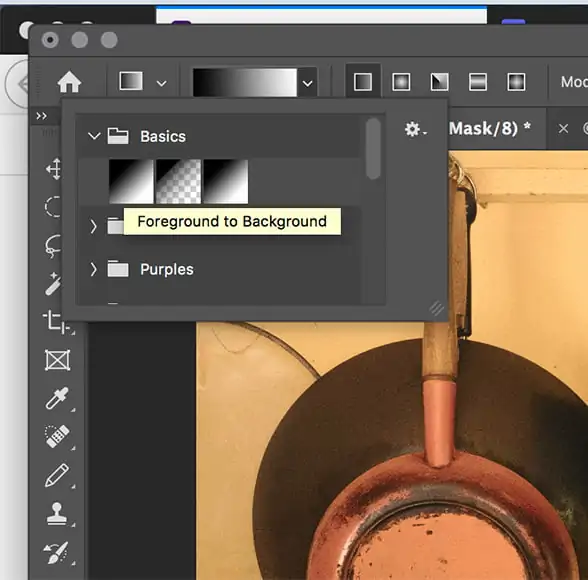
Include gradient maps utilizing custom Aztec-inspired colour schemes. It will offer more control over tone transitions and guarantee consistency within the palette.
If you are editing portraits, isolate and slightly protect skin tones to avoid abnormal discolouration while using global colour grading.
Step 3: Applying Suitable Textures

Choose textures that correspond to Aztec materials such as stone carvings, clay surfaces, rough paper, or weathered paint. These will incorporate depth and an ancient touch to the photograph.
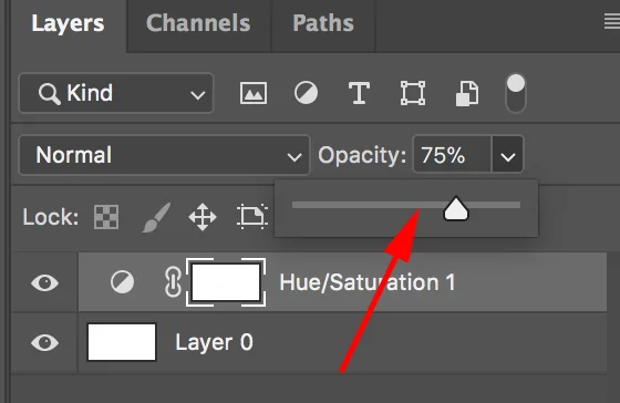
Put the texture layer over the image and decrease opacity around 15 to 40 per cent. It will guarantee that the initial picture remains visible while acquiring surface character.
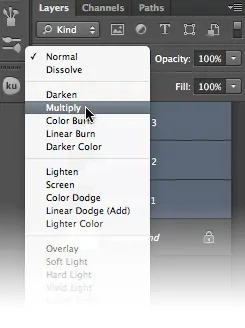
Play with blending modes such as Overlay, Multiply, or Soft Light to coordinate the texture naturally into the photograph without making it seem pasted on.
Mask parts of the picture where texture is unneeded, such as eyes in a portrait or neat parts of a product. It will keep imperative details fresh and clear.
Present a little amount of noise or grain to tie the digital image and texture together, imitating the imperfections of hand-made Aztec art.
Stack different textures together to make a more complex, authentic wrap-up. Alter each one independently for way better management.
Step 4: Adding Pattern Overlays
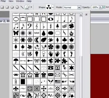
Utilize historically precise Aztec patterns like zigzags, step-fret motifs, suns, serpents, and geometric borders. Vector files or high-resolution PNGs work excellently for pristine addition.
Put patterns along edges, around the subject, or in background spaces. Do not cover the primary focal point. Utilize symmetry or radial layouts to mirror Aztec design standards.
Scale patterns to conform to the photograph proportionally. Repeat smaller designs to make borders or frames, and utilize larger motifs as feature components.
Coordinate pattern colours with the edited photograph palette and adhere to Aztec shades such as gold, black, red, and turquoise. It will keep up visual consistency.
Decrease opacity or mask parts of the pattern for superior blending. It will prevent abrupt contrasts and make the overlay feel integrated.
Be sure that patterns communicate with already added surfaces. Utilize blending modes or noise layers to make them appear as carved or painted, not digitally set.
Step 5: Incorporating Aztec Symbols
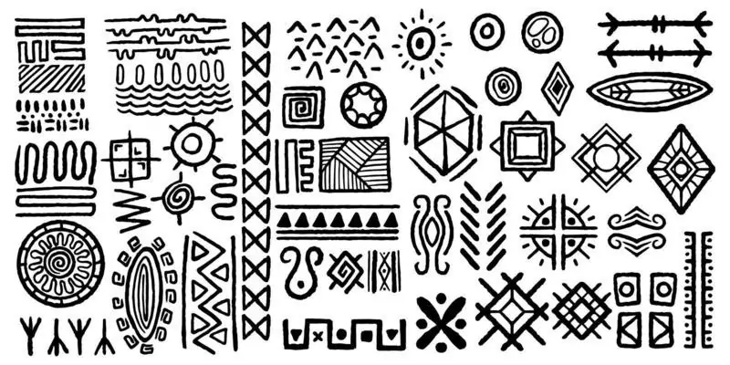
Choose Aztec symbols with particular cultural implications, such as the sun, eagle, serpent, or warrior masks. These will include depth and historical context to the visual.
Put symbols deliberately around the subject or composition, like centred, radial, or corner-based, to prevent any mess. They ought to enhance, not divert from, the primary image.
Keep up the stylized, angular quality of Aztec art. Neat vector symbols or custom illustrations perform sufficiently to protect authenticity and visual keenness.
Be sure that symbols are scaled proportionally to the picture. Excessively large symbols can overpower the frame, while too small may be visually negligible.
Add the same texture and colour temperament to the symbols as the background or patterns to form a unified effect. Utilize soft erasing or layer masks to insert them modestly.
Layer symbols behind or mainly behind components within the image, intensify depth and interaction, making the composition seem deliberate and fascinating.
Step 6: Utilizing Layer Masks
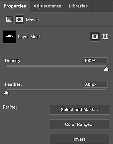
Add layer masks to patterns, textures, and symbols to delete or hide parts without for all time erasing them. It will permit clean integration and simple adjustments.
Ease the edges of overlays utilizing brush feathering or blur tools. It will prevent abrupt lines and make added elements appear like a part of the initial photo.
Precisely shape overlays around the contours of the subject, like its face, clothing, or objects, so that they wrap naturally and feel embedded instead of floating.
Alter brightness, contrast, or employ dodge and burn techniques to conform with the lighting of overlays with the initial photograph. It upgrades realism.
Utilize gradients to fade patterns or textures steadily into the image. It will make smoother transitions and prevent visual blockiness.
Observe the image at high zoom levels to tend to overlaps, settle arrangement issues, and make nuanced refinements that keep the composition groomed and proficient.
Step 7: Adding Final Details
Use the Zoom in option and clean any unpleasant edges, stray marks, or overlapping components. Utilize a delicate brush or eraser tool to ease transitions and fix the composition.
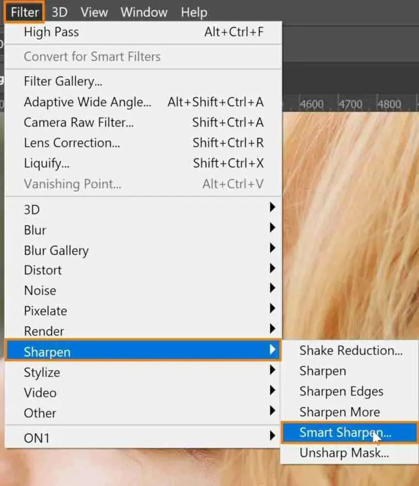
Utilize selective sharpening on the subject’s eyes, facial features, or central points to bring attention and develop depth, particularly in portraits.
Perform any necessary conclusive adjustments to brightness, contrast, and colour balance. Guarantee the whole photograph feels agreeable and outwardly balanced.
Opt for a delicate vignette, noise, or glow to include disposition or focus. Utilize these sparingly to avoid overwhelming the Aztec design work.
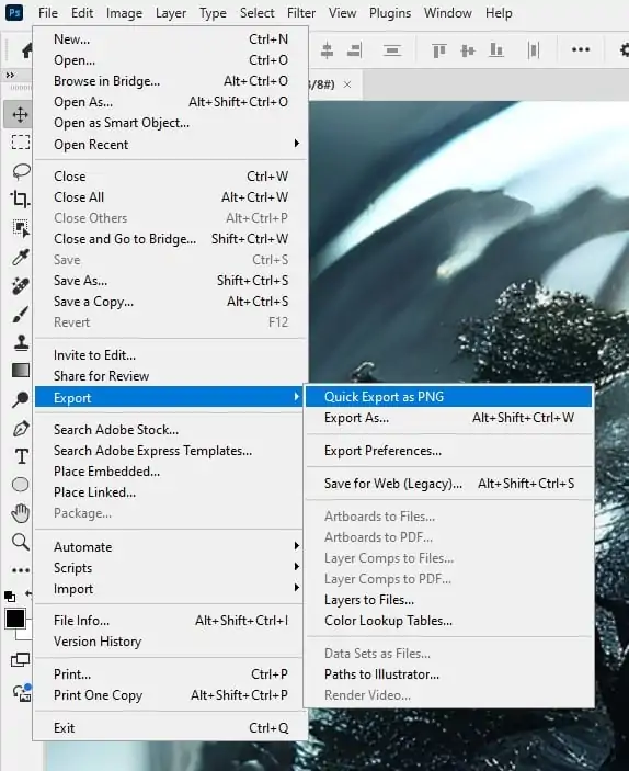
Save in different file types like PSD for editing, PNG for transparency, and JPEG for sharing; all rely on how and where the photograph will be utilized.
Review the ultimate composition at full size and thumbnail size. It will guarantee all components are precise and impactful across different formats and stages.
Conclusion
In conclusion, Aztec art is gaining popularity in the fields of design and art. Aztec patterns provide vivid colours and striking symbols that create an intriguing focal point in any arrangement. Aztec art effectively creates beautiful sights because of its dramatic contrasts between light and dark colours. Additionally, the ancient symbols included in many Aztec designs can be used to symbolize a range of characteristics in a number of visual art genres. Finally, the symmetrical shapes used in Aztec art add a sense of proportion and harmony to anything, including artworks and designs, or even if you use them just to modify your existing shots.
