How To Create A Kitsch Effect
The kitsch effect depicts the wilful inclusion of elements that are perceived as cheesy, overly emotive, or in poor taste to create a specific aesthetic or evoke an ironic, nostalgic, or humorous reaction. This style often includes the use of bright and flashy colors, excessive adornments, pop culture themes, vintage effects, and other cheesy chunks. The kitsch approach for image enhancement recasts a simple image into a perky and dramatic composition that exhibits its own pretentiousness. Such pieces are often appealing to specific audiences or serve as a critique of popular culture and exquisitiveness. To create a kitsch atmosphere within your photographs, editing strategies include modifying saturation and contrast, adding motifs, layering, collaging, color gradients, textural elements, and special effects and filters. By manipulating all these facets of an image, you can effectively revise your images into a kitsch effect composition that stuns your viewers with their excessively playful and enthusiastic nature. This blog will continue with the fundamental step-by-step process of using the above-mentioned techniques practically while creating a kitsch effect.
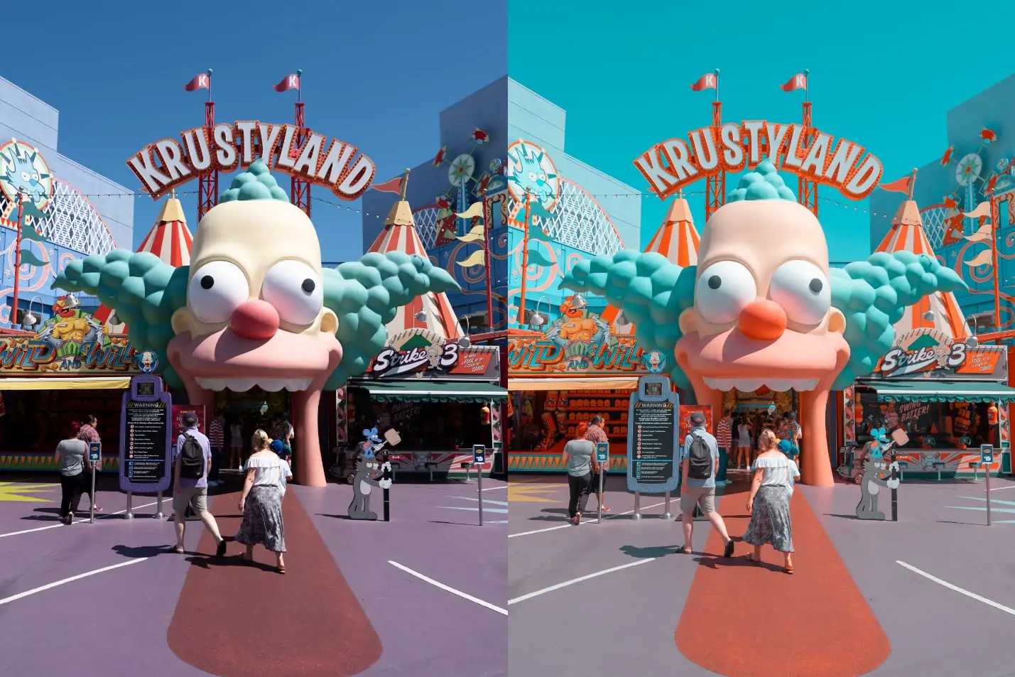
Step 1: Saturation And Contrast Settings
Launch your chosen photo editing program considering options like Adobe Photoshop, GIMP, or Lightroom, and open the photo you need to edit.
Make a duplicate of your original photo layer to guarantee you can return to the initial if required. Right-click the layer and select “Duplicate Layer, and you will have a copy of your image to edit freely.”
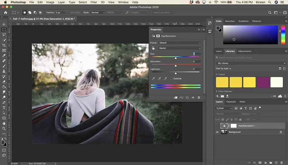
Get to the adjustment tools by navigating to Image > Adjustments > Hue/Saturation. In GIMP, navigate to Colors > Hue-Saturation.
Set the saturation slider to the right to boost the intensity of the colors. Strive for a dynamic, overstated view. Alter slowly to avoid over-saturation.
Head to Image > Adjustments > Brightness/Contrast. Increment the contrast by moving the slider to the right side. This will make the dark zones darker and the bright zones brighter, including profundity and intensity.
Persistently evaluate your adjustments. Regulate both saturation and contrast until you achieve the specified level of energy and visual effect.
Save the balanced photo as a new file to protect the original.
Step 2: Retro Effects Integration
Keeping your photo open within the editing program, head to the filter choices. If using Photoshop, you can utilize the Filter Gallery or Camera Raw Filter. Likewise, GIMP filters are found beneath the Filters menu.
As a safety measure, copy your working layer to preserve an editable backup. Right-click the layer and choose Duplicate Layer options.
Select a retro or vintage filter from the accessible choices. In Photoshop, you might utilize the Camera Raw Filter and alter settings manually or select from pre-installed vintage presets. In Lightroom, investigate the preset area for retro styles.
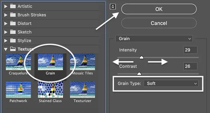
Hone the filter settings to improve the retro effect. Alter components like color balance, fade, grain, and vignette to attain a nostalgic appearance. Expand yellow and ruddy tones to imitate aged photographs.
Apply an unpretentious grain effect to duplicate the texture of ancient photos. Also, if the retro filter is too strong, the opacity of the filter layer should be reduced.
Persistently assess the changes to get the required effect. Once done, save the edited photo as a new file to protect the initial version.
Step 3: Including Decorative Motifs
Make a new layer over your photo layer to keep the decorative components partitioned for simpler alterations, and confirm that they do not specifically change the initial image.
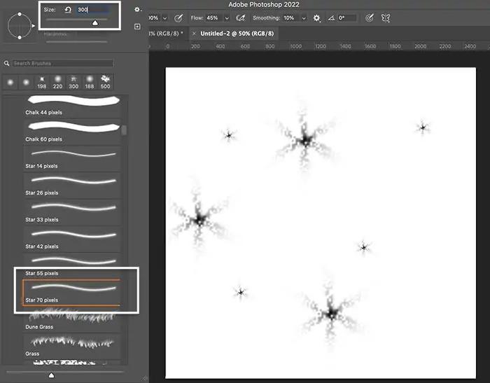
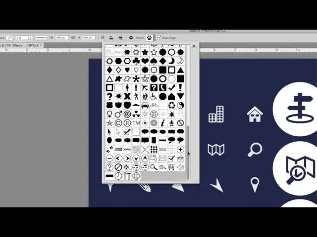
Select from a variety of decorative components such as sparkles, glitter, stickers, or motifs such as hearts, stars, and flowers. These can be sourced from free online packs or made utilizing drawing tools inside the program.
Import embellishing pictures or utilize the brush and shape tools to draw them directly onto the new layer. You can consider options like the Custom Shape Tool or Brush Tool for this purpose.
Deliberately put the decorative components around the photo, focusing on ranges that would benefit from added pizazz. Resize them as needed to make sure they complement the composition well.
Blend the components naturally with the photo by setting their opacity. This ensures they do not overwhelm the most images but rather maximize their overall aesthetic.
For included dimension, consider applying layer effects like glow or drop shadow to the embellishing components. This could be done through the layer blending choices.
Step 4: Using Pop Culture Themes
Take a look at pop culture imagery such as cartoon characters, movie posters, popular artworks, or famous images relevant to your wanted theme. Consider components with nostalgic or kitschy essences.
Select recognizable icons that resound with the general style of your photo. Take images that include humor, incongruity, or wistfulness to the composition.
Source high-quality images of chosen icons from legitimate online databases or make custom outlines utilizing graphic design applications. Guarantee the icons are suitably measured and formatted for integration into your photo.
Fit the chosen icons into the photo composition in a visually alluring way. Position them to complement the existing elements or connect with the most subjects of the image.
Alter the opacity and blending modes of the icon layers to consistently coordinate them with the foundation photo. Experiment with layer masks and blending alternatives to attain a cohesive appearance.
Make sure that the size and scale of the icons are proportionate to the prevailing composition of the photo. Avoid overpowering the image with unreasonably huge or crowded components.
Step 5: Applying Cheesy Filters
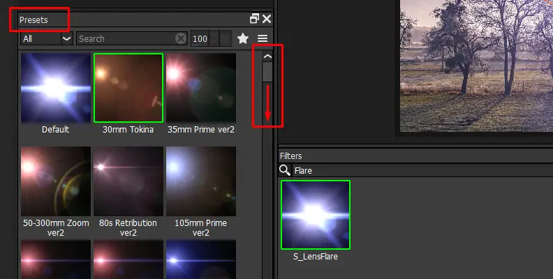
Move to the effects or filters menu in your editing software. This can be where you’ll discover a range of choices to include cheesy visual effects.
Select from an assortment of cheesy effects like lens flares, rainbow gradients, exaggerated shadows, and highlights. These impacts ought to be over-the-top and eye-catching.
Utilize the effects wisely to dodge overpowering the photo. Apply them specifically to particular ranges or components where they can improve the kitschy aesthetic without diminishing the overall composition.
Regulate the settings of each effect to attain the specified level of cheesiness. Explore with parameters like intensity, size, and color to make the specified effect.
Add effects on separate layers to preserve adaptability and control. This permits you to alter the intensity and blending mode of each impact autonomously.
Utilize blending modes and opacity settings to consistently blend the cheesy effects with the underlying photo. Point for a cohesive appearance that enhances the overall kitschiness of the image.
Step 6: Adding Commentary
Get to the text tool and pick a striking and decorative textual style that complements the kitsch aesthetic. Select styles that are unusual, retro, or lively. Alter the font size to suit the composition of your photo.
Make a new text layer over your photo layer so that the content can be effectively controlled and balanced without influencing the underlying image.
Enter your wanted text, whether it’s a catchy trademark, peculiar phrase, or lively commentary. Keep the message brief and impactful to capture the viewer’s attention.
Put the text deliberately inside the composition, considering components such as balance, central focus, and negative space. Play with placement until you discover the ideal position.
Scan the text arrangement, style, and message to ensure it adjusts with the overall kitsch aesthetic. Make any necessary alterations to attain coherence and visual appeal.
Step 7: Making The Frame
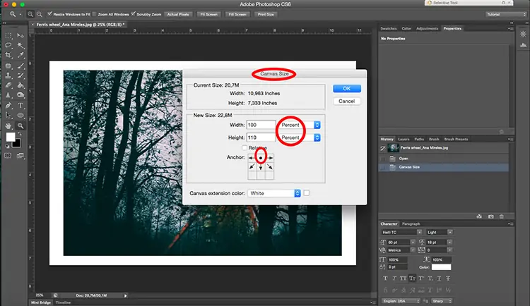
Begin by making a new layer over all other layers in your workspace. This layer will contain the frame or border.
Utilize the shape tool in your software to make a frame or border around the photo. Choose from shapes like rectangles, squares, circles, or custom shapes that suit the composition.
Draw the shape of the frame or border around the edges of the photo. Guarantee it encases the complete image and leaves sufficient space for the main subject to stand out.
Tailor the size and thickness of the frame to your delight. Try using distinctive widths and proportions to discover the correct adjustment for the composition.
Decide a color for the frame that complements the prevalent aesthetic of the photo. Consider utilizing strong, dynamic colors or patterns that improve the kitsch subject.
Improve the frame with decorative components such as sparkles, glitter, or themes that strengthen the kitsch aesthetic. Incorporate these components sparingly to avoid subjugating the frame.
Assess the framed photo to guarantee it adjusts with the desired kitsch impact. Make any essential adjustments to the frame, color, or decorations to accomplish the specified visual mark.
Conclusion
In summary, the kitsch art effect, when applied to images, offers characteristics such as cheesiness or tackiness. You can take inspiration from art or other objects that appeal to popular or uncultivated tastes due to their gaudy or excessive sentimental qualities. Though this art approach may appear ugly, unstyled, false, or in poor taste to some people, many viewers still find it amusing or ironic. The kitsch components refer to the composition aesthetics formulated to emphasize what modern art critics would see as overdone sentimentality and melodrama. Consequently, kitsch effects illustrate the close relationship between sentiments like humor and irony and visual art.
